Exploring the limits of good taste with Xbox Design Lab
A gamepad is the part of a game console people have the most intimate relationship with. You’re holding it in your hands for hours on end, and you know it so well you can control its every function without even looking at it. When the action gets intense, your hands start to sweat from twiddling the thumbsticks. For plenty of people, it’s the first thing that comes to mind when they want to throw something out of rage over a cheap death. Microsoft wants to make that connection even deeper by handing you the keys to the factory with its aptly named Xbox Design Lab.
Gallery: Xbox Design Lab wireless controllers | 6 Photos
The folks in Redmond are following the well-worn path forged by Moto Maker, Nike’s iD shoe-customization web app and countless sites that let you make one-off game controllers. The value proposition is straightforward: For $80 — a $20 premium over the stock gamepad — you can create a personalized controller for your Xbox One. Back during E3, Microsoft said 8 million color combinations would be possible. In practice, though, I found that keeping my choices simple was the best way to design a gamepad that won’t embarrass me when company comes over.
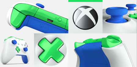
The design process breaks down into seven steps: picking colors for the controller body, bumpers and triggers, D-pad, thumbsticks, face and menu buttons, and the back panel. The same rainbow of 15 colors is available for the body, back and D-pad. The thumbsticks have eight options, the face buttons have five, while the ancillary view and menu buttons have four.
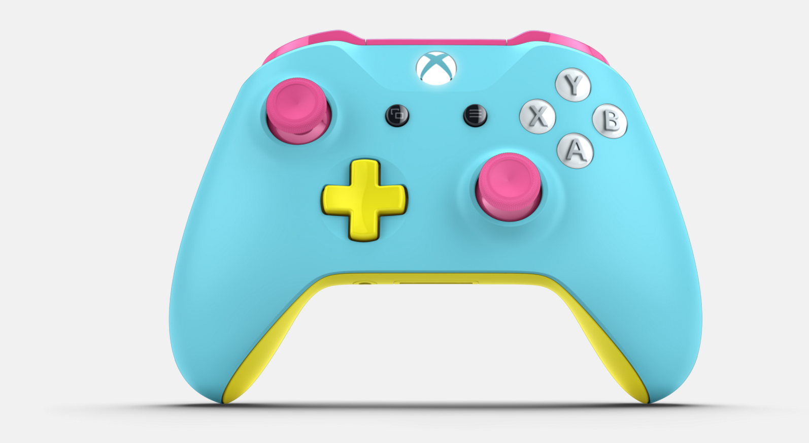
On paper, that sounds like a lot of room for creativity, but once I got down and dirty designing my joypad, it was anything but. My coffee table is littered with black remotes and gamepads, and I was feeling nostalgic for the controller that shipped with the Xbox 360 at launch, so I opted for a “robot white” body.
From here, the choices become much more difficult because there isn’t enough granularity. Both thumbsticks have to be the same color. The view and menu buttons, too, and the face buttons all have to be the same style. The latter bit crushed my dreams of having X, Y and B in black with the A button a contrasting lime green.
In fact, the backside’s battery cover isn’t customizable on its own either, which is a shame considering how much space whatever color you choose takes up. What’s more, the installation at Microsoft’s E3 booth had custom Guide buttons on display. Unfortunately, those different-colored, illuminated jewels that take you to the main menu didn’t make their way to the final product.
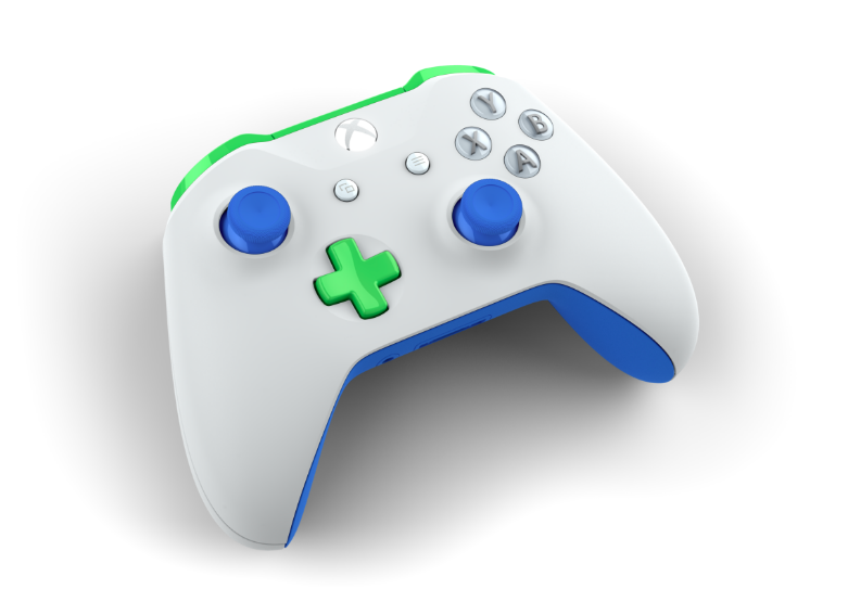
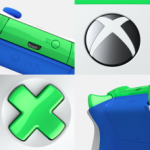
After a few hours of fiddling around, making garish looking mock-ups and trading screenshots back and forth with my coworkers, I wound up with the understated beauty above. The key to making a good-looking controller is restraint. Sure, I could’ve made something with more colors, but I didn’t want my creation to look like someone vomited confetti on a gamepad. Hence, I opted for “photon blue” thumbsticks instead of “regal purple,” “oxide red” or “deep pink” and matched them to my back panel.
For an extra $10, you can have a few words laser-etched into the spot between the D-pad and right thumbstick. Before you get your hopes up, though, be warned that expletives aren’t allowed. Basically, anything that would get your Gamertag flagged for vulgarity won’t work here. Had I realized that sooner, I could’ve saved myself 10 minutes.
While I wish there were more options and granularity in the design process, I have to commend Microsoft for the 360-degree 3-D rendering of the gamepad. Every time you choose a different color, it appears instantly on the mockup, replete with realistic lighting, shadows and reflections. It’s really cool and helps ease any anxiety one might have over how their choices will look in real life.
Sure, $80 to $90 for a gamepad is steep, but compared with other online custom shops it’s actually cheap. Building a one-off pad from Evil Controllers offers greater customization, but there’s an upcharge for most colors and finishes every step of the way. A black matte grip for the sides of the controller is $15, while nondefault choices for the face range from $20 to $25. What starts as a $70 gamepad can cost more than $250 by the time you’re finished. On top of that, the static 2D design interface for Evil Controllers or The Controller Shop are no match for Microsoft’s interactive mockups.
And now, I wait. The order confirmation email says I should have my white, green and blue gamepad by September. Until then, I just need to be patient and use my Elite controller for Inside and repeat runs through Quantum Break. Hopefully I don’t throw it.
(59)

