Facebook made a certain type of illustration ubiquitous—but it’s time to stop knocking it
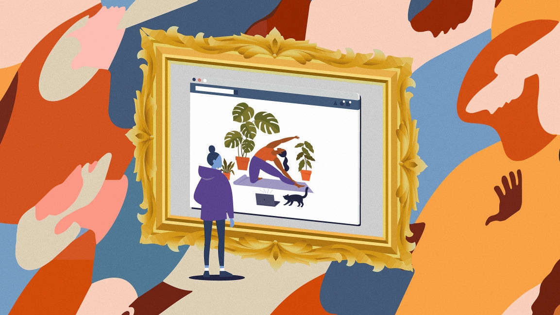
If you’ve been online in the last five years, you’ve seen them: brightly colored human-like figures with wobbly limbs and disproportionate torsos smiling, leaping, high-fiving, and watering their plants.
Facebook first developed the core aesthetic principles of shape-based flat art into its in-house style, known as Alegria (that’s Spanish for “joy,” an emotion not commonly associated with Facebook), in 2017. The abstract characters, in their anodyne cheerfulness and purple or bright-blue skin tones, are immediately recognizable to anyone who’s ever spent any time on Facebook.
In the time since, Alegria and its knockoffs have come to define the digital aesthetic of the late 2010s, just like all-white minimalism coupled with neon signage and plants defined the look of commercial establishments. Slack and Google rolled out copycats, as did banking apps, online media, and even sex-health startups. Vector-based flat art was suddenly everywhere, especially in startup and tech branding. Its ubiquity felt eerie, its relentless optimism infantilizing.
Soon enough, the backlash began: The look became derisively known as “globohomo” (global homogenization), “corporate Memphis,” or—even more archly—”corporate tech style.” It was at once so recognizable and so hated it became a starter pack meme, the subject of a very active subreddit, and the victim of countless parodies, most notably one mimicking Francisco Goya’s “Saturn Devouring His Son.”
Professional illustrators point toward a gradual return to texture and realistic brushstrokes on flat art, as well as 3D-like skeuomorphism, thanks to Zuckerberg’s metaverse. Even so, it’s safe to say that—love it or hate it—the style is now a trend with staying power. And it’s time to consider flat art with more nuance.
Some scholars and illustrators defend the style and its art-historical legitimacy, regardless of whether they’re adopters or practitioners. What at first glance appears like a sterile sea of sameness, they say, has unexpected depth and variety.
“I think flat art became a scapegoat for all the systemic issues we face in our industry, from loss of authorship to faster and faster turnarounds, through having to navigate being ‘authentic’ while making money,” says Montreal-based illustrator and researcher Julien Posture, who has a background in anthropology. “I think it was reassuring to blame it all on one style, one type of client, as a way to dismiss the much more worrying reality that these issues are creeping up everywhere in the creative industry.”
After years of being the punching bag of the aesthetically-minded internet denizens, flat art deserves a more comprehensive understanding that goes beyond its association with tech dystopias masquerading as tech utopias: It’s a style with its own merits.
“A lot of the criticisms are about the style itself, and people talking about how flatness is somehow dehumanizing or how exaggerated proportions are somehow dehumanizing,” says illustrator Michele Rosenthal. “People talk about how that is inherently a corporate style.”
Rosenthal calls herself a flat-art apologist: She has been a vector-based illustrator since 2007, and is part of a growing cohort of creative professionals who made it her online raison d’etre to defend that style.
“This is just part of our design language; these are ideas that have been in Western art for a really long time now,” she says.

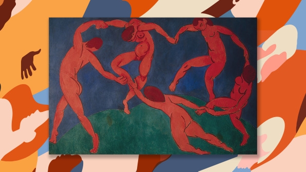
In fact, shape-based flat art has been around since the Stone Age and its cave paintings. It rose to prominence again with modernism, when Western artists looked into non-European art traditions to eschew realistic and figurative art. Consider the exaggerated proportions seen in Picasso’s “Les Demoiselles d’Avignon,” or the flat surfaces of Matisse’s “The Dance.”
Another illustrious precedent in flat art is the work of art-deco poster artist A.M. Cassandre, whose seemingly simple flat illustrations are, however, undergirded by mathematical calculations. Then came the midcentury aesthetic. Disney artist Mary Blair, most notable for the concept art of key scenes of “Alice in Wonderland” and “Sleeping Beauty,” created high-contrast color illustrations juxtaposed with surrealist scenery and oddly-proportioned characters. And while the 1970s and 1980s gave way to more pictorial illustration styles, by the 1990s, when personal computers came equipped with graphic programs with limited toolkits, people began experimenting with digital illustration.
“One thing the computer could do well was flat art. Or, more specifically, vector art,” says Rosenthal.
While Facebook was the first to popularize the use of flat art, it does not own the style—and all the copycats have meant a boom in work for certain designers.
“Somewhere around like 2012, I started getting clients from the tech sphere who wanted illustrations for their apps,” says Rosenthal. “Before that, honestly, I didn’t find a lot of takers for my illustration style. I started getting interest from all these tech startups that wanted to make their apps more appealing and more playful.”
Playfulness goes hand in hand with nostalgia, another component to vector, shape-based art.
“A lot of illustrators working in this style grew up with children’s books made in the style, and saw old animation done in the style,” says Rosenthal. “And because it has this familiarity, it works well. Tech companies want things to feel familiar. They don’t want things to feel like this is a scary new technological world.”
And while Google’s and Facebook’s styles might, indeed, feel homogeneous, there are companies that are pushing the ways shape-based illustrations are used. In the illustrations for the dating app Hinge, for instance, characters harmoniously follow a curvilinear line of action, while the educational animation studio Kurzgesagt combines flat art with lighting and shadow effects, convincingly reproducing, say, the glow of magma or celestial objects. The New Yorker is partial to flat art, featuring illustrations from Malika Favre and Olimpia Zagnoli on its covers.
Rosenthal points out that, in the field of illustration, individual style trumps whatever we might perceive as trends. “Most illustrators, we kind of have our own style that we like to work in,” she says. “So, if someone’s hiring us, they’re hiring us for the style that we’re already doing—they’re not telling us to work in someone else’s style. It’s a mistake that people think a lot of illustrations are in a similar style because clients are requesting it.”
It’s also important to note that, for professional illustrators, flat art can be an ideal medium, especially in a context of stagnating or shrinking budgets coupled with quick turnaround times.
“Vectors have the advantage of being efficient and scalable, which really helps when the image might end up on a different medium,” says Posture.
Rosenthal says some people have blamed the style itself for lowering illustration prices—but that isn’t true. Illustration prices have been plummeting for decades. Creating art that’s a little bit faster to make and doesn’t require a roomful of art supplies in addition to a computer and expensive software, she says, can make those lower illustration prices easier to work with.
“It keeps illustration viable as a career,” she says.
Fast Company , Read Full Story
(120)


