Facebook testing new Ads Manager interface
Advertisers have been getting sneak peeks at the changes Facebook is looking to bring to Ads Manager.

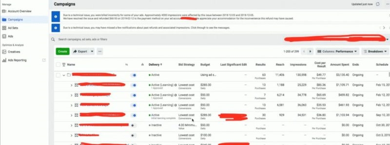
The campaign level view in the revamped Facebook Ads Manager interface. Screen shot: Duane Brown, Take Some Risk, Inc.
Facebook has a new spin on Ads Manager that it has started previewing to advertisers.
What’s changing? Last week, word started to get out that Facebook has a new version of Ads Manager in the works. Akvile DeFazio, who heads the agency AKvertise, said she got a look at the new interface Thursday. She compared the look to Reddit with the current navigation tabs at the top going away in favor of drop downs.
On Friday, Duane Brown, who heads performance agency Take Some Risk, posted screenshots of the new beta, which he said is only being tested internally at the moment, with no timing given on when it might open up.
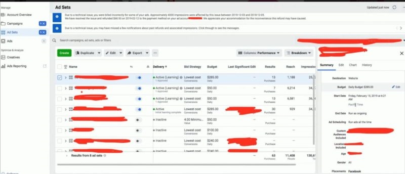
You can see from the ad set-level view Brown posted that the right side editing panel is sticking around.

Screen shot: Duane Brown, Take Some Risk, Inc.
Why you should care. User interface updates always take getting used to — just ask any search marketer who’s worked through the transition from the AdWords to Google Ads interface over the past couple of years. From this initial preview, though, it looks like Facebook Ads Manager will feel much more intuitive to advertisers using other platforms. That should mean higher productivity for those setting up, managing and analyzing campaigns. (Facebook does not have an offline desktop editor like that of Google Ads and Bing Ads. That would be a nice addition.)
FWIW. No word on when advertisers might be able to get their hands on this. Facebook isn’t saying much publicly yet. Asked about the interface, Joe Osborne, a Facebook spokesperson told us, “We’re always testing out ways to improve our interface but have nothing new to announce at this time.”
Marketing Land – Internet Marketing News, Strategies & Tips
(27)


