Firefox is picking a new logo, and it wants your honest opinion
When you think of the nonprofit-backed browser Firefox, its logo probably instantly springs to mind: a little orange fox curled around a blue orb. Now, the company is choosing a new one.
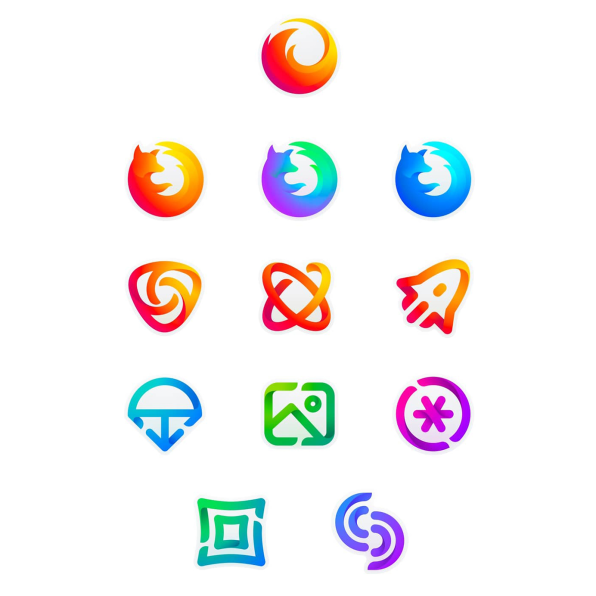
But unlike most companies, which unilaterally announce a new logo that the internet inevitably hates, Firefox is taking a different approach. It’s following the example of its nonprofit owner, the Mozilla Foundation, which open-sourced the process of picking a logo in 2016 by giving its community the opportunity to comment on different designs before it chose one. But while that process began with seven concepts by the branding agency Johnson Banks, Firefox this week is only presenting two for the world to dissect. Created by an in-house team of Firefox designers, each represents a distinct branding system, with a “master” logo as well as variations for Firefox’s host of browsers and apps.
Luckily for those who will always associate Firefox with its little fox, both designs maintain a version of it as the main browser’s logo. The first system features a geometric, stylized image of a fox’s head in bright orange, yellow, and magenta, with all the secondary logos adhering to a similar combination of geometric design and color.

The second system is more akin to Firefox’s current logo, with an abstract swirl in its classic orange, yellow, and pink gradient. The secondary app logo designs maintain an echo of the abstract, circular design of the master logo.

Now, users and anyone who has an opinion can comment on a blog post about the designs to give the designers their feedback. Then, the designs will be refined and ultimately the company will choose which direction to go in.
Why redesign now? Firefox has become a lot more than just a browser–it also offers a bookmarking tool, a VR and gaming application, and mobile apps with varying levels of privacy control–and the team plans to launch new apps in the future that can live under the Firefox umbrella. (Sidenote: if you care at all about privacy, Firefox is definitely the browser you should be using.)
“As an icon, that fast fox with a flaming tail doesn’t offer enough design tools to represent this entire product family,” write Madhava Enros, senior director of Firefox User Experience and Tim Murray, Mozilla’s creative director on the Mozilla blog. “Recoloring that logo or dissecting the fox could only take us so far. We needed to start from a new place.”
(18)


