First Complete Prototype Of Google’s Self-Driving Car Looks Like A Cartoon Ladybug
Hitting the streets next year, Google’s first complete working prototype looks cute and underpowered for a reason.
Editor: Suzanne LaBarre
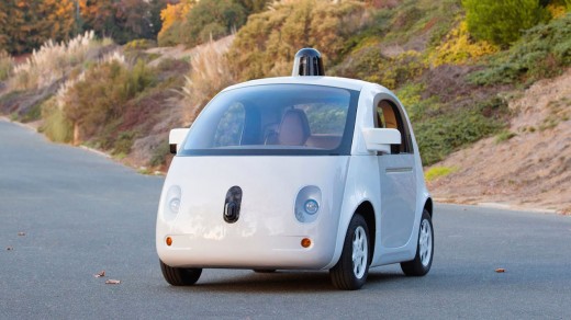
After first debuting the design in May, Google has just announced that it has completed building the first complete prototype of its self-driving car, with plans to take it on the road next year. And yes, it still looks like a big cartoon ladybug. Much of the prototype’s original design has stayed intact, with the addition of useful elements like blinkers, brake lights, and real headlights. Other differences: Whereas the original Google car looked like it literally had a big smiley face drawn on the front, the new design is more subtly anthropomorphic. Also, the LIDAR system on top—the 360-degree camera array that the Google self-driving car uses to see the world—has shrunk down and looks a little daintier.

Why the silly, albeit cute, look? As pointed out beautifully by Matthew Inman of The Oatmeal, who test-drove the new prototype, “Our brains are hardwired to treat inanimate (or animate) objects with greater care, caution, and reverence when they resemble a living thing…. By turning self-driving cars into an adorable Skynet Marshmallow Bumper Bots, Google hopes to spiritually disarm other drivers.” Which, as it turns out, is why we make our robots look so human-like, too. Science might back up the logic if Google’s self-driving car, but that’s not to say other car designers will like it. Back in May, two of the three designers we asked didn’t much care for Google’s Marshmallow Bumper Bots, describing it as “weak,” “inoffensive” and “naively detailed.” Certainly, Google’s design is the very antithesis of the ethos of speed and power that dictates conventional automobile design. To my mind, that’s what makes it work so well. Read Google’s full statement about the finished prototype here.
(189)

