FX reel shows how ‘Ghost in the Shell’ developed its visual style
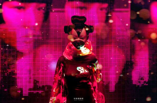
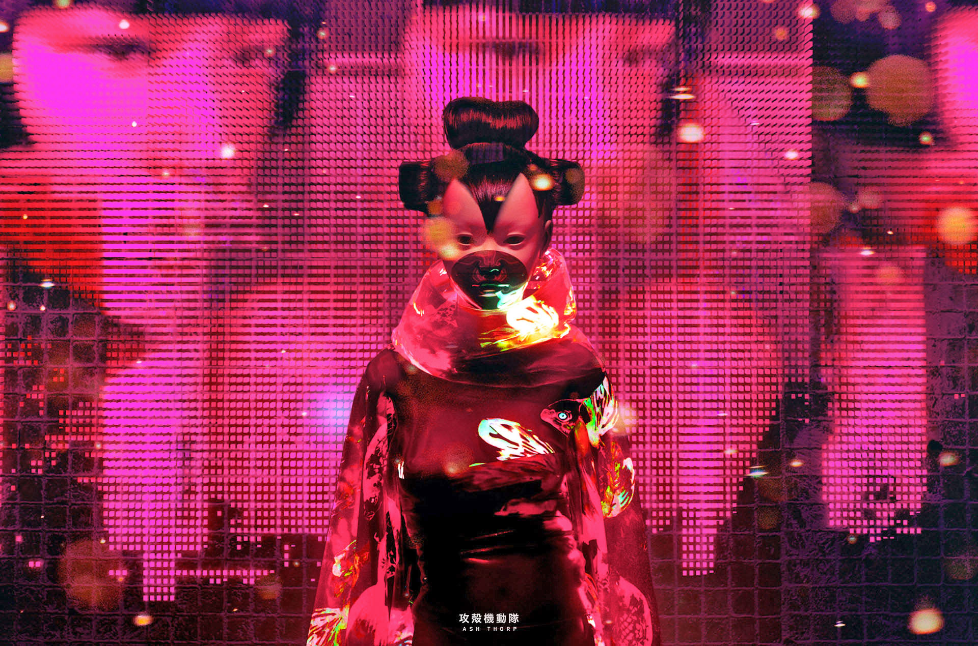
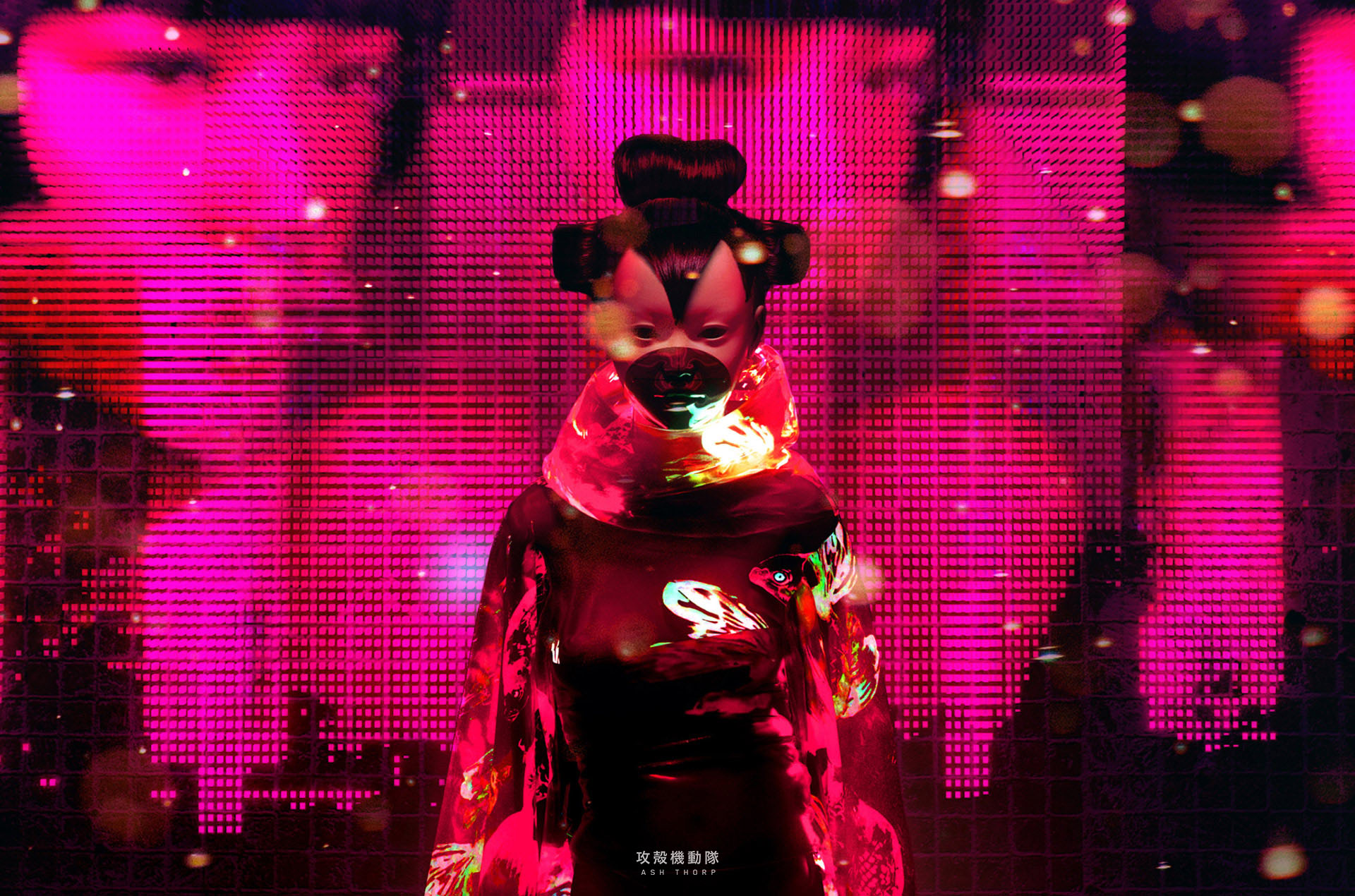
By most accounts, the movie adaptation of Ghost in the Shell didn’t live up to the visionary manga and anime it’s based on, but it did create some stunning visuals. The film’s holo-saturated neon cityscape was designed in major part by digital creative Ash Thorp, who recently put together a highlight reel of concepts and animations created for the film.
Part mood board and part tech demo, the short video blitzes through some of the most vibrant concepts that characterized the film’s world. True design nerds will want to dive into Thorp’s post on his personal blog, where he explains his philosophies behind the movie’s murky, neon-drenched cities and geometric-styled props:
“Pulling muse from the amazing original source material, I aimed to craft a look and style that would match [director Rupert Sander’s] vision, while still maintaining the essence of the original manga and anime. By merging physical buildings with the Solograms, old neon lights, and holograms, I aimed to paint a multi-layered facade over the city to bring it to life. I wanted it to feel as if the viewer was taking a psychedelic journey wavering between the realms of alternate reality and virtual reality.”
This isn’t Thorp’s first dip into bringing Ghost In The Shell to life. Three years ago, he directed Project 2501, an homage that recreated the anime’s title sequence in real-time with computer graphics. It’s little wonder Sanders brought him on to adapt the source material’s style to the film version — check out Thorp’s designs for his fan-film and compare them to the aesthetic that eventually ended up in the big-budget production.
(70)

