— December 26, 2016

Most companies turn to Gmail or Outlook to manage their workplace email. 13% of public companies use Office 365 or G-Suite (formerly Google Apps). The remaining 87% use a combination of the two, or a private email setup.
Some companies choose Google or Microsoft because they prefer one’s cloud office suite—which includes calendars, and collaboration on spreadsheets and documents—over the other. (We compared Office 365 with G-Suite in another post.)
But if you use other productivity tools and are deciding between Gmail or Outlook solely for email, you want to choose one that helps you speed up your workflow. Gmail set its initial bar high, and Microsoft clearly took notice. Given Outlook’s 2016 update, it is now more equipped to compete than ever.
Here are five game-changing differences between Gmail vs. Outlook.
1. Cost and Storage
To get Gmail or Outlook for your company, you can download it along with the rest of its related cloud office suite, i.e. G-Suite or Microsoft Office 365.
G-Suite offers two prices for email, as well as other business apps like Calendar, Google Docs, and Google Sheets. For $ 5 per user per month, you get 30GB between Gmail and Google’s other office apps. For another $ 5 per person, you can upgrade your business account to unlimited storage across those platforms.

Outlook offers several different plans, but their cheapest plan (Office 365 Enterprise E1) designates 50GB specifically to your inbox, and 1TB to the rest of your linked cloud office suite.


Outlook’s cheapest enterprise plan gets you a lot more space across the board than Gmail does.
When it comes to storage and price, Outlook’s the clear winner.
Score: Outlook 1/5, Gmail 0/5.
2. Search Within Your Inbox
Ever find that you’re writing an email, and you need to reference an old email at the same time?
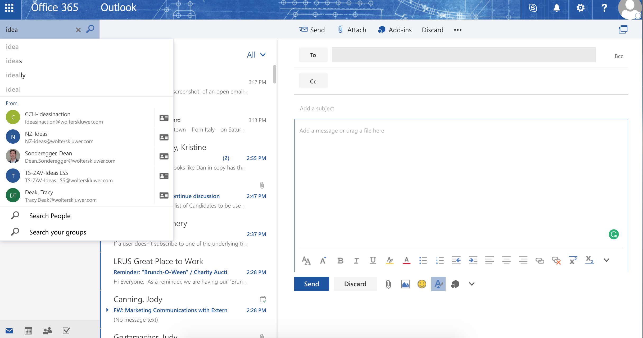
Gmail lets you search for old emails as you write new ones, but it’s clunky. You lose the message previews, dates, and most of the subject that you’re looking for.

Even if you enable a double-pane view of your inbox (via “Preview Pane” under the “Labs” tab in Settings), your view is still obstructed. You can’t adjust the size of your inbox, new message, or search bar to view all of them at the same time.

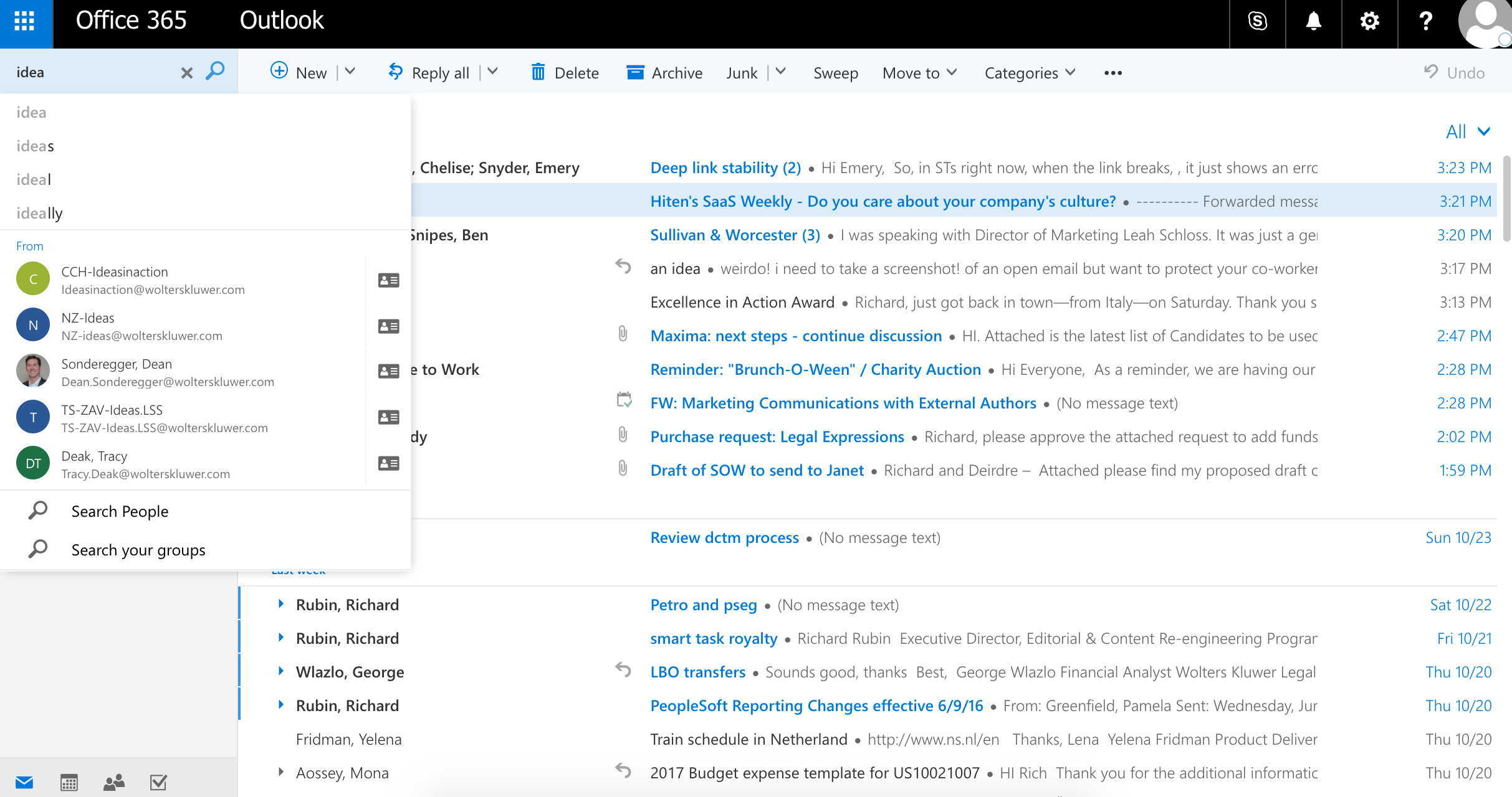
Outlook’s new message process is cleaner, though it’s not perfect either. Outlook’s default inbox is a double panel, and your view of your inbox still gets cut off. When you search for older items, you can still see a full picture of your new message.

If you prefer to zero in on one task in your email, you can adjust Outlook so that it is single-pane, like Gmail’s default. Just go to the Settings icon, hit “Display Settings,” and click “Hide reading pane.”


No matter how you configure your Gmail or Outlook display, Outlook makes it easier to search for old emails while writing new ones.
Score: Outlook 2/5, Gmail 0/5.
3. Calendar Integrations
Neither platform has a real solution that lets you view your calendar and email side-by-side.
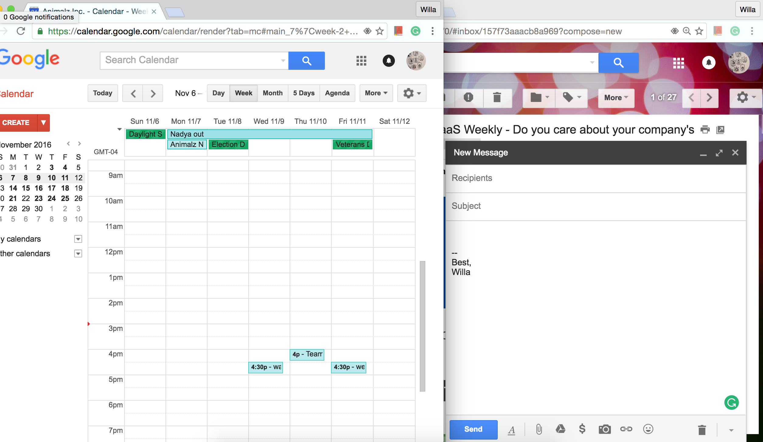
While both Gmail and Outlook sync events with your calendar, neither let you view your calendar and inbox at the same time, in one tab. When you click on the Outlook tool bar, you’re taken to a separate calendar window.


On the other hand, when you click on Calendar in Gmail, it keeps your inbox open, and adds a new window (or tab) with your calendar.


Neither Gmail nor Outlook lend well to multi-window viewing. At least Gmail lets you view your calendar and email at the same time, albeit in different windows.
Score: Outlook 2/5, Gmail 1/5.
4. User Experience (UX)
Inbox aesthetics are subjective, but they matter. If you’re staring at your backlit computer screen all day long, the only way you can avoid seriously straining your eyes is by adjusting the brightness level on all your devices.
That applies to email, too. The more you can customize your inbox for what strains your eyes the least, the better.
(Un)read emails
Text in Gmail is larger than in Outlook. Coupled with the clear definition between bold and non-bold text, as well as the inbox shading available with most templates, Gmail is generally softer on your eyes.
Gmail wins for customization around unread emails. “Read” emails appear in a darker shade than “unread” ones. “Unread” emails are also distinguished, because their sender and Subject are in bold.

Outlook differentiates these by putting the sender and subject in blue. It’s bold too, but since the text overall in Outlook is flatter and smaller, you still need to squint to see if something is a new email.

Thanks to shading, bold and text size, Gmail’s aesthetics makes it easier to spot unread emails than Outlook’s.
Score: Outlook 2/5, Gmail 1.5/5.
Flagging
But let’s not hate on Outlook’s aesthetics either. When you flag an important (read) email, the entire line around that email gets highlighted yellow, and is shaded differently.

Gmail offers a variety of different flagging symbols, but you can’t search through your inbox per each symbol (notice the exclamation point and different colored stars below). If you’re looking for an important read email, you’ll probably find it faster in Outlook.

Score: Outlook 2.5/5, Gmail 1.5/5.
5. Security
Gmail has spent most of its lifetime (i.e. the past twelve years) in the Security Spotlight. It offered two-step authentication before Microsoft did for any of its email clients. That means that if someone steals your password, it doesn’t necessarily mean that they can access your account. To log in, you still need to enter something else, like security questions, a retina scan, a touch ID, or a security code.
With Outlook 2016, Outlook also uses two-step authentication. When you log into Outlook on a new device, Outlook sends you a security code to verify your identity. When it comes to signing in, you’re more or less on equal footing with Gmail or Outlook.
The real difference between Gmail and Outlook’s security today hinges on whether images are displayed automatically.
Gmail’s rule of thumb was to send emails sent via a third-party server to spam, because in the earlier days of the internet, messages using third-party servers often were. This is something that once made Outlook, and Hotmail before it, vulnerable.
But now, if you’re a Gmail user who subscribes to newsletters—or just want to open an image that a friend sends you—you have to take a few extra steps to view them.
Like Hotmail before it, Outlook displays images, so everything you elect to see is right in front of you to begin with. Microsoft has become better at detecting potentially harmful messages, but its default is still to display images.
With the risks attachments may carry, whether you prefer the extra security or find it cumbersome is your call. If your password is strong, your account will be as secure as you make it.
Score: Outlook 3/5, Gmail 2/5.
The Winner: Outlook Has Come a Long Way
Both Gmail and Outlook are powerful platforms. Gmail is cheaper, and if you’re choosing which office suite platform to use, that’s a huge consideration. But barring the aesthetics, you’ll get more bang for your buck if you choose Outlook.
Digital & Social Articles on Business 2 Community
(123)