Google is testing variations of black links in search results
Google frequently makes changes to its search results pages in order to improve the user experience. Contributor Sergey Alakov has collected examples of what appears to be Google’s latest test: replacing blue links with black ones in the user interface.

Google appears to be testing a new look for its search results pages that would change the color of links from the traditional blue to black.
First reports of the black SERP tests started to appear at the end of April, and Google already ran a similar test almost exactly one year ago. This time around, however, webmasters have noticed several different variations of the test, and we decided to try to find as many of them as we could.
We’ve found 11 variations thus far, and we are pretty confident there are more.
1. Large black URLs
These results feature the listing URL above the page title.
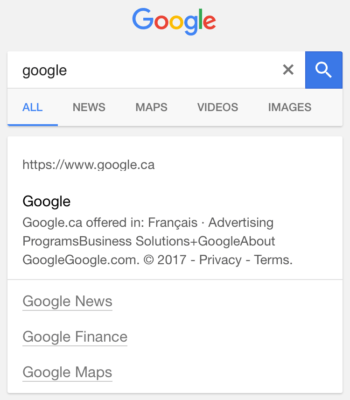
2. Small black URLs
This display is similar to the one above, but the URL text is noticeably smaller.
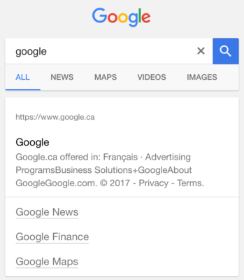
3. Thin blue bars
This display features a blue bar to the left of the search listing’s page title.
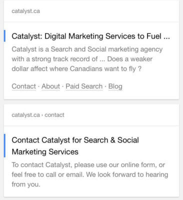
4. Thick blue bars
Similar to the display above, this version features a thicker blue bar to the left of the page title in search results.
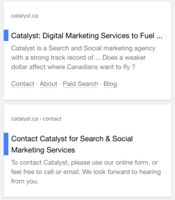
5. Black horizontal dots
To the right of the URL below, you can see three small dots, aligned horizontally. Presumably, you can click this for more options or information.
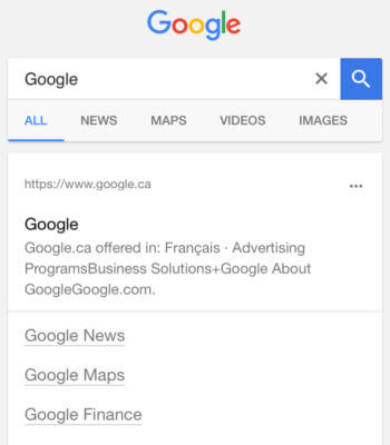
6. Black vertical dots
This display is similar to the one above, but the dots are aligned vertically.

7. Blue titles
In the screen shot below, you can see that the page title link is displayed in the traditional blue color, while all other links (sitelinks and URL) are black.
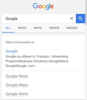
8. Blue URLs
In this version, the URL is displayed in the traditional blue color, while the rest of the links (page title and sitelinks) appear black.
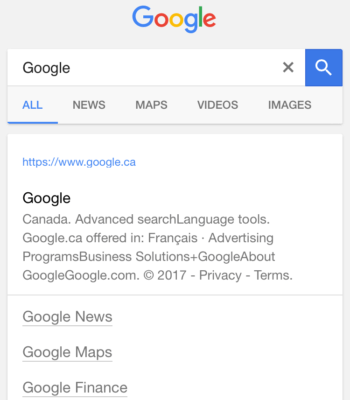
9. Colored dots
The display below features four colored dots to the right of the URL. The dots appear to be the same colors featured in Google’s logo.

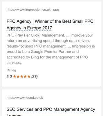
10. Dashed blue underline
This display shows the listing’s page title underlined with a blue dashed line. (h/t Aaron Dicks)
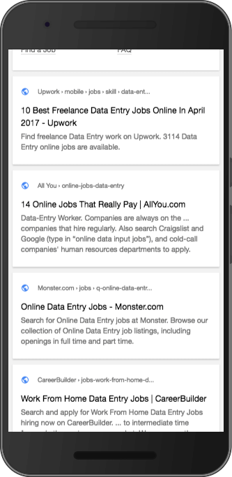
11. Globe icons
This test shows a blue globe icon in search results, above the page title and next to site breadcrumbs. (h/t Kenichi Suzuki)
What are you seeing?
Google itself claims to have run 9,800 live traffic experiments last year, and it seems they’re continuing that tradition this year in testing black URLs in search results. So far, we’ve identified at least 11 different variations of one test — and there may be more out there. Have you seen any versions we missed? If so, let us know on social media!
[Article on Search Engine Land.]
Some opinions expressed in this article may be those of a guest author and not necessarily Marketing Land. Staff authors are listed here.
Marketing Land – Internet Marketing News, Strategies & Tips
(24)


