Google Maps Gets Redesigned, Color Coded
by Laurie Sullivan @lauriesullivan, November 16, 2017
Google, known for search advertising and location-based directories, has updated driving, navigation, transit and ways to explore locations at a glance and provide the most relevant information for travelers on mobile.

Locations such as gas stations or trains stations for those in transit are easier to find, along with more prominently featured road closures.
For those scheduling an event using Google Calendar, a reservation confirmation will appear in Gmail. Add a restaurant to the “Want to Go” list and Google Maps reflects that too.
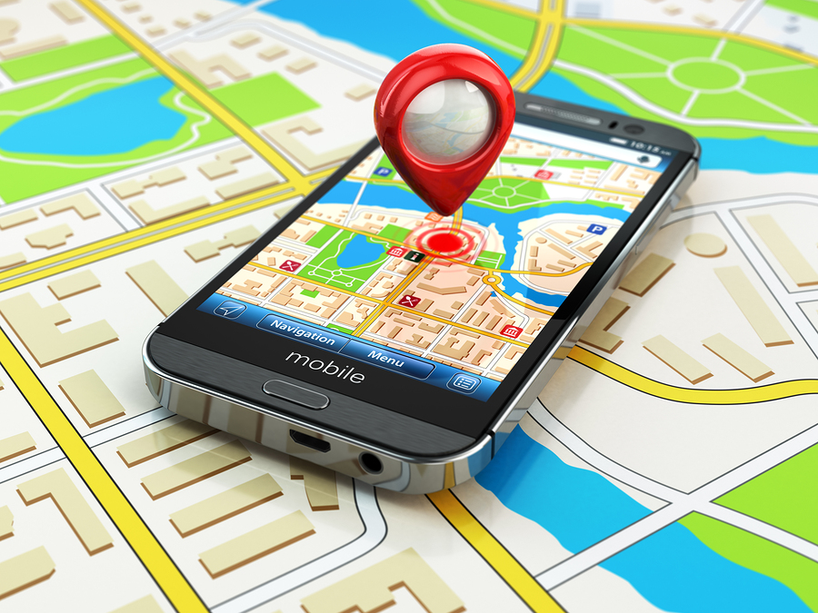
Google also updated the color scheme and added new icons to help users identify exactly the kind of point of interest. Places like a cafe, church, museum or hospital have a designated color and icon, so it’s easy to find that type of destination on the map.
For those in a new neighborhood searching for a coffee shop, orange-colored icons — the color for Food & Drink locations — will identify the nearest in the map. Google will use blue for Shopping and red for Health. There are eight colors in total to identify specific categories.
The changes will appear during the next few weeks in all Google products that incorporate Maps such as Assistant, Search, Earth, and Android Auto. Eventually the new style will appear in the apps, websites and experiences offered by companies that use Google Maps APIs.
MediaPost.com: Search Marketing Daily
(20)