Google Mobile Search Gets Redesign
Google Mobile Search Gets Redesign

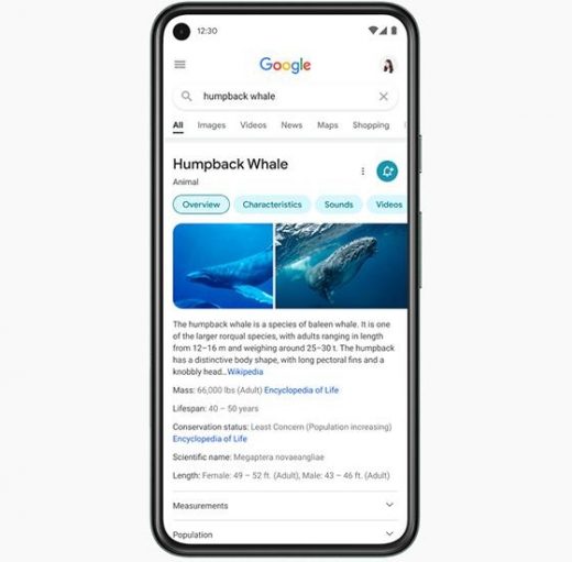
Google on Friday introduced a modern look for its mobile search experience, with a focus on making results easier to read.
“Rethinking the visual design for something like Search is really complex,” Google designer Aileen Cheng wrote in a blog post. “That’s especially true given how much Google Search has evolved. We’re not just organizing the web’s information, but all the world’s information.”
That information also includes web content like images and videos, providing additional visual blank space to comprehend the pieces on the page, and colors that guide the eyes to important information on the page.
In addition, users will have the ability to view animals in three dimensions, such as Alpine goats. It’s not a new feature, but it’s pretty cool just the same.
Five factors drove the redesign. They include bringing information into focus, making text easier to read, creating more breathing room rather than clutter, using color to highlight what’s important, and leaning into the “Googley’ feeling with a “bubblier and bouncier” feel.
As for the “Googley” feeling, Cheng says it means rounded icons and images, with a form like the rounded corners of the search bar, a shape very much part of Google’s DNA.
(15)


