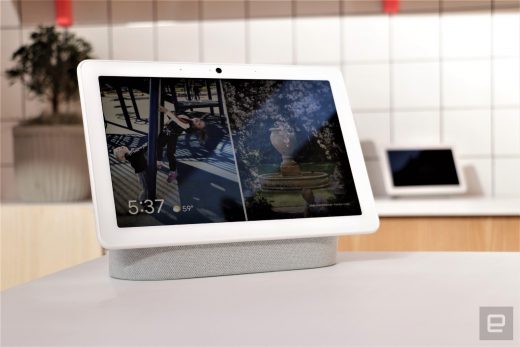
Google rolls out a refreshed, more personal Smart Display interface
Google introduced an updated Smart Display interface alongside the Nest Hub Max, and now you don’t need that new hardware to see what the fuss is about. The 9to5Google team has discovered that Google is rolling out the refreshed interface to the Nest Hub (formerly the Home Hub) and, presumably, third-party devices. The new home screen ditches the all-white Material Design appearance in favor of a more personal carousel of cards that keeps your wallpaper in the background. You won’t see as much of the weather forecast, but you should have more overall info at a glance.
The change isn’t just a fresh coat of paint. Google is partly prepping for the Nest Hub Max, which uses face detection to show Duo messages and reminders on the home screen when you gaze at the camera. In that light, this is as much about setting a new direction for Smart Displays as it is ensuring harmony in the smart home.
(20)


