Google Strikes A Blow Against Annoying Mobile Popups
August 24, 2016
Google is continually updating its mobile algorithms to better guide searchers toward the best answers to their questions. (September 01, 2016), they announced on the Webmaster Central blog two important changes. First things first, since 85% of mobile search results meet or exceed the criteria for mobile-friendliness, Google has decided to remove the “mobile-friendly” label from search results. They also announced something exciting for anyone who’s ever had to deal with an immovable, unshrinkable, screen-hogging popup on mobile: pages with immediately accessible content will now be prioritized over pages with intrusive interstitials.
Improving the Mobile Search Experience
Google explains the issue:
Although the majority of pages now have text and content on the page that is readable without zooming, we’ve recently seen many examples where these pages show intrusive interstitials to users. While the underlying content is present on the page and available to be indexed by Google, content may be visually obscured by an interstitial. This can frustrate users because they are unable to easily access the content that they were expecting when they tapped on the search result.
Pages that show intrusive interstitials provide a poorer experience to users than other pages where content is immediately accessible. This can be problematic on mobile devices where screens are often smaller. To improve the mobile search experience, after January 10, 2017, pages where content is not easily accessible to a user on the transition from the mobile search results may not rank as highly.
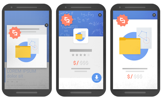
Google goes on to describe a few examples of these intrusive elements, such as popups that cover the main content, standalone interstitials that must be dismissed before accessing the main content, and layouts where the “above-the-fold” portion is indistinguishable from a standalone interstitial.

Image via Google
Understanding the Change
We sat down with SEO Specialist Lindsay Kavanagh and Web Designers/Developers Zoë St-Aubin and Iuliia Shchilnyk to discuss what spurred the change. Then, they explore design ideas that can help businesses balance the (sometimes competing) imperatives of user experience and lead capture on mobile.
What do you think was the major impetus for the change?

Zoë: Google is all about keeping users happy. If you click on a website and can’t access the content you wanted because of a poorly designed popup, you’re likely to leave the website altogether. The longer it takes you to find relevant content to your search, the less content you are as a user.

Iuliia: The main reason is that too many of such ads aren’t following the accessibility standards – users accidentally click on the ad while trying to close it because the button is too small (As stated by Google itself while designing for mobile the size of any touch target have to be at least 48x48dp including the area that responds to user input). It was more like a suggestion and best practices before this point of time but now they are starting to enforce it which I think is great and will help to ensure users have a much better experience.

Lindsay: User experience is becoming more and more relevant in Google’s core algorithm. Though it’s difficult to quantify something that is dependent on users’ perspective, there are core dos and don’ts for user experience. In an age where ads take priority over content – Google is placing importance on what the users want to see.
What design tips would you offer for making interstitials less annoying/intrusive, or do you think they should be avoided altogether?
Lindsay: Interstitials can be put into sites without occupying the entire page. Ensure that there is a prominent close button or that when the user clicks anywhere else on their screen, it closes. To ensure your site loads quickly on mobile, disable it on small screens altogether.
Iuliia: The most annoying ads are those that block content and of course that are hard to close, so designing an ad that doesn’t take over the whole viewport and has a more prominent close button or extended padding area around it could definitely help. Another idea that can help making such popups less intrusive is to program it for auto-close if the user continues to scroll the page, but then again the ad shouldn’t take over the whole screen.
Zoë: It’s now imperative for designers to ensure that if there is going to be a popup, it’s responsive. Often, even when a website is completely responsive, a popup won’t be and this results in it covering the whole screen or the close-button being pushed out of the viewport. This is also an important thing to keep in mind for any non-designers who manage their own websites. Shopify stores, for example, often use popups that can be installed by just about anyone using an app for the platform. If you install a popup app, make sure you do your due diligence and test out it’s appearance on mobile devices.
I think popups used to collect information or notify users of a sale are OK, as long as they are used in moderation and can be easily closed on any device, they can still have a place in a site’s design. Third-party ads in the form of popups, on the other hand, are awful for UX and should never be allowed if you want to keep users around!
If not interstitials, what design tips do you recommend for capturing user info, driving newsletter signups etc.?
Lindsay: To capture email sign ups you need to offer an incentive. Present and effective CTA to users and an easy to register form. For example, offer a discount code or special offer to users who sign up for your mailing list. Place this below your content in a section that stands out or put it in a sidebar. This doesn’t need to be flashy as the deal will make it flashy enough.
Zoë: Try to integrate these elements into the website and make them stand out in a less obtrusive way. Use buttons inviting users to open a popup rather than have it appear automatically.
Iuliia: I like to place newsletter signup on the website itself, not on interstitial – in the footer, under the blog posts, in a sidebar but always keep it very short and offer an incentive for it.
Do you have any predictions for other design or performance elements that Google is likely to punish on mobile the future?
Lindsay: In future – I foresee a core update penalizing sites for placing ads above or on content. On mobile especially, placing hindrances to prevent users from seeing what they want is a huge red flag. They key is to present users with what they are looking for and never make it difficult for them to find what they are looking for. Easy-to-navigate websites will always rank above the rest – and Google will make sure of this.
Iuliia: If they already started, they may dig further on accessibility of the layout – whether all elements of the design are properly sized and spaced on mobile (fonts, images, icons etc.)
Zoë: I agree with Iuliia. Sometimes you’ll see a website that’s “responsive” as in everything shrinks to fit the viewport. These websites are hard to use since all of the elements end up being tiny and hard to read or click. A truly responsive website needs to make use of media queries, not just automatic resizing based on the viewport size.
Digital & Social Articles on Business 2 Community
(44)


