Google’s 3 Rules For Designing Virtual Reality
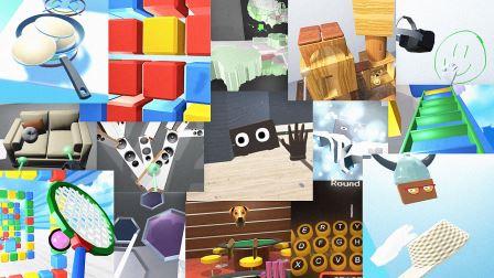
With Google’s new Daydream VR platform—announced earlier this month—the company hadn’t just developed new hardware. Four Google staff members (two engineers, two designers) have spent 30 weeks rapidly prototyping hypothetical experience after hypothetical experience in virtual reality. They’ve built 60 app experiments so far.
One week, they simulated watering flowers; another, building a dollhouse and teleporting yourself inside. Each Monday, these apps are tested by volunteers who work at Google. And the volunteers are actually recorded on video during testing to capture the nuances of their experience.
Now, the Daydream team has been sharing lessons they’ve learned about designing in VR. Here’s an early list of best practices, compiled largely from the company’s panel at the developer conference Google I/O.
1. People Enjoy Using Tools In VR; Let Them
Humans distinguish themselves from most mammals by using tools. In virtual reality, the opportunities to think about user interfaces beyond the mouse or touchscreen—to using real physical tools again—are sizable.
In one demo, the team built a gardening program. Sticking a Daydream motion controller inside a real, weighted watering can, they discovered that people holding the real object in virtual space found the experience incredibly satisfying. “We thought people would set it down because it was so heavy,” says Stefan Welker, software engineer on the Google VR team. “But it connected the real world and virtual world better.”
There’s no reason for the tools to be so 1:1 with real life, however. In another app, the team constructed a keyboard. But instead of typing with virtual hands at some virtual typewriter, you struck it with virtual sticks as if you were playing a marimba. Users didn’t just enjoy typing with this whimsical tool, they typed a lot faster than they did by aiming and clicking letters with a virtual laser pointer (which is the go-to interaction in a lot of VR today).
Finally, virtual space offers these half-physical, half-virtual tools a great possibility for ergonomic customization. The team created a virtual drum set, with drum heads that could be rearranged however you like in 3-D space, and people found the experience intuitive and easy to get used to. Plus, “there’s nothing like building your own drum fort and hiding inside it,” says Welker.

2. Do More Than Merely Replicate Reality
One of the best-selling games for the HTC Vive VR headset right now is called Job Simulator. It’s pretty much what it sounds like. You appear in a virtual office, and the game is essentially work.
But we shouldn’t be so quick to simply duplicate our real environments inside VR, the team argues—at least not by default. They have a saying called “experience the impossible.” In one example, they built a fruit-cutting simulator called Fruit Salad. You were standing at a cutting board, slicing fruit with a virtual knife. Set in a kitchen, the experience felt sterile and lame. But placed in the sky, with abstract, giant fruit floating around? It worked.
“More and more, we see people more engaged with delightful environments,” says Manuel Clement, UX designer and prototyper on the Google VR team.
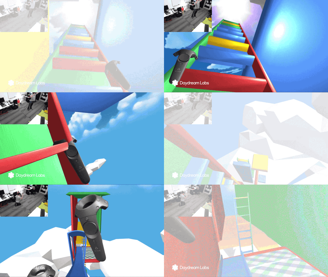
Similarly, such whimsical environments can greatly expand the scope of a VR world. In a demo called Slides and Ladders, the team returned to their strange sky setting in the clouds, where they constructed a giant obstacle course of slides and ladders that seem to stretch for hundreds of feet apiece. But the levels are designed vertically, rather than horizontally. So even in a tiny room setup for VR, just 5 feet by 12 feet, the user felt like he was traversing through an expansive place. “When people took off their headset they were stunned at how small the room was,” says Clement, “because that VR experience was massive.”
However, abstraction shouldn’t just be applied to tools, like the marimba keyboard, or environments, like Fruit Salad. People’s own avatars, too, make more sense as less than literal representations of the human body. A full-body human avatar the team built made people feel quite odd when they looked into a virtual mirror, because, “by showing bodies, we’re predicting where legs, arms, and torsos should be,” says Robbie Tilton, UX designer and prototyper on the Google VR team. “People looked at their body expecting it to be in one place, but it would be somewhere other than expected. . . . Full-body avatars are really hard to get right.”
Instead, while the VR industry is solving that problem, the Daydream team suggests designers do more with less. A simple floating VR headset, with big eyes and Mickey Mouse hands, worked wonderfully for social interactions.
3. Limiting Freedom Can Create Purpose
The virtual world may be a place of endless possibility, but designers still need to install limits.
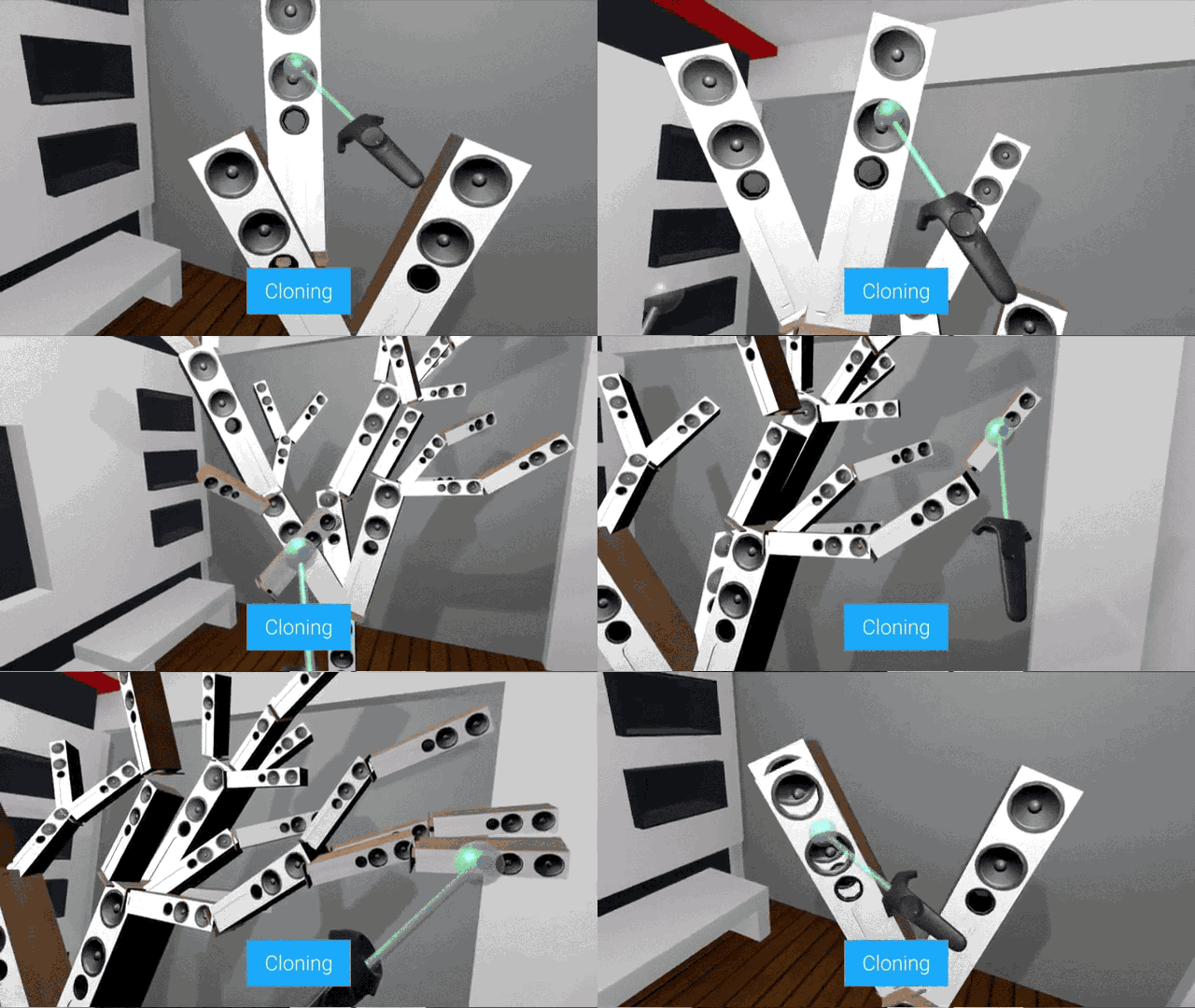
For instance, the team built a home-decorating simulator that allowed users to stretch and scale all types of furniture, and place it wherever they’d like. And then they made it a little too powerful. “Giving users creative feeling can lead to unexpected outcomes,” says Welker. “We created a clone button. People were very creative. They created trees out of speakers. But we found this creative freedom can distract from the app’s core use case.” In other words, a home-decorating app became some sort of Second Life-ian art app, which was not the intent. The team didn’t suggest a specific solution to the problem, but by simply limiting how and where someone could place speakers, they’ll probably use the app in a more utilitarian fashion.
When dealing with gestures—specifically having the ability to lift, resize, and reposition various objects in virtual space—the team came up with a good mantra to enable the feeling of freedom without ruining the experience: “precise results from imprecise actions.” By allowing a user to throw a picture at a virtual wall, but by making that picture stick and resize perfectly for the context, users felt both delighted by the action’s whimsy and satisfied with its efficiency.
Finally, the team urges that limitations also be built into social experiences. Innocent gestures, like placing a hat on someone else’s head, can come across as trolling because someone feels a real loss of control—so VR experiences should limit what you can do to other people. The interface should act as a social lubricant, too. “Just like in reality, people would be in the same room and just had nothing to talk about,” says Tilton. “To remedy this, give them a shared objective.” In this case? A jigsaw puzzle.
Google Will Share More Best Practices Soon
Daydream VR is only in its earliest days, and for Google, it won’t just be four dedicated developers building VR experiments, but a challenge that’s open to the entire VR team. And so the company plans to share more findings, as they discover them.
In the meantime, if you’d like to do a deeper dive on Google’s rules of VR, you can check out their recent talk on the topic at I/O.
All Images: via Google
Fast Company , Read Full Story
(55)

