Google’s “More Results” Test Could Spell Drastic Change in Paid Search
— April 19, 2018
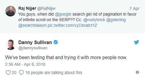
Reports started coming in a couple weeks ago that Google was undertaking a new beta test: replacing the “next” button at the bottom of mobile search results pages in favor of a “more results” button—which, when clicked, would load more results on that same page, as opposed to hopping to a new page. These early rumblings reached a crescendo a few days ago, when, as confirmed by Google’s Danny Sullivan, Google began rolling the feature out universally:
In this post, we’ll give a full rundown on the “More Results” test as it has unfolded, and discuss the potentially substantial ripples it could send throughout the world of paid and organic search.
Let’s dive in.

What Is Google’s “More Results” Test?
More Results is a mobile-only test currently in beta at Google. Google is experimenting with replacing the option to click to the next page of the SERP with the option to merely expand (or elongate) page one. To illustrate, here is a nice gif of the proposed action from Barry Schwartz over at Search Engine Land.
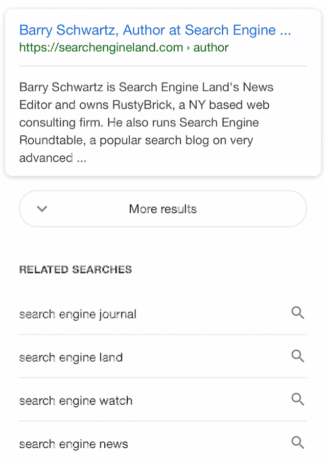
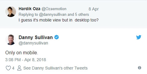
In theory, then, if More Results were to go completely universal, and if Google were to stick with it, pages two and up of the SERP would be indefinitely eliminated, and all results would exist on “page one.” The effect that would have on ranking designations remains unclear. What is clear, at least for the moment, is that this is a mobile-only test.
In theory (again), More Results is perfect for mobile. Back in December of 2017, Google tested a very limited version of More Results. The button itself came two-thirds up a truncated page, after just two or three search results. The current iteration of More Results would seem to offer the best of both worlds—the decreased load time of staying on page one, with the full-bodied flavor of a full mobile SERP. An endlessly scrollable page—in case, say, you reach result number 15, decided result number 5 was click-worthy after all, and want to quickly scroll back.
Implications: Desktop vs. Mobile
As I’ve said, this experiment is tailor-made for mobile, and really doesn’t change much of the current aesthetic. You’re going from this:

And this:

To this:

Sideways to down. Nothing groundbreaking there.
Still, the prospect of staying on one page is appealing, especially if you’re remote and load speeds are already compromised—a pretty common mobile occurrence.
And on desktop? Does More Results make sense? Ehhhhhh.

Sacrificing those funny-looking O’s is going to make it awfully difficult to skip to page 3 on multiple IPs and vigorously up the click-through rate of your number 36-ranked blog post. Not that someone would do that. Ditto, it’s going to make it hard for your average Joe to skip back to that bed and breakfast he mentally earmarked after his third tap of “More Results”—especially if he’s tapped it 3 more times since then.
But honestly, the most sensible argument against More Results on desktop might just be that we don’t need it. The desktop experience allows for plenty of clicking accuracy, and desktop browsing (usually) receives the benefit of wifi-connected load speeds. More autonomy where you can afford it, right?
What about my ads?
The jury is still very much out on how More Results could affect mobile advertising (though we have some ideas). If you’re among those thinking about the efficacy of your mobile AdWords campaigns, it might pay to direct some pointed concern @dannysullivan (sorry, Danny), because we can’t do much more than give it the eye test and make observations. That said, when you look at how ads appear on the current mobile SERP, there is one very interesting thing to note.
Head to your mobile device and type in a query that’s going to return some paid results. I went with, simply, “mobile ads”:
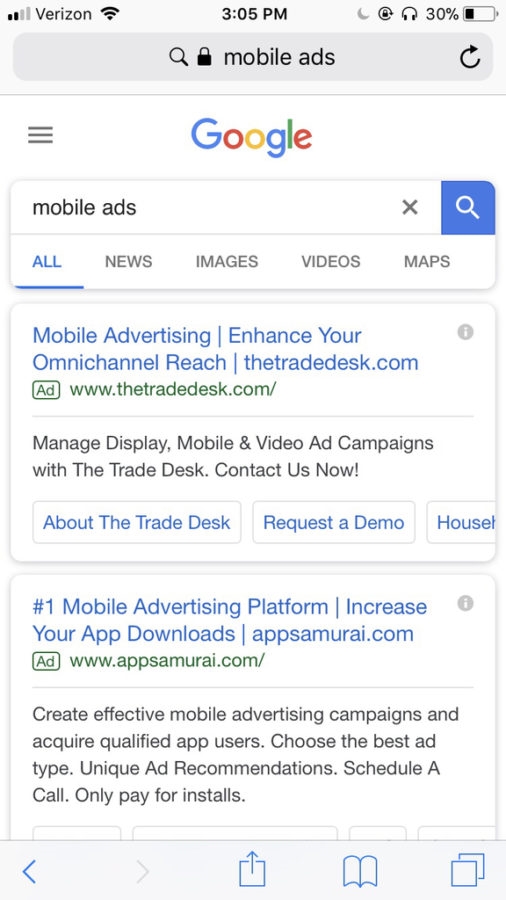
Nothing out of the ordinary here. A few paid results to start, 10 organic results, and a few paid results to finish:
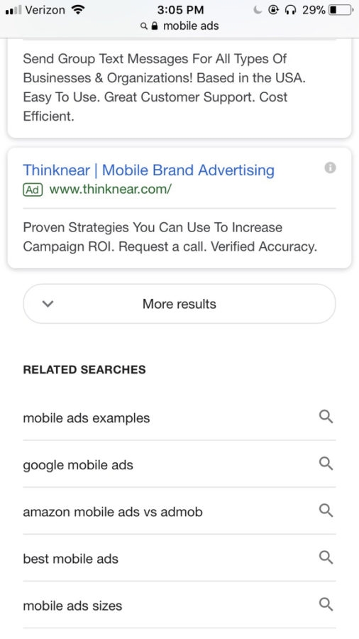
What’s interesting, though, is what happens when you do tap “More Results”:
If that button says “Next” instead of “More Results,” the next 3 or 4 results are ads. At the top of page 2. It appears that with More Results, however, in order to avoid listing six/seven ads in a row, Google has pushed those ads beneath the 10 organic results you would normally see on page 2. That means that if your ad was in the 11th position in the mobile SERP, it’s now in the 21st. Likewise, scroll down and tap “More Results” again, and the ads you would normally see at the bottom of page 2 have been relegated beneath 10 more organic results.
To put this in a less muddled conceptual lens, and using “mobile ads” as an example: in the old mobile SERP, the ratio of organic results to paid results per page was 10:7. On pages 1, 2, 3, so forth. In the new mobile SERP, the ratio changes from 10:7 to 10:3 after your first click of “More Results.” Way less ads, way more organic results.
It’s too early to tell what, if any impact this change will have on mobile campaigns, but you can easily imagine some lost visibility on the paid side of things. Still, when Google has eliminated ads in the past (a la right-hand sidebar ads), it’s because those ads were hardly getting clicks anyway. So it could be this will have little to no effect on impressions or clicks. We’re keeping our ears to the ground either way!
What does it all mean??
If Google catches the amount of flack for More Results as if did for Zero Results, this experiment will last about as long as that one did: no longer than a week. Interestingly, More Results and Zero Results share the same ostensible benefit (decreased load time), but seem to contend with different stakeholders. The biggest detractors of Zero Results were SEOs (over the loss of organic traffic and visibility) and users (over the misunderstanding of their search intent). The biggest detractors of More Results may very well be acquisition specialists losing visibility in their paid campaigns.
Clarity should emerge in the coming weeks!
Digital & Social Articles on Business 2 Community
(12)

