Google’s original Nest Hub drops to $40 at Best Buy
Google Home Hub review: A more personal smart display
Attention to privacy goes a long way.

Google debuted its take on the smart display earlier this year with a slew of Echo Show rivals. This is, after all, the Google way. As it did with Android, Google created the ecosystem and then partnered with third-party companies like Lenovo and JBL to make the actual products. However, as with the Pixel and the first run of Google Home products, Google likes to dabble in hardware, too.
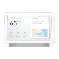
That’s why it wasn’t much of a surprise when Google announced the Home Hub — its very own spin on the smart display. What was surprising, was how different it was from all the other Google-powered smart displays so far. The Home Hub is small, clad in a fabric finish, and (perhaps its most intriguing “feature”) doesn’t have a camera. It all adds up to a refreshing take on the smart display that makes it a good fit for nearly every room in your home.
Gallery: Google Home Hub review
Pros
- No camera
- Beautiful display
- Simple minimalist design
- Affordable compared to the competition
Cons
- Might be too small for some
- Sound quality is just OK
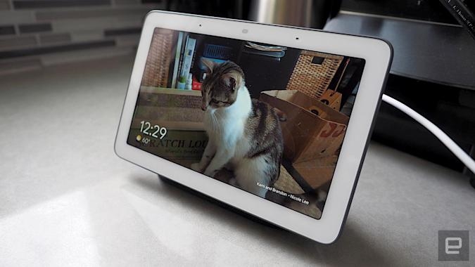
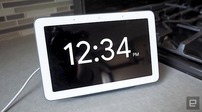
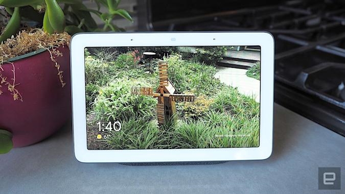
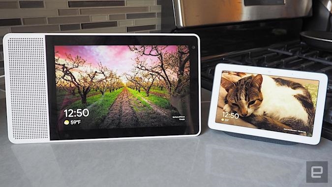
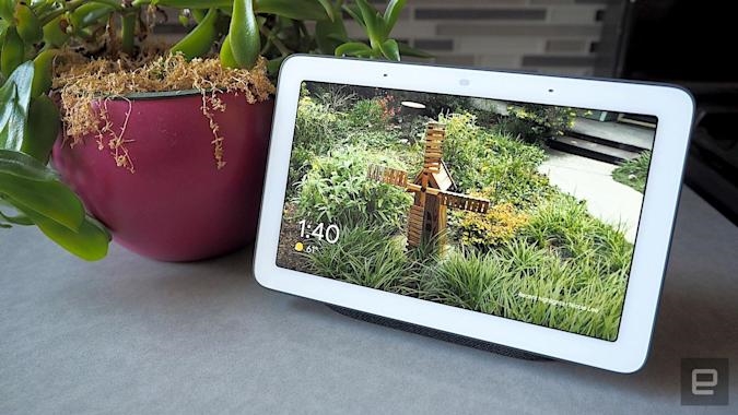
There’s no getting around it: The Home Hub is small. Compared with the 10-inch Google-powered displays that came before it, the 7-inch screen looks positively tiny. The Home Hub looks like a phablet on a stand, so much so that a colleague wondered if the display could be detached and used like a tablet (it can’t).
At first, I was disappointed by how small it was. For a screen-centric device like a smart display, this seemed wrong. Why wouldn’t you want a big, beautiful display to watch your favorite YouTube clips or view photos of friends and family on? A huge selling point of a smart display is its visual interface, so you can look at album art while the song is playing or check out directions on Google Maps. Surely a bigger display makes more sense?
I soon realized, however, that the smaller display wasn’t necessarily a negative. I tend to test smart displays in the kitchen, where I use them almost like a second TV. I yell out commands from across the room and can see the results from several feet away. For larger screens like the Lenovo Smart Display or Amazon’s Echo Show, that makes sense.
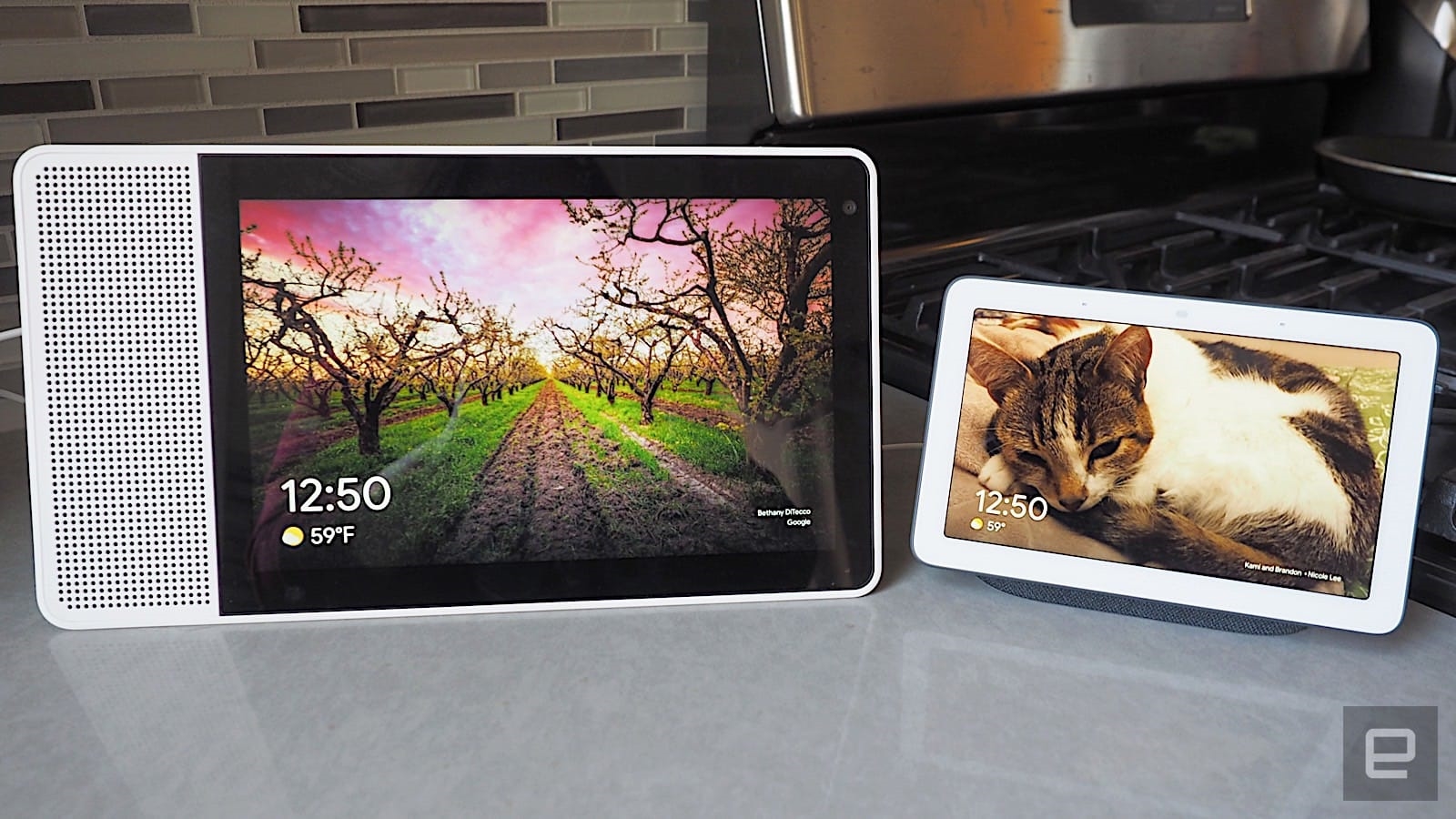
Not for the Home Hub. Due to its size, I’m forced to be a lot closer if I want to interact with it. This reminded me of Amazon’s Echo Spot, a device primarily for the bedroom or office. It was then that it clicked: The Home Hub is designed to be a more personal smart display. It should be used up close.
The Echo Spot struck this note because it looked like a cute alarm clock; the Home Hub looks more like a digital photo frame. Both are devices you’d normally keep on a nightstand or a side table. The Home Hub’s rectangular screen actually means it’s versatile enough to fit in the living room, the office and the kitchen. It looks at home on both a large desk or a skinny dresser.
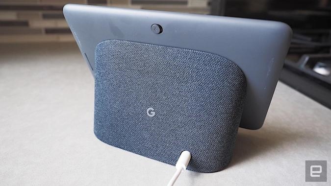
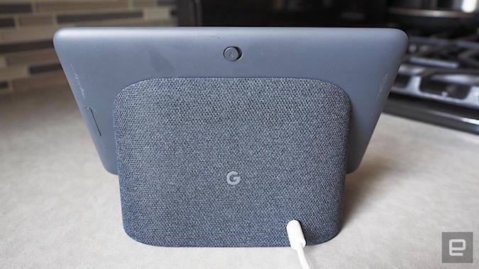
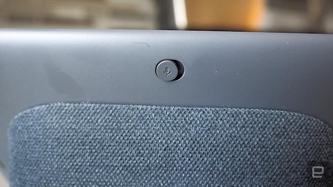
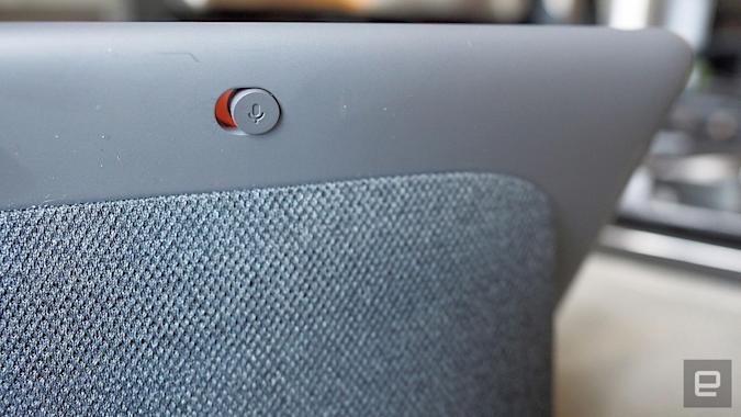
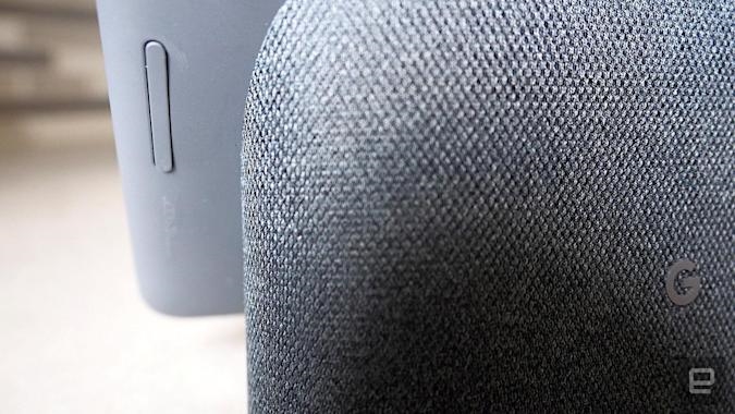
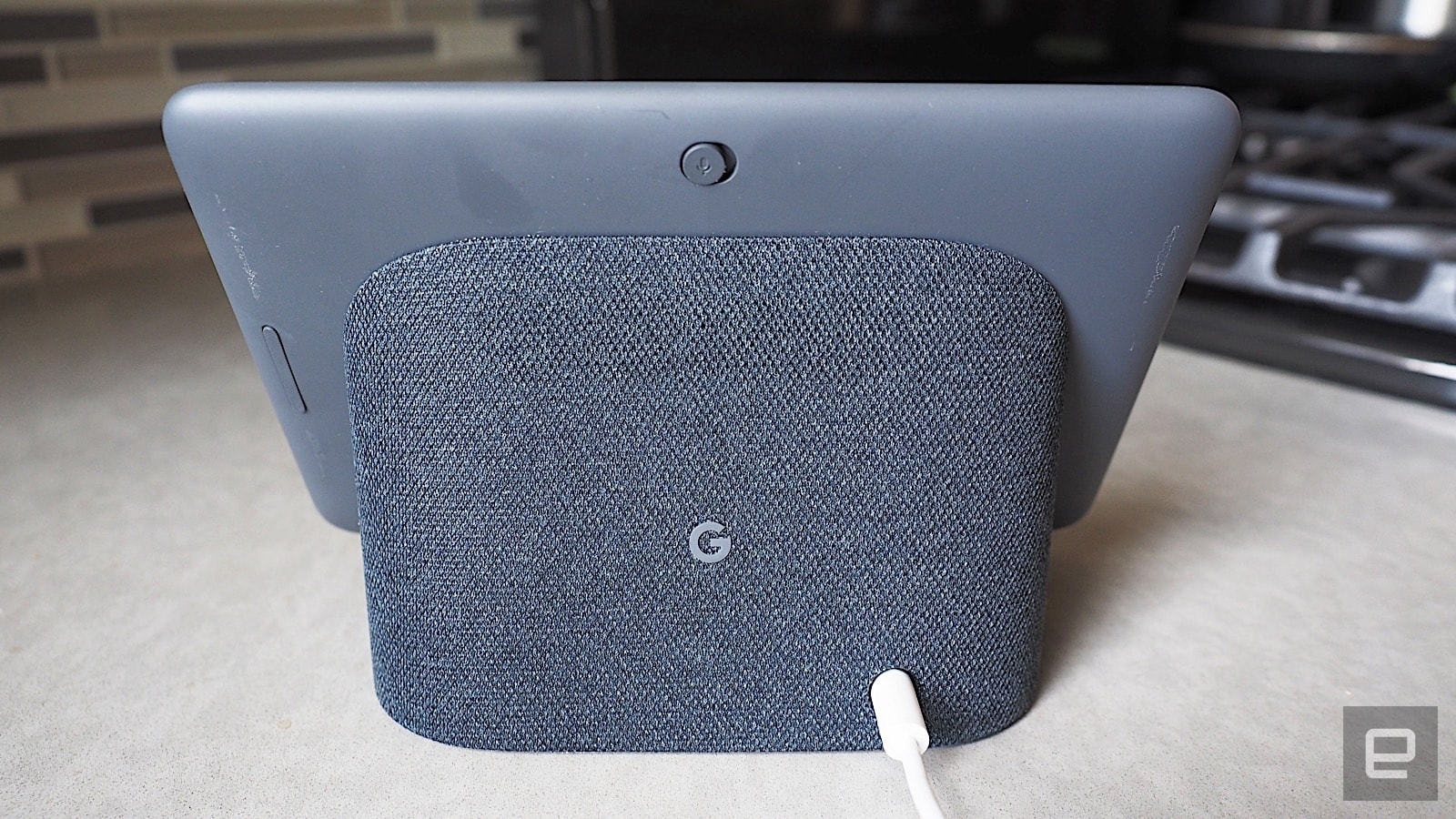
Then there’s Home Hub’s no-frills design. On the back, you’ll find a microphone-mute toggle and a volume rocker. Like Google’s Home and Home Mini, the Home Hub is clad in soft fabric, available in four colors: chalk (light gray), charcoal (dark gray), sand (pink) and aqua (minty blue). These colors give it a minimal, friendly look rather than a generic, boxy gadget feel. Unlike other Google-powered smart displays, the Home Hub doesn’t stand out, and that’s because it’s designed not to. It’s all part of the Google Home design philosophy, where the devices are made to blend into your existing furniture.
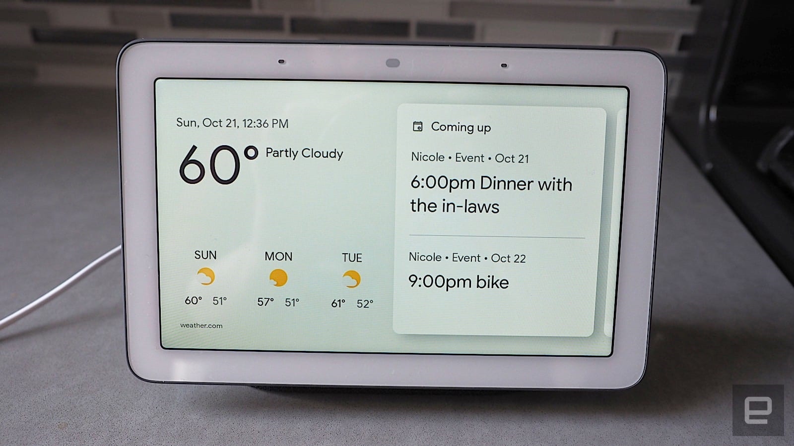
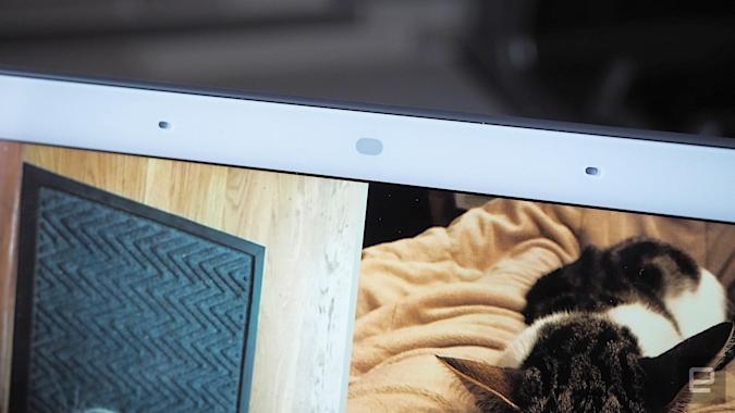
What really makes the Home Hub feel more personal is that it doesn’t have a camera. One of the most common criticisms of Amazon’s Echo Spot is that even though it looks and feels like an alarm clock, having a camera by your bedside feels intrusive. That’s how my husband felt when I was testing the Echo Spot last year, and we ended up kicking it out of the room after just a week.
Sure, I can toggle the camera off with a physical switch, but that mutes the device’s microphone too, which negates its purpose. I could say, “Alexa, turn the camera off” which disables only the camera, but it’s pain having to say that each time. Additionally, that lens is still technically exposed even if the camera is off, which is still unsettling if you’re paranoid or privacy-conscious.
Of course, you could put tape over the camera, but then why not opt for a device that doesn’t have a camera at all? That’s exactly why Google decided not to include one in the Home Hub, and for me (and my husband), that made us more comfortable having one in the bedroom. If we had kids, we’d probably feel better about having one in their room, too. I’d even consider putting the Home Hub in the bathroom, though that’s probably not wise since it’s not water-resistant.

So, what is that at the top of the display if it isn’t a camera? Well, that’s a light sensor that works with a feature called Ambient EQ, which automatically detects the lighting and color condition of the room and adjusts the screen to match. This was especially helpful when I used the Home Hub next to my bed, as the display dims when the light is out. I should note that Ambient EQ applies only when the Home Hub is in Ambient mode (i.e. when it’s on standby). When I watched videos on YouTube, for example, it reverted to normal brightness.
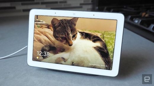
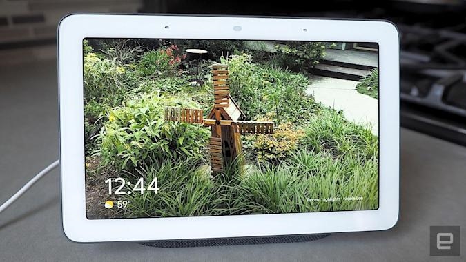
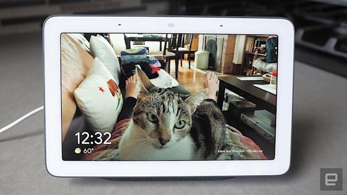
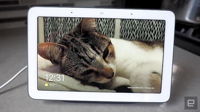
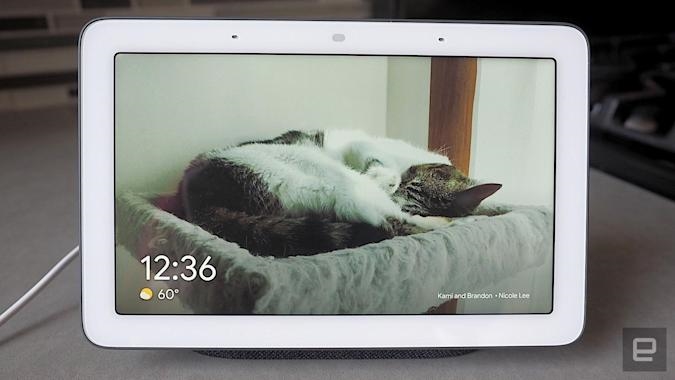
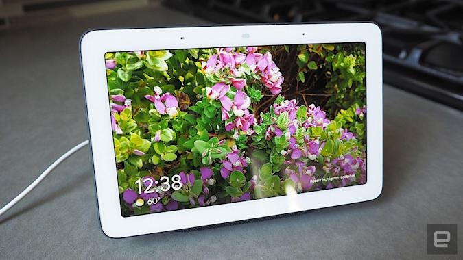
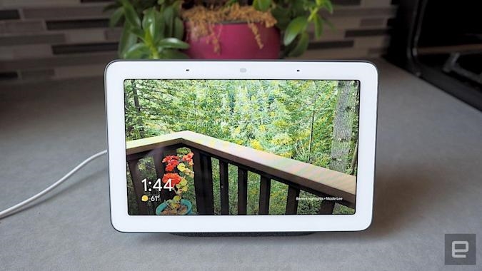
When the lights are on, however, it doesn’t hurt that the Home Hub’s display is easy on the eyes. Photos look crisp and colorful at almost any angle. Plus, this little display made my highly unprofessional iPhone photos look good. Seeing as one of the Home Hub’s main functions is to double as a digital photo frame, this is a real bonus.
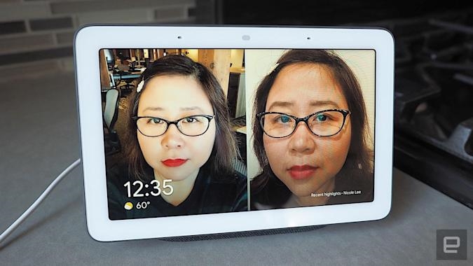
Just as with other Google-powered smart displays, you can have your personal snaps show up on the Home Hub if you store them on Google Photos. I could say things like “Show me all the photos from Hawaii” to see a gallery of shots I took from a recent vacation. What I really liked, however, was a new feature called Live Albums, which automatically compiles photos of your friends and family.
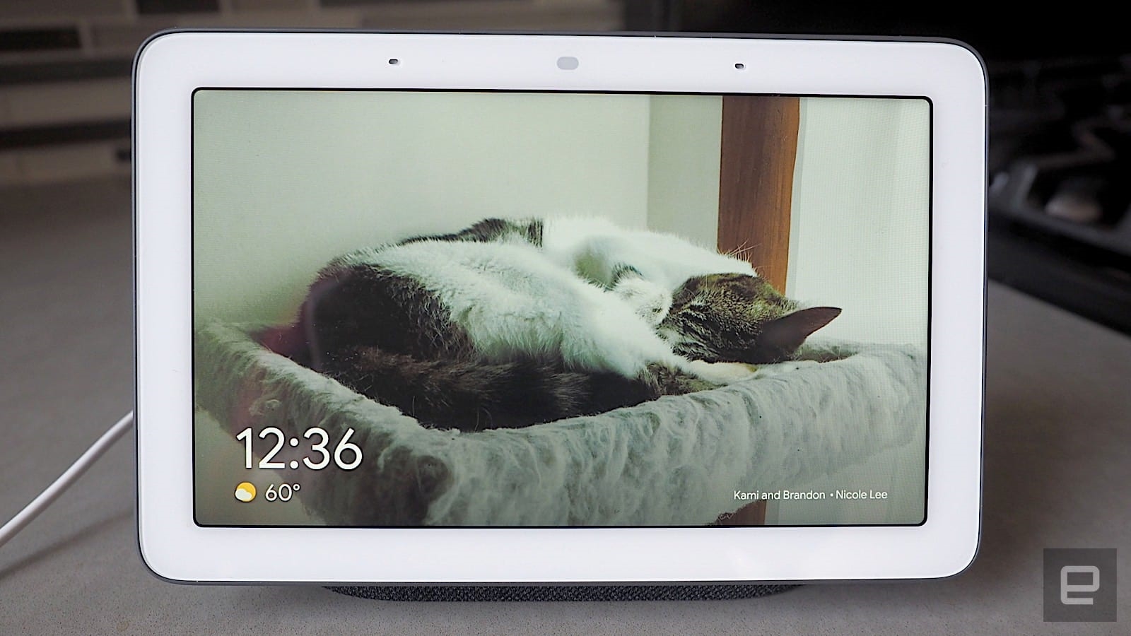
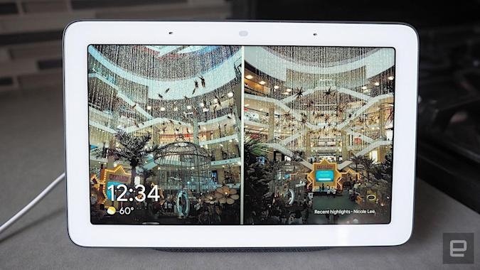
To use Live Albums, I just picked my favorite people and pets, and Google’s machine-learning algorithms pulled all the photos of them into a single album. Since it’s a “live” album, any new photos I take of them automatically show up on the Home Hub, too.
According to Google, the algorithm is smart enough to weed out embarrassing shots and duplicate photos, so you’re almost guaranteed to have the best selfies and group pics show up. Live Albums will even put certain photos in a side-by-side mode, especially if they are vertical shots of the same subject. The feature isn’t exclusive to the Home Hub, but it is the first Google smart display to get it.
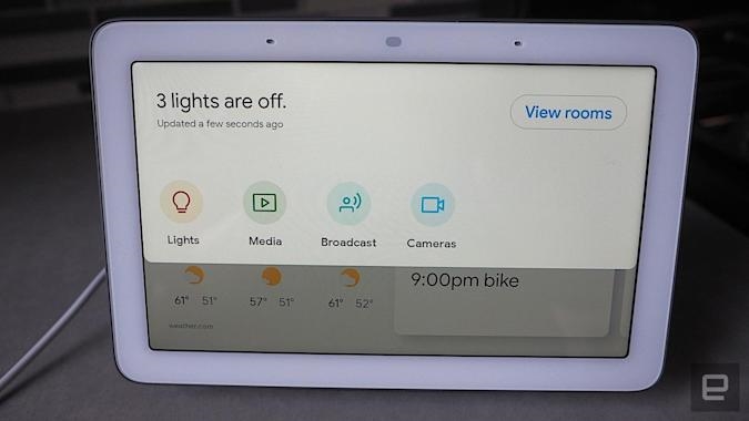
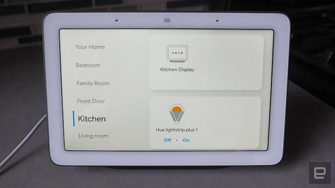
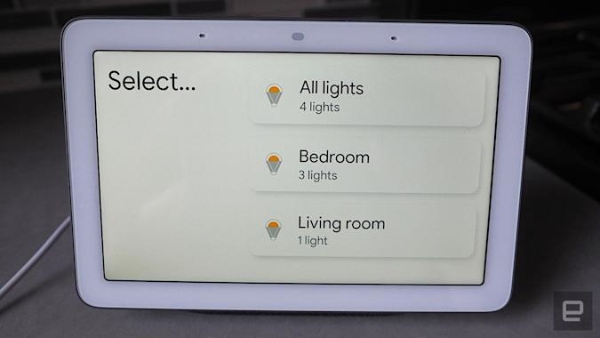
There are a couple of other new smart-display features here, too. One is Home View, which displays all your different smart devices room-by-room or device-by-device; just swipe down from the Hub’s screen and you’ll see a dashboard with all of your smart home gadgets that you can then sort by room. With just a couple of taps, I could turn off all my Philips Hue lights, broadcast to other Google Home speakers in the house or control what’s playing on the Chromecast. Again, Home View isn’t exclusive to the Home Hub, it’s just making its debut here.
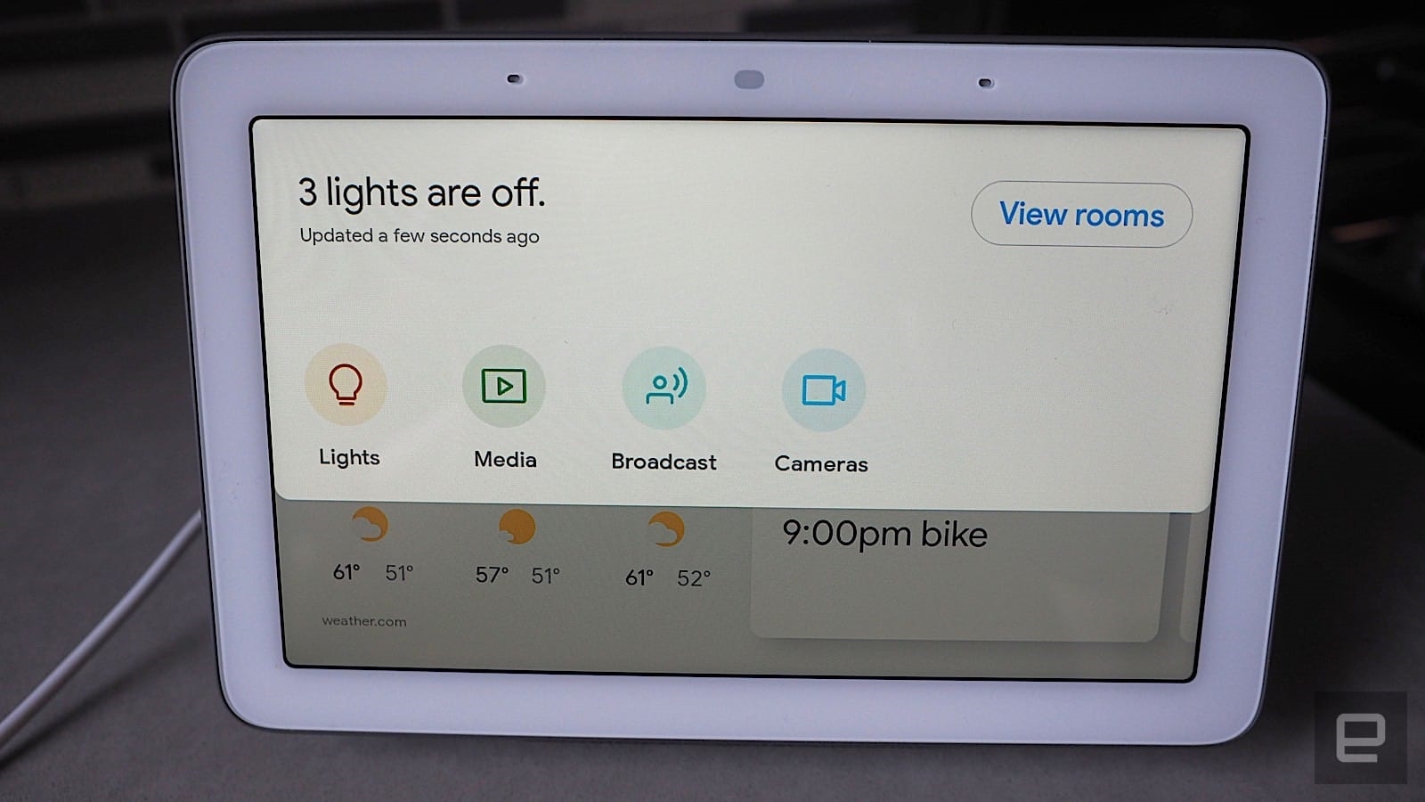
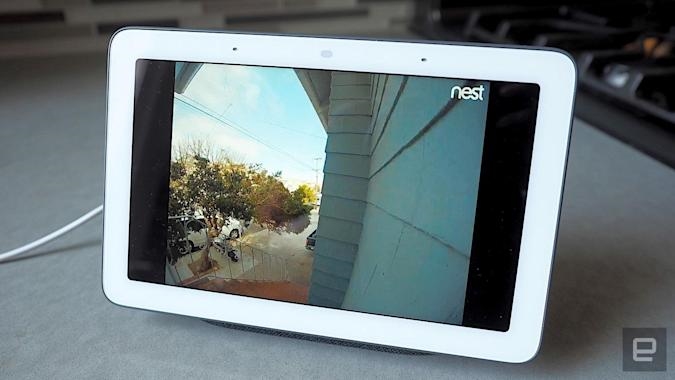
Naturally, like other Google-powered smart displays, the Home Hub works seamlessly with Nest products. Commands like “Show me the front door” will show who rang my Nest Hello, for example. This worked for the most part, but I did encounter some quirks.
Because I’ve had other Google smart displays in the house before, the Home Hub initially responded to my query with something like “I’m sorry, but I don’t know which display to show the front door on.” Occasionally, I’d even just get the aforementioned Home View screen instead of the Nest camera. I fixed the issue by unlinking the other devices and factory-resetting the Home Hub (which you can do by holding down the volume buttons on the back). Google tells me I was the only person to have reported this so far, but it’s something to keep in mind.
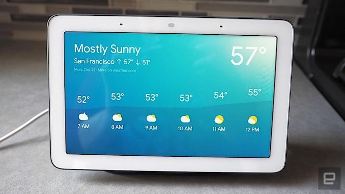
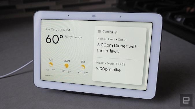
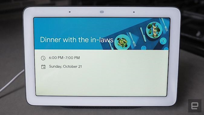
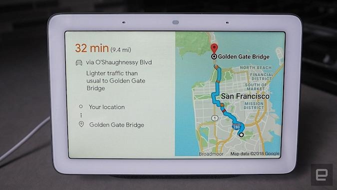
The rest of the Home Hub’s features are the same as we’ve seen on other Google-powered smart displays. It works well with all Google’s apps and services, so once I synced my Google account, the Home Hub pulled in all my calendar appointments. Because I also have my work and home address entered in Google Maps, it can even tell me the most efficient route to get to the office each morning. Plus, whenever I ask for directions, they’re automatically sent to my phone.
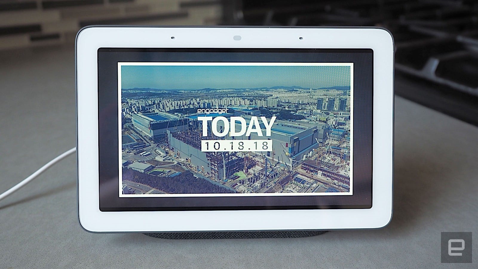
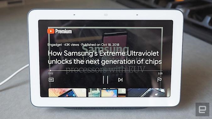
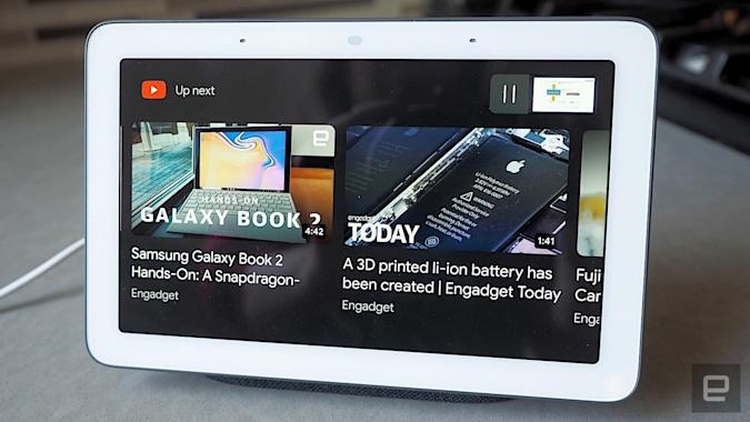
One of my favorite features on Google smart displays is YouTube and YouTube TV, and that’s no different here. I love watching my favorite YouTube channels as I get ready in the morning or to catch up on the latest sports news via ESPN when I’m upstairs. In the evenings, I’ve used YouTube Music to play me relaxing tunes to help me sleep, which has been surprisingly effective. Sure, the display is small and the sound isn’t mind-blowing (I’ll get to that later), but for short videos, the Home Hub works fine.
Still, as with the other Google-powered smart displays, don’t expect the full YouTube experience — you still can’t access subscriptions and playlists. Instead, I had to be very specific with my commands, like “Play Engadget on YouTube.” Similarly, I couldn’t look up a YouTube TV channel listing on the Home Hub; I have to request a specific channel like ESPN or BBC America. Seeing as YouTube is a Google property, I expected more functionality here.
Ah, but there is a workaround. I found I could actually cast whatever’s on my phone or computer to the Home Hub using Google Cast. Of course, it’s a little redundant — if I already have my phone or computer on me, why would I then cast that video to the Home Hub? — but it’s an option if you want it.
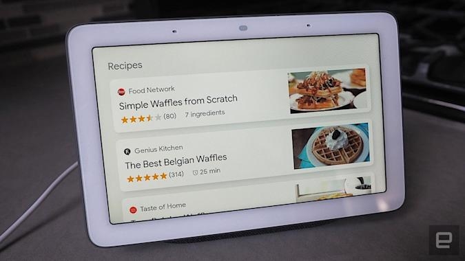
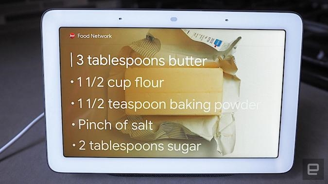
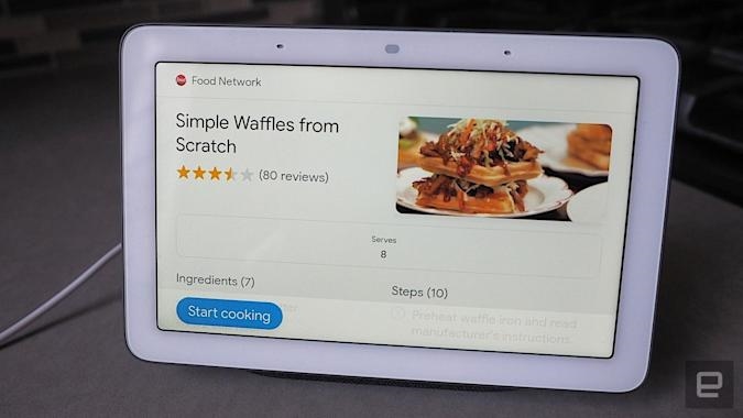
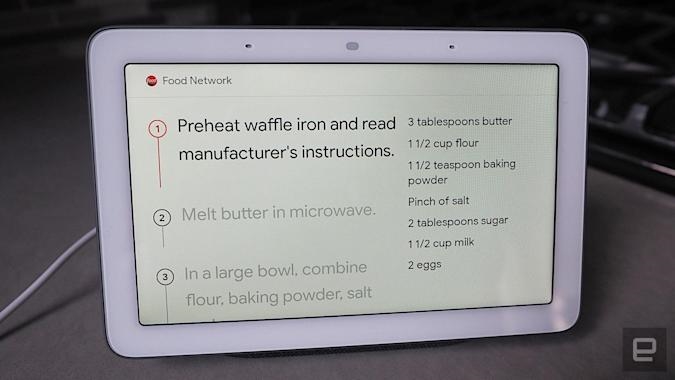
Another Google smart display favorite of mine are step-by-step cooking guides, which I fell in love with on the Lenovo Smart Display. The Home Hub has this feature too, but I’ll admit that I mostly used the Home Hub in the bedroom, not the kitchen. I actually prefer the Lenovo Smart Display for kitchen use, simply due to the larger screen. But if you have limited counter space, then the smaller Home Hub might make more sense.
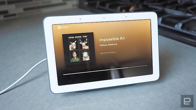
As for audio quality? The Home Hub is decent for its size. Don’t expect thumpy bass or a full, smooth sound, but overall, the audio is punchy. At max volume, the Home Hub is positively deafening, and you’ll have no problems hearing it from across the room. I found that while the Home Hub isn’t great for listening to music, it’s excellent for podcasts and audiobooks, thanks to loud, crisp vocals.
On the whole, Google’s Home Hub was a bit of a revelation. Due to its size, I didn’t expect to like it as much as I did. But its unassuming form factor worked its way into my heart. It’s also priced affordably at $150, which is nearly $100 less than other Google-powered smart displays and about $80 or so less than Amazon’s Echo Show. It is a bit pricier than the $130 Echo Spot, but the Home Hub offers a bigger, better screen, has built-in YouTube and, let’s remember, doesn’t have a camera — which is a bigger deal than you might think.
If you want a larger screen for a communal space, go for the 10-inch Lenovo Smart Display. If you want one with deep bass and great sound, opt for the JBL Link View. But if you want a Google-powered smart display that can fit in nearly anywhere, especially in private spaces, the Home Hub is a perfect choice.
(16)

