For the past couple of days, the smart display in my kitchen has been missing its screen.
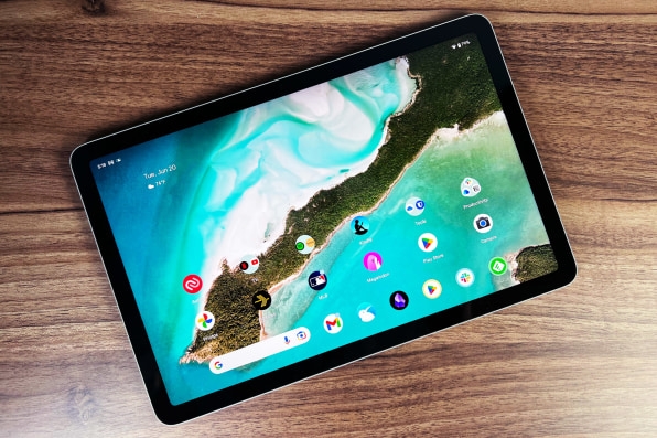
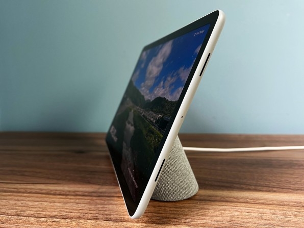
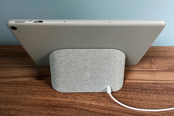
That would be the Pixel Tablet, Google’s new $499 tablet that comes with a magnetic speaker dock. Snap the two parts together, and you essentially have a smart display akin to Google’s Nest Hub Max, able to show personal photos and respond to “Hey Google” voice commands. Pull them apart, and you’ve got an 11-inch tablet running the latest version of Android.
It’s a clever concept, aimed at making tablets more useful even when you’re not using them. But after spending a week reviewing the Pixel Tablet, I have doubts about how well it works in practice. By combining the functions of two different devices, Google has created some new problems, one of which is that I keep forgetting to put the tablet back in its dock again.
Smart display trade-offs
Don’t get me wrong: I appreciate smart displays in general and Google ones in particular. I was an early adopter of the Lenovo Smart Display when it launched in 2018 and evangelized it to other folks as a way to bring Google Photos straight to the kitchen counter. That device is still a fixture in our household and is a big reason why I’ve stuck with Google Photos even after the company cut off unlimited storage.
The Pixel Tablet has the same basic photo frame features as those earlier smart displays. With Google Photos, you can create always-updating albums with pictures of specific people, and the tablet will cycle through those photos when it’s docked and locked.
But compared to dedicated smart displays, the Pixel Tablet makes too many compromises. You can’t tap on the screen to quickly share a photo or view more pictures from the date that’s being shown, and saying “Hey Google, show me more from this day” doesn’t work.

Even worse: The Pixel Tablet fails at photo searches. Saying “Hey Google, show me pictures of Dad” brought up stock photos of dads. Saying “Hey Google, show me pictures of Dad in Google Photos” prompted me to unlock the tablet with a fingerprint, then showed pictures of me and my kids instead of my father, who’s labeled as “Dad” in Google Photos. The Lenovo Smart Display handles these kinds of searches without issue.
The Pixel Tablet is also missing some other smart display features, such as quick access to an alarm menu and the dashboard that shows thermostat controls, the weather, and upcoming calendar appointments. Aside from photos, the only other feature that works in smart display mode is a panel of smart home controls via Google Home. There isn’t even a way to adjust screen brightness in docked mode independently of tablet mode, and to my eye the screen was always too dim while docked.
Granted, you can always unlock the Pixel Tablet to use Android’s weather and calendar apps, but that’s more complicated than just swiping over to those functions on a smart display. In bolting on the full Android OS, some of the smart display’s simplicity has been lost.
Detachment issues
Even if Google improves the Pixel Tablet’s smart display features, combining these two device types has some inherent problems.
In my case, I kept bringing the Pixel Tablet up to the bedroom to watch Netflix before bed. In the morning, I’d inevitably forget to bring the tablet back downstairs again, and would be greeted by an empty dock in the kitchen. Perhaps this is my fault, but it’s not something I’ve had to think about with a regular smart display.

The dock, by the way, is worthless without an attached Pixel Tablet. It doesn’t respond to Google Assistant voice commands like a smart speaker, and you can’t cast audio to it from the Pixel Tablet or any other device. Unless you make a habit of re-docking the tablet, you might still want another speaker or smart display in the same space as a backup.
Smart docking stations aren’t a new idea. Google has long offered a picture frame mode for Android phones, and Apple is dabbling in smart display features for the iPhone with Standby in iOS 17. Still, the concept works better as a nice-to-have feature for phones, which you’re likely to carry around everywhere, than with tablets, which you’re going to leave all over the place.
Refined tablet chops
Purely as a tablet, at least, the Pixel Tablet is fine. The 10.9-inch, 2560×1600 resolution display is sharp and bright, though the 16:10 aspect ratio feels cumbersome in portrait mode. The aluminum chassis is cool to the touch, but looks a bit like plastic and lacks the visual flare of Google’s Pixel phones.
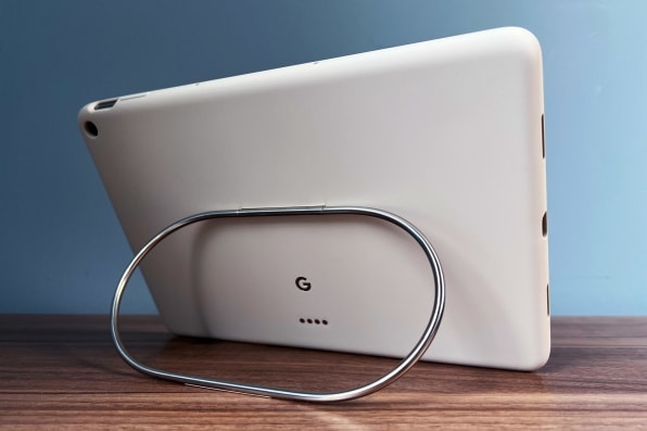
Meanwhile, Google’s $79 Pixel Tablet case includes a kickstand in the form of a sturdy metallic ring, but the lack of a keyboard case—perhaps one that uses the same connector as the speaker dock—is a missed opportunity. Google’s done a lot of work over the last year to make Android more tablet-friendly, with new features like drag-and-drop and easier access to split-screen mode, but you’ll need to bring your own Bluetooth keyboard (and maybe a mouse) to use the Pixel Tablet like a laptop.

App makers still aren’t fully on board, either. The MLB app, for instance, opens in portrait mode even when the tablet is held lengthwise, and Slack lacks the persistent sidebar you get with its iPad app. While many of my go-to apps did make full use of the tablet screen, it’s a nuisance running into apps that don’t.
Gotta keep ’em separated
Does the tablet experience alone add up to more value than a $449 iPad or $330 Samsung Tab A8? Perhaps, for Google enthusiasts who want a pure Pixel experience running the latest software. At the very least, it’s nice to have more competition and some fresh ideas in the tablet space.

But if your main reason for considering the Pixel Tablet is the speaker dock, you’re better off buying a standalone smart display, then choosing whatever tablet you want.
(18)