GoPro’s Guide To Great UX
For the GoPro UX design team, understanding how software and hardware intersect is the key to a product’s success.
Clair Byrd: As UX designers, do you ever work closely with GoPro’s hardware team?
Hilary Nemer: The hardware and software teams at GoPro have unified design principles that we all strive toward. We collaborate as much as we can for the sake of consistency—and for a seamless high-quality experience between the camera, phone, and desktop for our customer.
David Lee: For example, we recently introduced a new feature on the Hero4 camera that lets people add a “HiLight” tag to certain parts of a video. So the user needs to be able to access those HiLights on the software side and the customer experience needs to be consistent on both the hardware and software.

Are the differing design processes between hardware and software challenging?
HN: Naturally, it’s much easier to be iterative within software. With the design of the actual camera, you can’t just change things once it’s launched—once it’s out there, it’s out there, with or without feature issues. But we have flexibility to change the UI of the camera by making firmware updates from the software side. We’re learning how to best work together to meet each other’s processes and schedules.
What’s the design culture like?
HN: One of our biggest values is to fail fast: design something, test it, learn, iterate, and repeat.
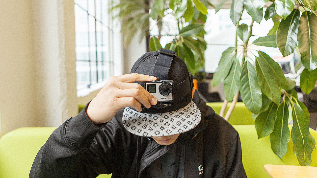
DL: What differentiates us as designers and as a company is that the staff use GoPro cameras on a daily basis. Most of our inspiration comes from there. Even better, it helps us bond with each other and increases team chemistry.
What’s a day in the life of a GoPro designer like?
HN: Wireframing, researching, testing—for the most part, it’s probably pretty typical for any other product designer in Silicon Valley. But one of the more unique things is “Live It, Love It, Eat It”—a company-wide program that especially helps the design team. Nick Woodman, our CEO, wanted the company to live the brand and have the time to use the product so that we’re able to improve it. He instilled a mandatory two-hour break every Thursday for employees to go out and use their GoPro.
DL: So now, every Thursday from 1 p.m. to 3 p.m., we can do whatever we want so long as we capture it with our camera.
We often visit the design team in San Diego. They do things a little differently since they’re close to the beach—I’ve seen designers take time during the day to clear their minds by going out and surfing with their cameras, then going back to work.
HN: The most powerful part of our process is that we get to become our own users, so we understand pain points. We deal with the same things our users deal with, and then we get to help solve those problems. We get company-wide input as well.

What are the most important values reflected in designs at GoPro?
DL: It all depends on the area of the product we’re working on. For example, we have a channel where you can watch GoPro videos—we want to give viewers a high-definition experience. But when someone’s editing a video, speed and simplicity are more important than how pretty or HD it looks.
HN: As a young team, we’re still defining our values. But the most important thing for us right now is supporting the lifestyle of our users by making the process as easy as possible. People shouldn’t have to take time out of their lifestyle to do what they want with their content.

How do you continue to innovate the “be a hero” story?
DL: Many design teams focus on how the company can tell its story, but we want to make sure our users can tell their story. Focusing on that lets us be innovative and create features like time lapse or burst mode.
HN: One of our major company-wide principles is “No half-assery.” We’re not just creating something that’s already out there. We take it seriously and want the experience to be the best it can be—that’s what’ll set it apart.
What advice do you have for new designers?
HN: Have empathy. Know and feel the pain points of your users, then solve those. You can build something that looks really cool, but if it’s not something the user needs, you aren’t going to be successful.
DL: When a lot of people get into design, they focus on what they’re going to build and how they’re going to build it. That’s important—it’s good to have a well-rounded toolkit. But just as importantly, you should focus on why you’re building it. Once you’ve figured out why you’re designing something, the “how” comes easily.
Just look at GoPro: it all started with a guy who wanted a way to share his own unique experience of being out in the middle of the ocean, riding an incredible wave. So he cobbled together a prototype, slapped it on his wrist, and the images he captured opened up a totally new perspective for millions of people.
[All Photos: courtesy GoPro]
(115)


