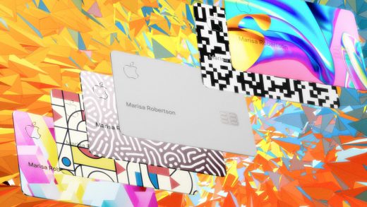
Here’s how Apple Card users are customizing their plain white credit cards
Apple’s new credit card, the Apple Card, is little more than a thin layer of titanium coated with a layer of white finish, laser-etched with the Apple logo and your name so they glimmer. It’s a very Apple credit card: a perfectly minimal example of the pared-back aesthetic that has made Apple’s industrial design so widely sought after.
But it appears that, after more than a decade of pushing less is more, some consumers are pushing back.
Earlier this week, a man named Lukas loaded his Apple Card into a watch cleaning machine that scrubbed away the white coating to reveal the brushed titanium base. He “just wanted to differentiate it,” he told 9to5Mac. Then, as The Verge reported, the CNC-enthusiast Nick Wiegand, aka Run CNC, got in on the fun. As Wiegand showed on his Instagram account, he loaded his card into one of these computer-controlled cutting machines to customize the white finish with the filigree you’d find on the back of a 19th-century-era Bicycle playing card.
When I asked Wiegand why he took on the project, he said, “I saw the blank card as a canvas waiting to be customized.” He also pointed out a subtle design flaw with a perfectly white credit card: “The standard issue card is striking that it is so plain, and I received lots of comments from cashiers and severs about it,” he says. “However, I noticed on a few occasions that it blended in with the receipts when trying to pay for dinner. This meant that the server couldn’t see it, and everyone was left waiting for me to pay, including me.”
It’s just two people so far, but these Apple Card modification projects hint at a larger trend. Apple has been pushing its language of minimalism for almost 20 years now. Around the year 2000, its products shifted from the quirky, curvy, and colorful, 1990s-era iMac aesthetic to the sleek, metallic, white-and-black design language that’s synonymous with Apple today. Take a look at the Powerbook G4 (2001) and you can see the outline of today’s Macbook Pro.
Apple pushed the boundaries of industrial design for electronics, introducing the widespread use of materials like aluminum and glass. Using inspiration from classic, Dieter Rams designs, it found a way to introduce these complicated devices as gorgeous, simple-looking machines. The Apple Card is part of this decades-old design heritage.
Of course countless people buy crystal-encrusted iPhone cases already, and people put stickers on their Macbooks all the time. But these custom Apple Card projects permanently alter Apple’s design—and seem to suggest some crafty consumers are hungry for something new. Could the Apple Card be the canary in the coal mine for Apple’s design language? On the one hand, Apple’s industrial design is now classic—a brand unto itself. But it’s also now nearly two decades old, and consumers are fickle. (Imagine if, by comparison, Toyota was still designing vehicles it that looked like the 2000 Corolla in 2019.)
Both Apple and Braun were wildly successful at developing design languages that resonated with consumers, and both owe their heritage to the function-focused Bauhaus. But consumers’ hunger for minimalism may be waning. And mass customization is a trend that’s blowing up across product design right now. If Apple waits long enough to change, it seems like its customers might create the company’s next look for it.
(96)


