Hey Apple, you could learn a lot from Google’s tools to fight digital distraction
Some of my worst smartphone habits occur between the hours of 6 p.m. and 8:30 p.m. That’s supposed to be family time for playing with the kids, having dinner, and putting them to bed. But it’s all too easy to be distracted by some urgent-sounding email or a direct message in Slack.
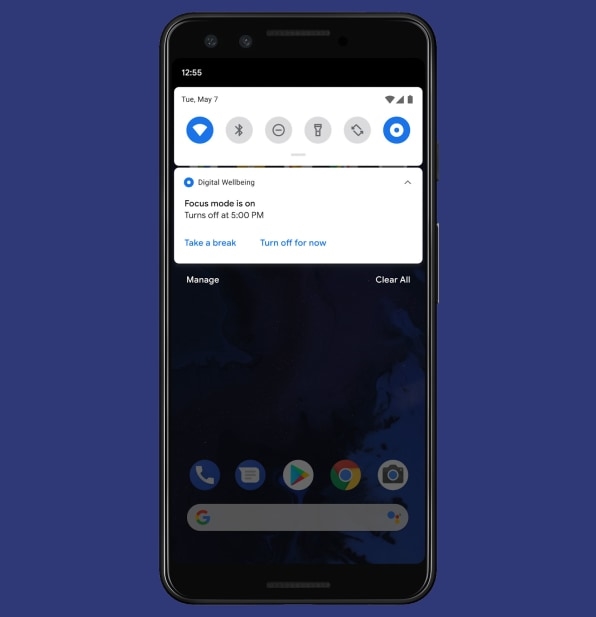
So when Google launched a new feature for Android phones called “Focus Mode” earlier this week, I knew exactly how I’d use it. By scheduling Focus Mode for those evening hours, I have now stopped myself from using Gmail, Slack, and Twitter without significant friction. Notifications from those apps won’t even show up on my phone until after the kids’ bedtimes.
The launch of Focus Mode highlights a subtle but important difference in how Google and Apple have approached the issue of digital distraction so far: While Apple’s Screen Time tools tend to be heavy-handed, Google has realized that it needs to allow for granularity and nuance. Otherwise, people may get frustrated and avoid using the tools at all.
How Focus Mode works
When Google launched its first “Digital Wellbeing” tools on Pixel phones last year, it took a more prescriptive approach to curbing screen time. You could monitor usage habits and set time limits on individual apps, but to use an app for more time on a particular day, you had to disable the limits entirely. Google’s time limits also didn’t reduce the flow of notifications from distracting apps, which are often what draw us back into our phones to begin with.
Maggie Stanphill, Google’s director of user experience for Digital Wellbeing, says the company has since realized it needs to offer more granularity.
“What we found is that if we made too many assumptions, it was not the useful experience people were hoping for, and they might indeed abandon [the tools],” she says. “We wanted to make sure they had a lot of agency.”

Focus Mode is Google’s attempt at offering more granular tools. Instead of making users race against a daily clock with their app usage, it recognizes that unhealthy screen time has more to do with context, hence the ability to schedule or toggle Focus Mode as needed.
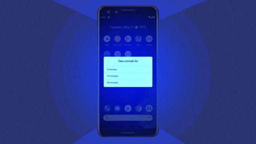
Users can also “take a break” from Focus mode in 5-minute, 15-minute, or 30-minute increments, with the option to end those breaks early. While this might seem to defeat the purpose, in practice it recognizes that people need to make exceptions without disabling Screen Time tools outright. Besides, Focus Mode doesn’t show notifications from distracting apps while it’s active, so any decision to use those apps becomes more intentional.
Looking ahead, Google will likely build more tools around scheduling to reduce the amount of digital distraction we deal with in the first place. As an example, Stanphill points to Gmail’s Schedule Send feature that launched earlier this year and the out-of-office statuses that work colleagues can share in Google Calendar. It’s not hard to imagine Google tying these kinds of scheduling features together in the future, so that users can automatically activate Focus Mode through their calendars or schedule messages to send outside of their colleagues’ downtimes.
“If a user shows some preference for being offline at certain times of days, using the way they set their calendar, might we take some of those user-indicated preferences and build them into the intelligence of these products?” Stanphill says. “It’s something we’re exploring.”
How Apple’s Screen Time tools compare
On the iPhone and iPad, the closest equivalent to Focus Mode is a feature called Downtime. But instead of letting users create a blacklist of distracting apps, Downtime uses a white list that blocks everything except phone calls by default.
This approach seems too heavy-handed to me, because the biggest problems usually come from just a handful of apps. Having to enable dozens of others to work during Downtime is a hassle.
Apple doesn’t allow for as much flexibility in when Downtime occurs, either. If you set up Downtime to run on a schedule, you can’t manually toggle it on at additional times. And while Apple does allow users to ignore its app usage limits (in 1-minute, 15-minute, or full-day increments), you can’t immediately cancel those overrides when you’re finished using an app. Even the way Apple phrases its ability to circumvent Downtime (“Ignore Limit”) seems more discouraging than Google’s (“Take a Break”). Rather than suggesting that you’ve already given up the fight, it recognizes that sometimes you do need to use your phone, and that’s okay.
Google has also shown more willingness to tinker with ways to reduce distraction. In October, the company released a series of “Digital Wellbeing Experiments” that included some minimalist home screens, an app that withholds notifications until specific times, and a wallpaper that counts how many times you’ve unlocked your phone. Stanphill says the goal was to encourage app makers to build their own anti-distraction tools, and the company has seen developers work with Google’s ideas through hackathons. (I’m still using Google’s Desert Island experiment as my home screen.)
I don’t think Apple is being nefarious here. If anything, its hardware- and subscription-based business models are more aligned with reducing screen time than Google’s ad-based model, which depends on engagement.
Still, Apple has always been more prescriptive in terms of deciding what it thinks works best for users. In many cases, that approach of simplicity over granularity works well. But as Google has discovered over the last year, countering digital distraction is an area in which one size does not fit all.
Fast Company , Read Full Story
(45)


