With its giant phones and tiny laptops, it makes less and less sense that Apple’s OS X and iOS operating systems are completely separate platforms. Even if one has a touch screen and the other does not, should the design language between the two really be so different?
Apple certainly doesn’t think so. In the past, we’ve seen Apple bring iOS-like features such as Launchpad, Notification Center, to OS X, along with unifying apps such as Mail, Calendar, Messages, and Apps between the two platforms. And during (June 12, 2015)’s WWDC Keynote, Apple announced new versions of OS X and iOS that teased even more new features that will bring the two operating systems closer than ever before.
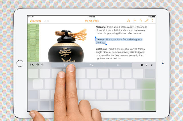
An On-Screen Keyboard With A Trackpad-Like Controls
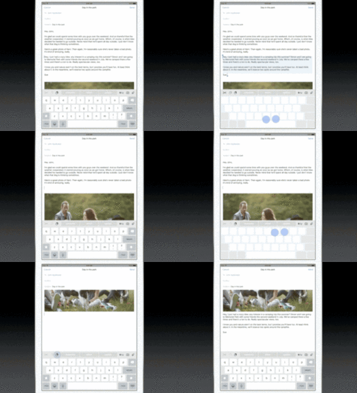
In iOS 9, Apple is adding some gesture controls to its keyboard. It’ll work just like your old iPad and iPhone keyboard that you know, except with one big difference: hold down two fingers anywhere on the keyboard, and it turns into a virtual trackpad that lets you control the cursor.
Apple showed off how handy this control would be for highlighting text in a document, and it’s easy to imagine the utility of this gesture in any other experience a developer might want to translate 1:1 from a laptop app to a mobile app.

Full-Screen Apps
iOS apps run full screen. They always have because, let’s face it, would you want to see eight apps open on your iPhone’s screen? But by default, OS X apps run in self-contained windows by default—just like papers you have shuffled and stacked on a “desktop.” Of course it’s possible to run full-screen apps in OS X, but it’s never been emphasized in quite the same way as iOS.
Through a couple of UI tricks, OS X “El Capitan” offers users more incentive to take their apps full screen. Most notably, a three-finger swipe will allow users to zoom out of a full-screen app, see everything they have open, and zoom into another app.
Microsoft’s Windows 8 tried to unify the desktop and mobile through full-screen apps. It failed horribly, because, if you’ve ever used Windows 8 on a desktop, you realize that you feel sort of claustrophobic trapped inside an app. With El Capitan, Apple isn’t forcing you to use fullscreen apps, but it’s offering a convenient temptation to use a desktop more like a phone or tablet.
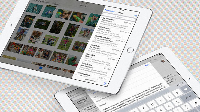
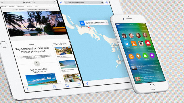
A Split-Screen Mode Across The Board
On top of the full-screen support, both iOS and OS X are getting a split-screen mode. That means users will be able to pull up two apps, side-by-side.
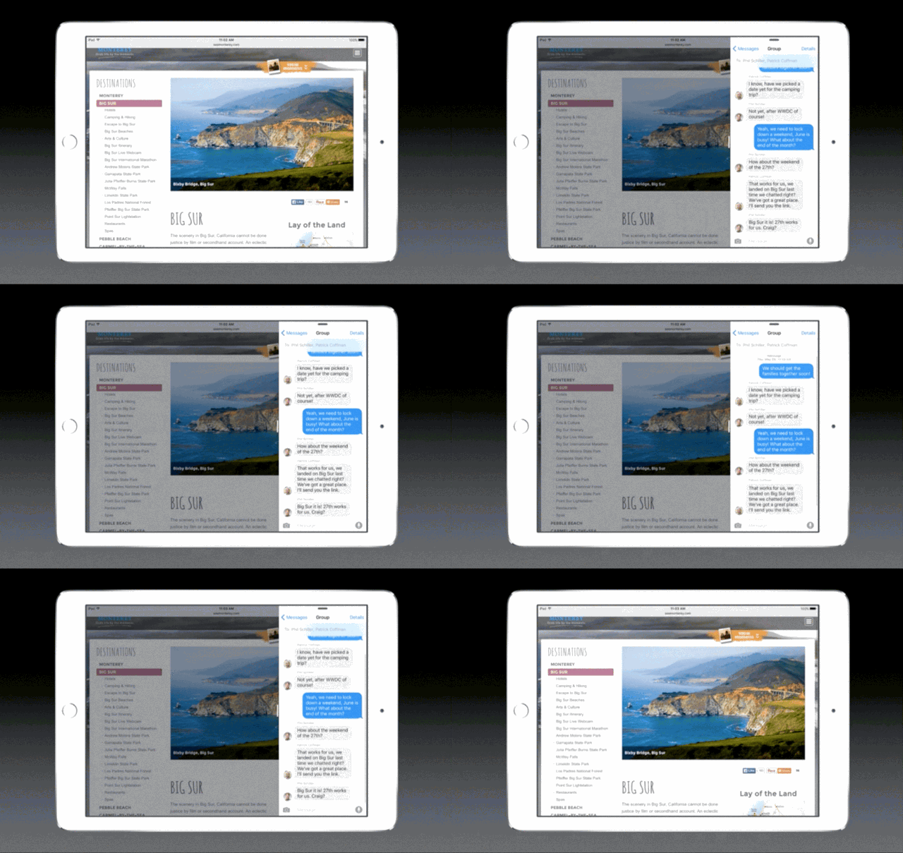
In terms of mobile, we’ve seen this solution already in Samsung Tablets and Windows 8, because it’s a logical way to allow a user to multitask when they don’t have a giant screen. If someone’s hopping between two apps over and over anyway, just load the two apps together and save the headache.
I have my doubts about its practical utility. (If you’re anything like me, you hop between docs, email, Twitter, Slack, and Facebook all day—and loading two apps at once, even though Apple allows you to scroll through your apps to swap each window out as you like, can’t help that.) But my tastes aside, it’s worth pointing out that Apple is offering this UI feature to desktops and mobiles together.
So What Happens Now?
You could take a look at all these small similarities of user interface and think, “Well that’s just good practice. Apple wants OS X and iOS to feel alike. That doesn’t mean it’ll ever truly merge the two operating systems.”
And while that may be true, when Apple does something like adding trackpad controls to iOS apps, it’s not just turning away from what makes desktops and mobile platforms so different, but actively inventing new ways for you to treat them the same.