How Casio’s G-Shock watch design has hung tough for decades
Few product brands last for more than 35 years. But the Casio G-Shock line is a cultural institution. Developed by engineer Kikuo Ibe after he dropped and broke a pocket watch given to him by his father, the G-Shock line includes the world’s most durable watch as deemed by observers from the Guinness Book of World Records after it survived the weight of a 25-ton truck. Today, the G-Shock’s appeal stretches from military personnel to outdoor adventurers who need its resilience to weekend warriors who simply like its style, a countercultural statement against the high-priced sleek minimalism and app-driven versatility of the Apple Watch.
Over the decades, the line has expanded across a range of digital and analog designs and an array of sub-brands: Baby G, G-Steel and the epic-sounding Master of G. There’s also a brand called Mr. G., and over the years he’s had plenty of companion brands: Mudman, Frogman, Rangeman, and Gulfman—a veritable Justice League of tough watches fighting the supervillains Water, Dust, and Shock. (Casio has shifted away from such gender typing with its recent Mudmaster series.)
[Photo: courtesy of Casio]
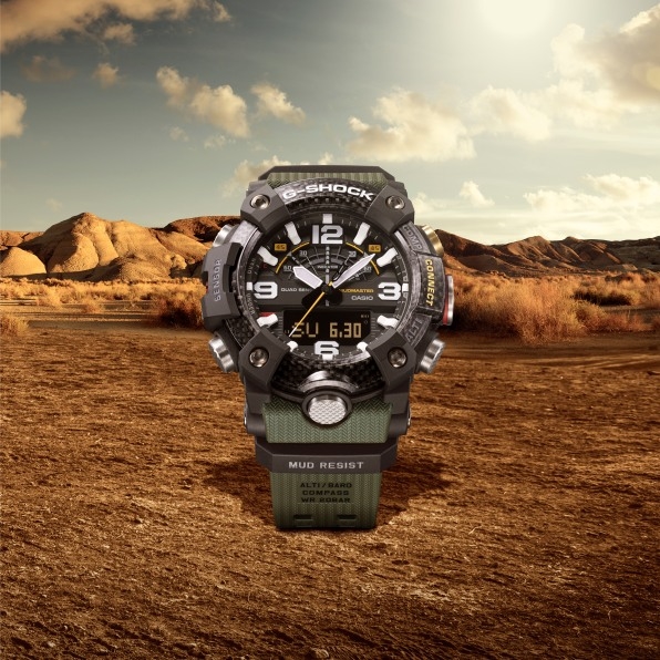
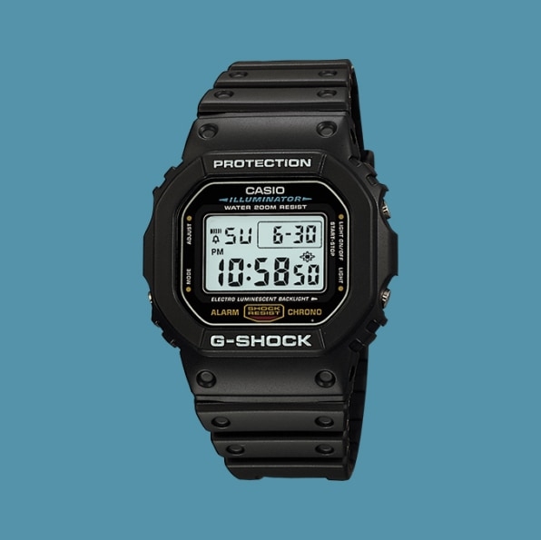
Despite the hundreds of color and style variations over the decades, Casio still sells a model, the DW5600E, that is virtually identical to the original G-Shock watch that the company launched in 1983. Its hallmarks have included four corner buttons that are notoriously and intentionally difficult to press and a bulky, loosely octagonal face with a matching plastic strap.
According to Tadashi Shibuya, senior product manager of the time products division at Casio America, the watch’s toughness transcends the material choice and price brackets. “Whether a customer is purchasing a $99 G-Shock or a high-end model at $7,500, a shock-resistant structure and the ethos of absolute toughness are built in. While we might be better known as a resinwatch brand, we have several materials we work with, including stainless steel, titanium, and carbon fiber.”
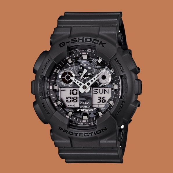
Casio’s design decisions help reinforce the watch’s ruggedness. But ruggedness does not imply simplicity; the designs are often intricate, visually overwhelming affairs. On the analog front, you have the likes of the Casio Men’s XL Series G-Shock Quartz 200M WR Shock Resistant Resin Color: Grey With Camo Face—also known as Model GA-100CF-8ACR—a watch that pairs a busy name with a busy face. Below its hands are three smaller circular indicators and two LCDs for alternate time zones and the date.
[Photo: courtesy of Casio]
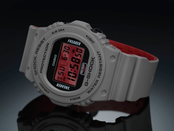
The digital G-Shock watches, on the other hand, tend to include printed text—lots of text. These indicators serve a range of functions that include the typical (branding), the functional (button labels), and the quirky (proclamation of features). The last feels unnecessary given that features need to be advertised only before the watch is purchased. But there’s a case for a kind of viral marketing element for anyone else who happens to see your G-Shock.
[Photo: courtesy of Casio]
And Casio isn’t shy about driving home the message. The 21 words printed on the DW5600E face include “Illuminator” below the Casio brand and “Electro Luminescent Backlight” below the display. Both are redundant given that the two buttons on the watch’s right side are labeled as controlling functions related to the watch’s backlight. And if you were unaware that the G-Shock brand included shock resistance, the words “Shock Resist” appear above the product brand while the broader “Protection” appears at the top of the face.
Shibuya explains G-Shock’s verbosity. “Think of it as a kind of, ‘functional expressionism,’” he says. “Of course, Water Resistance is indicated, that’s industry standard, but our technology like Tough Solar or Bluetooth, that’s like having V6 or Hemi on your car or truck. Sure, part of it is marketing, but we want to convey the functionality of our watches.” But if the G-Shock were a car, that vehicle’s visual identity would be more like a NASCAR race entrant than an SUV with a lone sticker boasting of all-wheel drive or the number of engine cylinders.
[Photo: courtesy of Casio]
The G-Shock paved the way for products that consumers bought even when they were designed for far more extreme conditions. The Hummer has gone the way of the dinosaurs that fueled it while Canada Goose jackets migrate from closets every winter. But unlike those brands, G-Shock watches don’t command a huge price premium compared to popular fashion watches from Fossil or Swatch. So that may help explain why its owners don’t mind Casio doing a bit of bragging.
What happens to all this functional expressionism when Casio must deal with the constraints of a smartwatch display? The company has created an outdoors-focused watch based on Google’s Wear OS called the Pro Trek. It’s marketed as being tough—that is, for a smartwatch—but it’s not a G-Shock.
Shibuya says that the company gets asked all the time about how it might create a smartwatch that lives up to users’ rugged expectations for its storied brand, but that any such product would have to be a G-Shock first. “I believe you can rest assured that it will be uniquely G-Shock in its form factor, unlike anything we have seen before.” If Casio carries its tradition forward, you’ll be able to read all about it—right on the face of the watch itself.
Fast Company , Read Full Story
(73)

