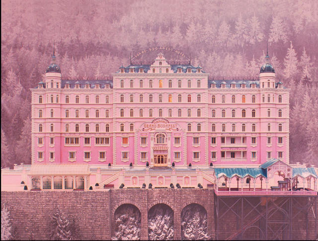
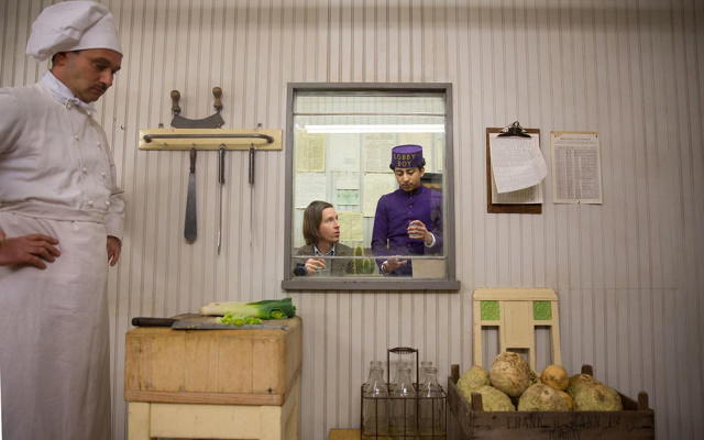
In his Oscar-nominated 2014 film The Grand Budapest Hotel, Wes Anderson didn’t just tell a story-within-a-story about murder, purple-suited lobby boys, and prison breaks—he created an entire universe. The fictional Eastern European land called Zubrowka has its own original architecture, money, fashions, and government documents. And all this was, for the most part, built by hand, without much computer manipulation, at a time when many big-name Hollywood directors can’t pull themselves away from the CGI (looking at you, James Cameron).
The Grand Budapest Hotel, a lavish new book by cultural critic Matt Zoller Seitz, reveals the elaborate, often labor-intensive devices Anderson uses to lure viewers into his curious Zubrowka world. “Wes prefers to do things in an analog or handmade way whenever he can,” Seitz tells Co.Design. “It’s one thing that makes him so unique. He’s got the sensibility of a graphic illustrator. No other major American filmmaker is working in that vein.”
At first glimpse, Anderson’s fealty to all things analog might seem defiant, borderline self-defeating. How else to explain why the trains in the film were actually made of cardboard; the majestic Pepto-Bismol pink Grand Budapest Hotel itself (the film’s central setting), was actually a 9-foot-tall model; and the pastry boxes from the fictional Mendl’s Bakery didn’t magically fall open as they appeared to; rather, somebody hiding under a table pulled them open with a fishing line?
 Grand Budapest Hotel © 2014 Twentieth Century Fox Film Corporation. All rights reserved.
But together, they create a sense of intimacy and tactility that is largely missing from CGI-driven films. Because they’re handmade, or vintage, or hand-aged, the sets and props “have a kind of a lived-in, elegant quality,” Seitz says. “Many of them look pretty and well-maintained, but none look new. That’s really the key.” When the actors interact with these handmade places and things, the interactions feel more organic. Their characters come alive.
It fell to production designer Adam Stockhausen (Moonrise Kingdom) to create the elaborate mirages of The Grand Budapest Hotel, which he likens to those of a science fiction film. His strategy was a painstaking one: to design the movie frame by frame, shot by shot. (In less fantastical films, the production designer might just shoot a big location the way it is—they might design just 50% of the shots.) “You’re creating everything, because you’re dealing with a fictional world,” Stockhausen says. Take the way he constructed the film’s many shots of trains, on trains, out the windows of trains: “No actual train was used in the production of this film,” Seitz says. “They were flat theatrical props that looked like trains.” There’s a scene where the legendary concierge protagonist Gustave and his lobby boy, Zero, pull up in a fancy old car on top of a roller bridge and leap out to catch a train. “Well, there was no train station there at all!” Stockhausen says in his interview in the book:
We made a train. But the train wasn’t a real train. There was nothing much to it. It was exactly like a stage train, made out of cardboard and tape and sticks and painted black, with smoke coming out the top. We pushed it into the shot on dolly tracks from the right-hand side of the frame. There is no way, in a motion motion picture, that you could get away with a shot like that—but I think we pulled it off.
Seitz likens this cardboard-based optical illusion to tricks used in much older films, like a shot in The Night of the Hunter , which Stockhausen cites as an influence. “Kids look out the window to see Robert Mitchum’s character, Reverend Harry Powell, riding up on a ridge on a horse. He’s kind of silhouetted in the distance,” Seitz says. This scene was actually shot on a soundstage, and it wasn’t Robert Mitchum on a horse at all, but a little person riding a tiny pony. Why mimic these old-fashioned optical illusions when there are easier options? “Tricks like that create a different sort of energy when you use them in a film,” Seitz says. “There’s something enchanting about them.”
They convey the great care being taken with each tiny detail in the film, which invites the audience to care more.
 Martin Scali
Even something as seemingly simple as making a pastry box fall open was a fussy trick that required jerry-rigging an elaborate contraption, Stockhausen explains:
We used a false tabletop, and then somebody underneath the tabletop pulled on a fishing line to open the box. When you untied the ribbon, the box needed a little bit of help to pull itself apart and down. The opening of the box has an origami kind of quality, but there’s a little push involved. Without the fishing line, two sides of the box would’ve fallen right away.
It’s this loyalty to old-fashioned methods instead of slavery to technology’s convenience that lends the production design of The Grand Budapest Hotel its idiosyncratic charm and ultimately makes the film more believable. “Everything in a Wes Anderson movie is intentional,” Seitz says. “He’s like Stanley Kubrick with a smiley face.”
The Grand Budapest Hotel by Matt Zoller Seitz is available from Abrams Books for $26 here.
[All Images: courtesy Abrams]