How Dropbox is finally breaking free of the folder
For years, the single best thing about Dropbox was that it was practically invisible.
The service, which debuted in 2008, was far from the first to put a hard drive in the cloud, having been preceded by the likes of i-drive, X-drive, Driveway, and Microsoft’s OneDrive (née SkyDrive, née Windows Live Folders). But Dropbox integrated so tightly with a variety of computing platforms, and synced data so reliably, that you didn’t have to give it much thought. Beyond a few right-click menu items for features such as sharing links to files, there was little evidence of all the heavy lifting it was doing in the background.
Quietly living inside file managers built by operating-system companies “served us well,” says Dropbox CEO and cofounder Drew Houston. Indeed it did. The service, which he was inspired to create as an MIT student—the eureka moment came on a bus trip to New York when he’d forgotten his trusty thumb drive at home—has grown to serve more than a half-billion users and 400,000-plus business teams. But Dropbox’s lack of a user-facing interface it could truly call its own has also been confining, especially as the service has built itself into something that’s about much more than raw online storage.
After all, Windows’ File Explorer and MacOS’s Finder haven’t changed much—and certainly aren’t optimized for the the sort of workplace collaboration that propelled Dropbox to its IPO last year. “If you went back to literally the original Finder, it’s the same experience,” says Houston. “It’s designed for a world not only before the internet, but before computers were even networked, when your whole life could fit on a couple of floppy disks.” Which might lead you to wonder: What would Dropbox be like if it had more say about how people used it?
Today, at a media event in San Francisco, the company is answering that question with an upgrade it’s dubbed “the new Dropbox.” But “upgrade” fails to convey the import of the news: For the first time, Dropbox is emerging from Windows and MacOS’s file systems and setting up shop in a full-fledged app of its own, where it can do things its own way and meld itself with other key productivity offerings such as Slack and Zoom. The new app, according to Houston, is about “turning Dropbox from the filing cabinet to the conference room. There’s people, and there’s content, and you can have conversations, and it can be on the whiteboard. That’s metaphorically the evolution of the experience we thought no one was really building.”
Dropbox users—including those on the free Basic tier—can opt into the new Dropbox Windows and Mac apps as early-access features. After a period of testing, they will become part of the default offering. Other aspects of the new experience, such as integrations with G Suite, Slack, and Zoom are now generally available. Everything that’s new is in addition to the old-school interface rather than a replacement for it, which means that those who were happy with the service the way it was needn’t fear its arrival or adjust their work habits before they’re ready.
The familiar and the new
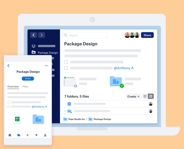
The new Dropbox desktop app is rife with elements that the company has not tried to reinvent. Like a lot of productivity apps—from Slack to Gmail to Dropbox’s own Paper collaborative document editor—it has a search bar up top, a skinny left-hand pane for navigating content, a roomier middle one for viewing and interacting with it, and another skinny pane on the right where some additional functionality lives. All the mundane file-wrangling features you’d expect, such as tools for moving, copying, renaming, and deleting files and folders—are present and accounted for. Along with dragging files and folders to the left pane for easy access, as File Explorer and Finder let you do, you can pin items to the top of a folder to eliminate the need to rummage for them.
Other new features go beyond standard file-system fare. A new Create drop-down menu—similar to one already available in the service’s web-based incarnation—lets you create word-processing documents, spreadsheets, and presentations in Microsoft and Google’s respective office suites and store them in Dropbox. This menu also allows you to create web shortcuts—links that live amongst the other items in a folder and take you to the specified URL when you click them. They’re nothing fancy, but they do provide a basic degree of intermingling with any web-based service that doesn’t have a formal Dropbox integration—or even just online articles you’d like to file away.
What’s most intriguing are the new Dropbox’s collaborative features—many of which the service probably couldn’t have shoehorned into File Explorer or Finder, at least in a way that many people would want to use. The existing menu that pops out from Windows’ tray and MacOS’s menu bar doesn’t look much different, but it’s been retooled to show the files that your colleagues are sharing, editing, and commenting upon: “It’s not just about your sync activity or files that you’ve edited, but what’s going on with everyone in your group,” explains Adam Nash, Dropbox’s VP of product. The menu also offers newly sophisticated search, similar to that in the web version, that plumbs the content of files rather than just scanning their names.
Every folder sports a shared scratchpad-like area that lets you type free-form text, numbered or bulleted lists, and to-do items, as well as reference colleagues by their Dropbox @names, giving you the ability to do anything from write a brief description of a folder’s contents to assign tasks to colleagues, who are represented as a row of avatars whom you can discuss items with in comments that show up in the right-hand pane. “The folder feels richer, more like a lightweight project,” says Nash.
With the new Dropbox, the service is taking the wraps off integrations that let you share items via Slack channels and direct messages or in a Zoom meeting. The company is also announcing a new collaboration with Atlassian, maker of such collaboration tools as Jira and Trello. Details on that partnership are yet to announced. But it’s easy enough to visualizes what the integrations could look like—along with ones involving other workplace stalwarts that could use closer connections with Dropbox (hello, Airtable!).
Enlightened working
All in all, the new app feels like something Dropbox has been working its way toward for a long time—at least since it killed its more consumery Mailbox email client and Carousel photo app to redouble its focus on business collaboration. But Houston says that serious work on it began when the company adopted a new mission: to “unleash the world’s creative energy by designing a more enlightened way of working,” a phrase it started publicizing around the time it went public in March 2018. (The old, more prosaically stated mission was to “simplify the way people work.”)
Houston describes the current, not-so-enlightened way of working: “When we talk to our customers and we watch how they work, they’re toggling between dozens of different apps. They have to move across different ecosystems, and there’s all kinds of friction in the experience of working with their team. And in a lot of ways, our industry is just adding more stuff to the pile without making the existing stuff work well together.” Moreover, much of the stuff is siloed off in self-contained web services, which means that it doesn’t involve files that Dropbox can sync between devices.
As the company mulled over these dynamics, “we embarked on this effort … to build a new Dropbox and transform the share folder into a collaborative workspace,” says Quentin Clark, Dropbox’s CTO. Internally, the move wasn’t without its controversies. “At first it was kind of a religious debate,” says Houston. “A lot of what people love about Dropbox is that it’s sort of out of the way. ‘Do we want to change that?’”
Once Dropbox committed to expanding its horizons, an early glimpse of the vision—and the challenge of implementing it—came in the company’s partnership with Google to meld Dropbox and G Suite, which it announced in March 2018, released in early-access form (after a delay) 13 months later, and is making generally available today. An uncommonly ambitious bit of cross-platform integration, it treats Google Docs, Sheets, and Slides like conventional files, the key to letting users store them with related items in Dropbox rather than walling them off in Google’s cloud. When Nash told me in April that this work was part of something bigger that would change what Dropbox was, he wasn’t exaggerating.
New frontiers
Certain things about Dropbox’s new zeal for tying together disparate work tools resemble recent developments at other major providers of collaborative services. Box, its longtime rival, is pursuing integrations that, though not identical to Dropbox’s, also go well beyond merely storing files in the cloud. And new Slack features such as “actions” feel like the messaging-centric flip side of Dropbox’s vision, with a similar goal of reducing the friction between apps.

[Image: courtesy of Dropbox]
Houston allows that Dropbox’s mandate could overlap more with those of other companies over time; still, he emphasizes, “Even with this new change, you’re not going to stop using Slack because you’re using Dropbox, and you’re not going to stop using Dropbox because you’re using Slack.” And as Clark points out, Microsoft and Google—both of which already compete with Dropbox on some fronts—partner with the company to ensure polished integration of their respective products. “We have shown that what we want is to help them keep their users deeply engaged,” he says.
Besides, the newly reimagined Dropbox feels like a first pass, not a complete package; if Houston is right that the service is now a conference room, it’s one that’s modern and inviting but still in the process of being outfitted with all the accoutrements you might want. Dropbox’s robust preview feature and the ability to mark up documents and share them with colleagues are part of the web-based version of the service, so using them takes you out of the app and into your browser. They feel like they want to live inside the app—and sooner or later, I imagine that they will.
Even Dropbox’s own Paper doesn’t yet have any bespoke functionality within the new Dropbox app, depending instead upon the new web shortcuts for a lowest-common-denominator level of linkage. Should the company’s two apps be stitched into a more seamless whole? “We get a lot of feedback from users that they want this very deeply integrated, and it is something that we’re listening to,” says Clark.
As Dropbox listens to that feedback and much more, it will be in a far better position to respond than if its service was still trapped inside a right-click menu. The revised version, says Houston, will be “a new departure point for all kinds of different experiences.” Still, he isn’t contending that the new Dropbox’s mandate is that much broader than its historic one.
“Basic tasks like finding information take about 20% of our time,” he says. “And if you think about that, that’s like a full workday a week spent typing things into search boxes, not finding what you’re looking for, going somewhere else, trying to pull stuff together, just trying to get a basic handle on the information you need to do your job.” That sounds like the same problem the company has been trying to solve all along. And that means that wherever Dropbox goes next, it will likely still be recognizable as Dropbox.
Fast Company , Read Full Story
(33)


