How Opill’s designers made the first OTC birth control pill foolproof to use
The first over-the-counter birth control in the U.S. might not be available over any counters yet, but we know what it will look like when it hits stores in early 2024.
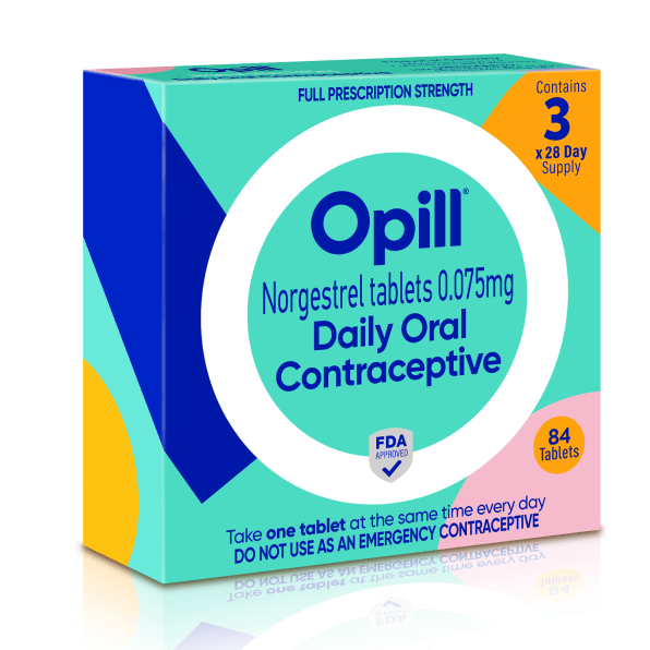
At first glance, the design of Opill’s packaging might seem rather simple—but that’s the whole point.
“Over and over, women and people told us that their contraception journey was often bumpy, difficult and full of compromises,” says Shivaani Phillips, global director of marketing for women’s health at Perrigo, the pharmaceutical company releasing Opill. “They were facing unnecessary barriers to access effective contraception, and they wanted the freedom to get safe, effective birth control easily.”

Which is why Perrigo wanted the packaging to convey a definitive sense of effortlessness. “Everything that we’ve done leads to simplicity, comprehension, and access,” Phillips says.
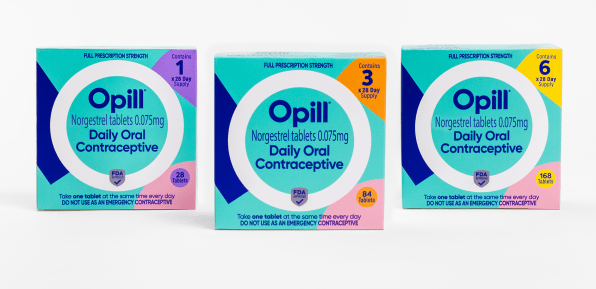
Phillips’ team, who collaborated with design consultancy Elmwood on the project, zeroed in on simplicity in a variety of ways. It manifests graphically in the lone “O” dominating the design. In the top right corner of the box, a single digit indicates how many months of supply comes in a box. And the instructions—a mere nine words—sit at the bottom of the package in bold type, specifying exactly how people are to use the product.
The name of the product was even selected for its simplicity; Phillips says it tested best among multiple options not just for memorability, but user comprehension of what Opill actually does.
Given that the pioneering product was making the leap from pharmacy to shelf, the design also had the heavy lift of legitimizing Opill to prospective consumers—starting with that “FDA Approved” seal. The FDA didn’t mandate the “full prescription strength” text (notably set in a highly legible sans serif, which Phillips says testing groups found reassuring), but its inclusion is critical as it goes beyond the red tape of designated dispensaries.
Phillips says such work is highly scrutinized by the federal agency. Because OTC medications are taken without seeing a doctor, the FDA has stringent labeling guidelines so consumers can know exactly what they are purchasing, right down to the active ingredient. In this case, Phillips says it had to feature prominently following the product name, and there were specifications for the actual size it appears in relation to it. The design also had to clearly specify that Opill is not an emergency contraceptive.

Everything else, from colors to the shapes in the design, was fair game for the company—but it was no less considered. The team selected the 45-degree angles of the geometric elements because they conveyed a sense of ease. Phillips confirms that the “O” locking out the other shapes was also intentional to imply a sense of protection and security (and thus, efficacy). The color palette, meanwhile, was selected to avoid any gender-based cliches.
“The colors are inclusive, and it’s a little bit outside of the category norm,” she adds.
Ultimately, Phillips says her team’s goal was to bring joy and dynamism to the pack—and for good reason. “It has to represent something that is game-changing. Because this is game-changing. It is revolutionary. It’s historic, it’s transformational—and also unapologetic,” she says.
A design three years in the making, the high-stakes packaging was ready to go with the FDA seal the moment the agency approved the product on July 13. With the U.S. primed to join more than 100 countries that offer OTC birth control, 2024 can’t come fast enough.
(19)


