How Paul Rand Pioneered The Era Of Design-Led Business
The graphic design legend convinced businesses to put design first. Here’s how.
We live in an era that acknowledges the business value of good design. Research proves it. But it wasn’t always so. Everything is Design: The Work of Paul Rand, a new exhibit at the Museum of the City of New York, reveals that today’s design-led businesses owe much credit to the work of visionary graphic designer Paul Rand.
Spanning six decades of work, including corporate communications for the likes of IBM, ABC, UPS, Westinghouse, Morningstar, and Steve Jobs’s NeXT, the show reveals that Rand didn’t just make beautiful graphics—as his colleague Lou Danziger put it in an interview with Steven Heller, he also “almost single-handedly convinced business that design was an effective tool.” Danziger elaborated:
Anyone designing in the 1950s and 1960s owed much to Rand, who largely made it possible for us to work. He more than anyone else made the profession reputable. We went from being commercial artists to being graphic designers largely on his merits.
How did Rand help transform designers from accessories to mainstays in the business world? Here, a few lessons from the master:
Make A Pretty Picture Book Explaining Your Work To Clients

One of Rand’s main strategies for explaining how his designs would help meet a client’s business needs was to write and illustrate beautiful presentation booklets for CEOs. They were “works of art in themselves,” curator Donald Albrecht says in an interview, and would explain how Rand had gotten from square one to his final design. “These booklets presented a logo design as some kind of rational, logical choice,” Albrecht says. “Not as a science, but they laid out the thought process behind the designs in simple, persuasive language and images.” Rand’s patience and clear communication with clients helped non-visual thinkers (like the CEO of financial analysis company Morningstar, for example) understand the importance of the aesthetic aspects of products and corporate communications.
Channel Contemporary Artists’ Styles Even In Corporate Work
Rand’s pioneering work in advertising design in the early ‘40s helped shift the way businesses approached branding. “He was very revolutionary in the ad industry,” Albrecht says. Rand knew an ad’s point was to sell a product, but believed that in visually conveying that message, a designer should be artistic. “He was one of the first to say, ‘I can take the ideas of Picasso, Jean Arp, Miro, and apply these fine art principles to the design of everyday objects and ads,’” Albrecht says. “As a result, he elevated the field of advertisements. People could look at an ad and have an aesthetic experience.” And more compelling advertising, as corporations know well, leads to better business.
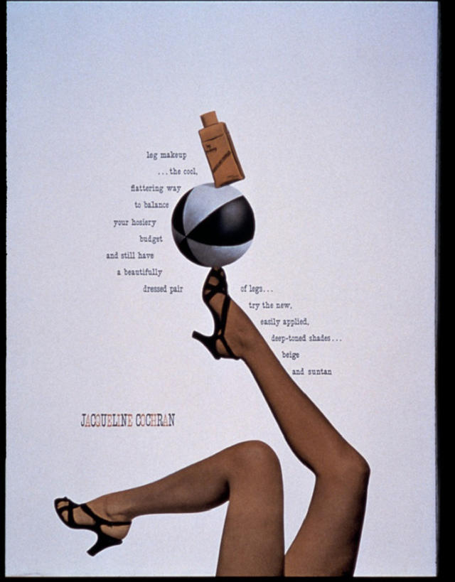
Rand also helped art directors gain more power within corporations. “Up until Rand’s time, the copywriter was king,” Albrecht says. The copywriter would write ad copy first, and then the designer would illustrate it. Rand, whose design philosophy espoused a fusion between beauty and utility, wanted to merge text and image instead. In designing a campaign for Volkswagen in the ‘60s, he convinced the company that this fusion should be led by the art director, not the copywriter. His imaginative approach to typography in ads—see the way words dance around a model’s stretched legs in a 1943 Jacqueline Cochran ad or float in white bubbles in a 1948 Coronet brandy ad—has a strong legacy today. Now, you rarely see an ad that’s just an illustration tacked onto a bland caption.
Don’t Propose Something Too Radical Right Off The Bat
It was the success of Rand’s corporate communications for IBM in the ‘50s that inspired future businesses, including Steve Jobs’s NeXT, to put design first. When Thomas Watson Jr. took over IBM in 1956, he was struck by how poorly the company handled corporate design. The aesthetic was inconsistent across various platforms—for example, “branches in different regions would use different stationery,” Albrecht says. Inspired by a visit to an Olivetti showroom, where there was a cohesive, art-directed modern branding across various platforms (stores, ads, equipment, brochures), Watson. Jr. started a formal Corporate Design Program. “Watson Jr. was one of the first to say ‘good design is good business,'” Albrecht says.
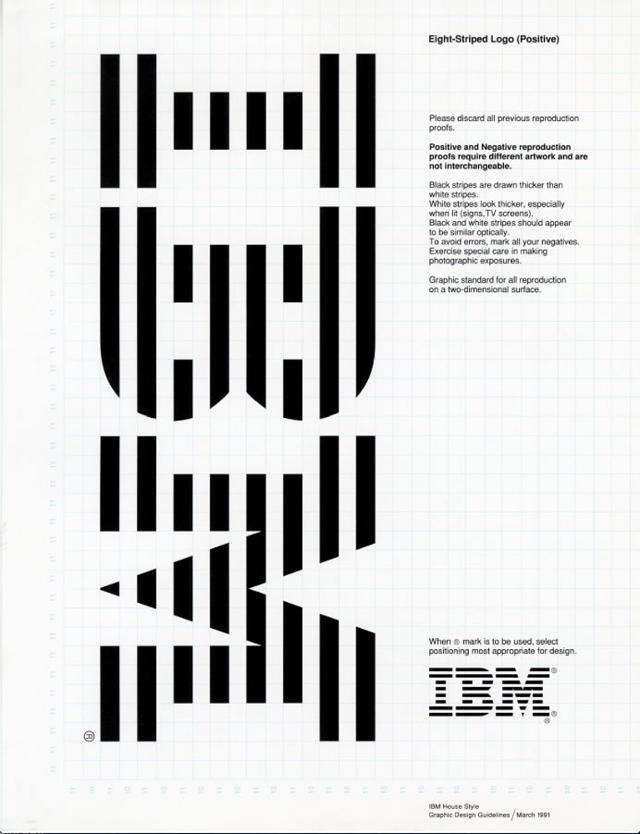
Led by design consultant Eliot Noyes, previously of the New York Museum of Modern Art, this program ultimately hired Charles and Ray Eames to do IBM’s exhibitions and books, architect Errol Saarinen to design buildings, and Paul Rand to design new logo and graphics. “Rand made everyone use his logo and branding,” Albrecht says. At the time, this sort of visually cohesive communication across all platforms of a brand was just gaining traction as a business strategy.
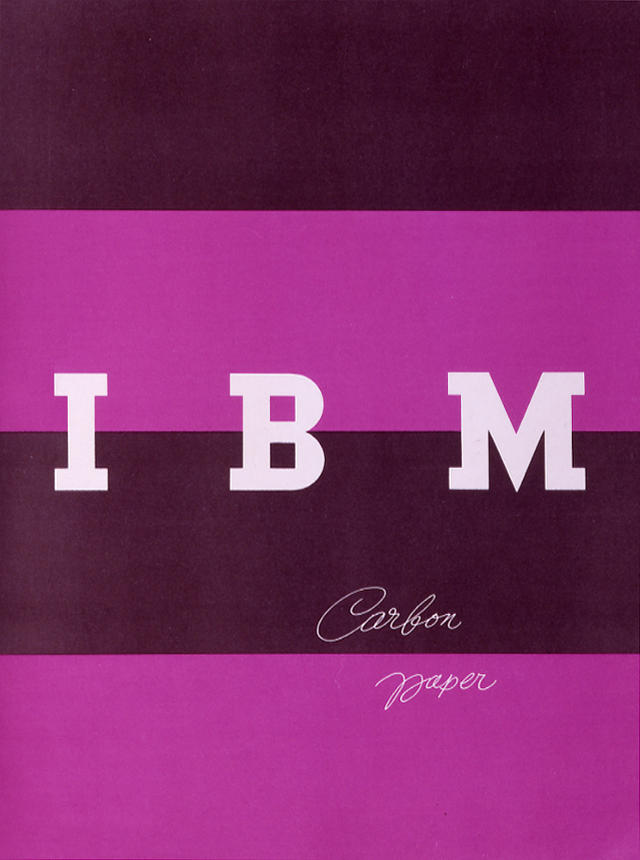
Crucially, Rand didn’t revamp IBM’s old logo too dramatically right off the bat—a strategic move. “He made it look like a modernized version of the old logo,” Albrecht says. The bold and blocky letters signified modernity with their minimalism. “Once they accepted Rand’s new logo, and he got his foot in the door, then he started to modify it.” The unusual purple and black stripes didn’t come until 1962. “Rand would never propose something too radical on the first day.” Soon, the power of IBM convinced other businesses to go the IBM route. “By the late ‘50s, Westinghouse wants to be like IBM, ABC wants to be like IBM, Cummins wants to be like IBM. And Rand is the IBM guy,” Albrecht says. These companies would later hire Rand as well.
Don’t Be Pretentious
In the ’80s, the power of IBM’s visual communications program inspired Steve Jobs, a longtime admirer of Rand’s work, to hire Rand as a designer for NeXT, his educational computer company. “Rand was the first and only designer Jobs looked to,” Albrecht says. One reason for Rand’s success with clients, aside from the sheer beauty of his visual work, was that he was “one of the guys,” Albrecht says. “He wasn’t coming into boardrooms acting like an artiste. He was very down-to-Earth, and fit into this Brooklyn boys’ world of corporate advertising in New York.”
“In a way, what Apple does today with design is what IBM was doing in ‘50s,” Albrecht says. “It was about simplification and cohesiveness across all platforms of the brand—products, ads, stores. These are all ideas in the modern vein that came about with Rand’s work with IBM. It set a precedent.” Now, Apple is perhaps the world’s preeminent design-driven company. “Everyone knows Apple products, but many people don’t know the the long history behind that kind of visual communication,” Albrecht says, or that Rand contributed invaluably to this history.
Everything Is Design: The Work of Paul Rand is on view at the Museum of the City of New York from February 25 to July 19, 2015.
[Cover Photo: Courtesy of The Paul Rand Foundation]
Fast Company , Read Full Story
(162)

