How pioneering modernist designer Florence Knoll revolutionized work spaces
The campus of Connecticut General Life Insurance Company was designed under the assumption that “a good place to work means attractive recreation space as well as efficient offices.” At Connecticut General, Florence Knoll did a great job of furnishing the modern office, finding fairly humanized solutions for the rather sterile modularity of the modernist building and seamlessly playing the corporate game. In this and in other projects, she paid a considerable contribution to the design of the “American workplace, where women, who largely played supportive roles, were visible in the open-plan configurations, but invisible within the corporations’ higher ranks.”
Florence Knoll prided herself for having improved the typical secretarial desk, customizing the design of this and other furniture based on interviews the Planning Unit team [Knolls Associates’ interior design service] conducted with employees from all levels. In her determination to do her job properly, she sometimes failed to understand, however, that improving functionality was not always sufficient to boost the working conditions and well-being of the workers. The design language Knoll employed was no doubt coercive enough to attract good employees, selling to them as well as to clients and investors the image of a solid and reliable, yet also hip and smart, organization. Yet this did not necessarily impact positively on the quality of the working relationships or environment.
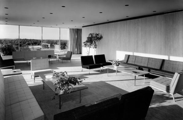
Connecticut General was an exemplary model of total design. Its interiors were perfectly streamlined with the architecture, providing a smooth, coherent experience. Remarkably, the color scheme of this interior is gayer and livelier than in most other Knoll offices, which no doubt helped the company sell the idea that working with them was fun and exciting.
The solutions Florence Knoll found for refurbishing existing spaces were, at times, more complex and meticulous than the interiors she designed for new buildings. At CBS, although the general design orientation verged, in tandem with the principle of total design, toward an overall sense of coherence, particular elements, such as an “awkwardly placed window,” created some tension, lending more individuality to the scheme. Another challenge this commission posed was the need to conceal a sophisticated electronic control system, which included phonograph, telephone, radio, and televisions. For this, Knoll reverted to the streamlined way of thinking that characterized the Planning Unit, creating an ingenious storage unit to resolve the problem. Drawings such as this one are evidence of one of the main hallmarks of the Knoll look: the articulation of a utilitarian problem with such a degree of care and artistry that it almost acquired, in itself, a decorative status. At CBS, Knoll balanced moments of extreme precision, as in the electronic control unit, with ones where some improvisation was employed, as in the above-mentioned window. This made her design language more nuanced and created a less uniform interior in comparison, for instance, to the Connecticut General project.
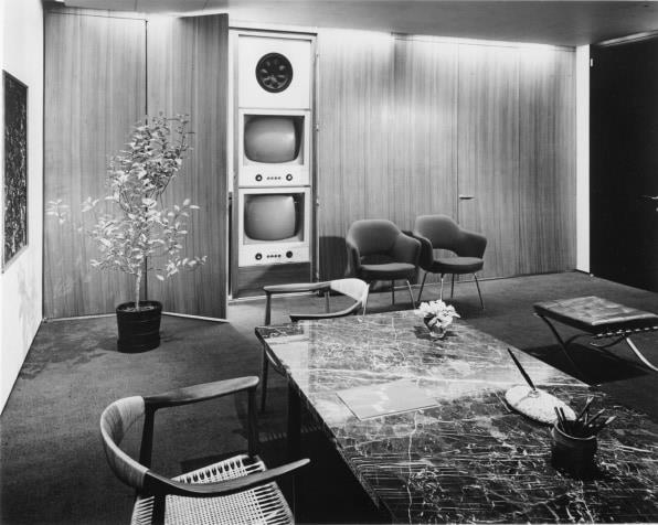
Whether she was playing with or avoiding inconsistencies, Florence Knoll took the level of finesse and precision that would be expected of a theatrical set, a church, an art museum, or a gallery to the office space, making the “arrangements comfortable looking and rather residential in character.” Her attention to detail added substantially to the persuasive nature of her work, which changed in character according to each project. In some interiors, like at Connecticut General, the persuasive character of the design was focused on the notion of well-being and on the alignment of work with entertainment. “While game rooms, coffee and nap rooms may be enjoyable, these spaces also function as a means to tap onto unpaid wage hours of employees, getting them to work longer hours in exchange for having a ‘cool’ workplace.” In others, like at CBS, she associated the sense of enticement of the interior to ideas of sophistication rather than fun.
Elegant offices like Frank Stanton’s at CBS gave workers something to aspire toward. “Closeness to beautiful offices amplified the belief that such pleasures could be available to all through hard work.” This was something Florence Knoll might have personally related to: fighting through hard work for deserved success and recognition and for the compensations that came with it. While complying within the slightly cynical framework of corporate thinking, Knoll seems, nevertheless, to have found a way to be sincere and, through her designs, to promote something she might have genuinely believed in and thought to be possible based on her own experience.
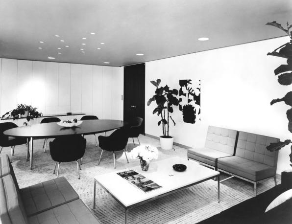
Sophistication was, again, one of the themes of the second project Florence Knoll did for the CBS company, this time in a new building designed by her friend Eero Saarinen. The CBS headquarters in New York (1964), the last scheme Florence Knoll designed with the Planning Unit, consisted of a new, 38-floor building expected to house 2,700 employees, with no less than 868 offices divided into four different types. Saarinen originally intended to design the interiors himself—with Knoll’s help, he told her over dinner—but upon his death in 1961 the Planning Unit took over.
The goal throughout was simplicity. This was achieved through methodical and efficient design procedures, in addition to the solutions outlined above, such as mounting light switches in doorjambs; concealing telephones, control panels, and other special equipment completely from view; color-coding the reception area of each floor to indicate its overall color scheme; and choosing fabrics and other materials not only for their visual effect but also for their acoustic performance.
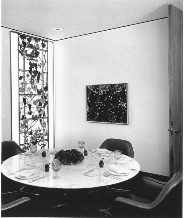
The highlights of the scheme were, however, the executive suites. For those, Florence Knoll introduced a more subtle color scheme, composed of metallic browns and olive greens. Textiles included lush velvets, until then an uncommon material in her palette. And the Knoll Planning Unit even designed different sets of pleats for the curtains: the “pleatless pleat.”
Knoll’s “pleatless pleat” for the vice presidential suite made the room look more casual and simpler, in harmony with many of Knoll’s earlier interventions. In the presidential suites, however, she went for a more imposing, more traditional-looking draping style aligned with the more old-fashioned colors and textures she was experimenting with. In the private dining room of Frank Stanton’s suite on the 35th floor, Knoll introduced another unmodern detail: a pair of Tiffany glass panels.
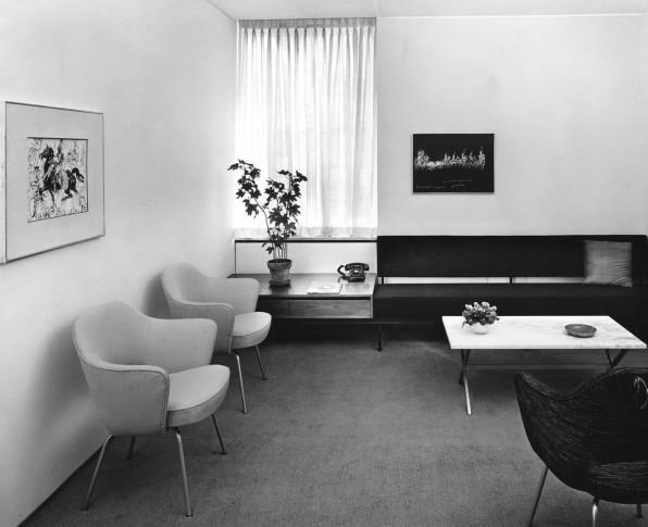
As the CBS headquarters indicates, Florence Knoll started to engage a less homogeneous design language in later moments of her career at Knoll Associates, moving away from an orthodox form of modernism and sometimes introducing historical elements into her vocabulary. Consequentially, the message conveyed by her interiors also changed, as a richer and more inclusive repertoire replaced a predominantly abstract and self-referential language.
In Knoll’s later projects, the decorative aspects of the design no longer related exclusively to the realm of the utilitarian. This also meant that they diverted from celebrating exclusively work-related values to pointing to a wider reality, which also started to include the world outside the office. Knoll’s later interiors continued to be coercive, yet, rather than emphasize an ideology of work for work’s sake (or for financial compensation), they promised something different. Elements such as the Tiffany glass panels and the more luxurious pleats and fabrics she employed in the CBS design connected the user to ideas of pleasure, leisure, meaning, and comfort that were not mediated by the yardstick of efficiency and not directly circumscribed by the corporate way of thinking. Although in most cases such transformations were still contrived—standing alongside pristine white walls, built-in ceiling lights, sleek furniture, and the usually rather rigid Knoll layout—they indicate nonetheless a departure from the Knoll look as it had been established in the preceding years. Their design language was more akin to the one that Florence Knoll would develop in the works she did after she left Knoll Associates.
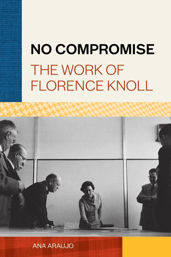
This article was adapted with permission from No Compromise: The Work of Florence Knoll by Ana Araujo. It will be published June 22 by Princeton Architectural Press.
(50)

