How Samsung Used Customer Insights To Refine Gear VR’s Design
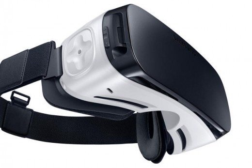
Gear VR’s most noticeable change revolves around its main point of interaction: the touchpad.
After previously testing the mobile VR waters with the Gear VR “Innovator Edition,” the company is going forward with a new $100 model fully intended for mass consumption by owners of Samsung’s recent flagship phones. But before Samsung got to this point, those two limited releases from the last year provided invaluable information for designing the Gear VR that was given a wide release today, both from developers making software and from users of the headset.
Developed in conjunction with virtual reality-trailblazer Oculus, the focal point of these insights primarily revolve around one important area: the touchpad located on the right side of the headset.
“We’ve given lots of demos of Gear VR and everybody can touch their temple. But it’s still a new behavior to touch the temple of the Gear VR. The touchpad is one of those things that when you go through the tutorial, it becomes really natural,” Nick DiCarlo, VP of Immersive Products and Virtual Reality at Samsung, tells Co.Design.
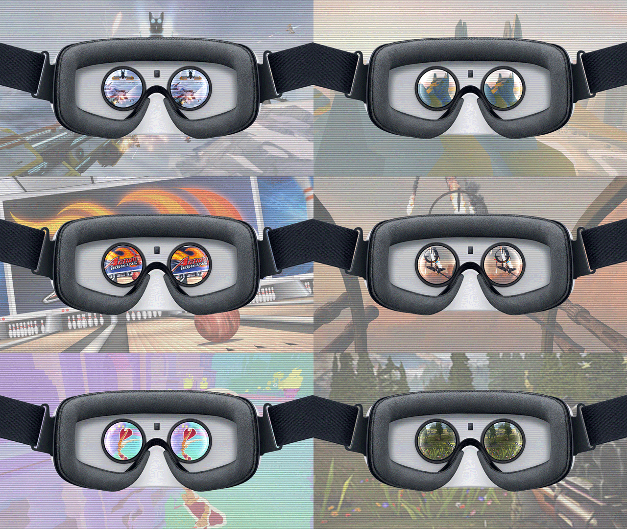
When looking at how it could improve and refine the touchpad, Samsung took it from a flat, squarish shape, to a slightly larger cross-shaped groove perfect for swiping up and down or left and right through menus a more. Where a thin raised line in the center previously existed, it now has a little pit where a finger naturally lands when you tap to select menu items. The border delineating the touchpad from the rest of the case has also been made more pronounced, to help a user to find it when the unit is on their face.
“By having the pad like this, you can easily find where you are in the headset. So there are little lessons that have been learned throughout. And we can expect that to continue in the future. This is not the final form factor for 10 years of VR. We will take what we learn and go from there,” says Max Cohen, VP of Mobile at Oculus.
Another change near the touchpad is the back button. Cohen explains, “The back button used to be over here [toward the middle]. When people went to put the headset on, they were pressing the back button. So we moved it up here [toward eyes], because no one really holds the device like that.”
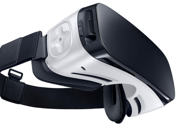
The new Gear VR comes other improvements as well. It is 19% lighter—thus easier to wear for longer sessions. The design allows more ventilation, to reduce the fogging on the lenses that can happen. There is more space in the case, allowing someone to wear eyeglasses (though, they may not have to since you can change the focus of the lenses). And with a moveable connector, it can work with the Samsung Galaxy S6, Galaxy Edge, Edge +, or Note 5, whereas the previous two models each worked with one specific phone.
DiCarlo says, “Consumer and developer feedback is critical and all of the tweaks we’ve made to the device have been as a result of what we hear from the community. We are committed to continuously improving and bringing this amazing new technology to millions, and that takes a careful ear to listen and learn from the passionate VR community and developers we work with every day.”
[All Photos: via Samsung]
Fast Company , Read Full Story
(39)

