Can you replace a human designer with artificial intelligence and machine learning? That’s the question, more or less, which will likely plague The Grid long after the company launches its new website creation and hosting platform.
The Grid’s sales pitch is that creating a beautiful looking website geared towards your intentions shouldn’t be harder than giving it content—images, videos, and text. But it also wants to be able to respond to your shifting demands. Want more people to share your content on social networks? You can indicate that’s one of your goals and the site will adjust accordingly.
Unsurprisingly, this upstart has raised more than a few eyebrows, not least of whom are web designers.
It won’t matter how many times its founders claim they aren’t replacing the designer, because to most people it doesn’t make sense why you would try to replicate their skills through algorithms and AI, if removing the designer from the equation wasn’t part of the goal.
It’s a magical proposition for a website to be able to design itself with AI, but it begs the nagging question: what’s the catch? The promise of any user being able to throw content at a Grid site and it intelligently understand what it is and present it in a way that’s unique seems too good to be true.
And so far, the perceived catch is that this will come at the expense of the designer.
But people, designers specifically, who have a desire to create things will always do so, just try and stop them. There will always be a market for bespoke designs. That said, there are so many more people that just want a nice looking website without any hassle, not even the work of tweaking pre-built templates.
Even though the question of whether machines can replace human designers is a fascinating one to contemplate, it’s just the wrong one to ask in the context of The Grid, because the idea is to take designers along for the ride, letting them occupy the role of creative director when using this nascent platform.
“Our AI is dependent on designers training it; the designers are still the masters; the AI just scales their efforts,” explains founder Dan Tocchini. “As we release more details about The Grid’s platform, how designers can extend and customize it by inputting their own creative best practices, the idea of replacing designers will be less of a concern.”

What’s it like to be the one responsible for designing a system that in turn automatically designs everyone’s sites? Former Medium designer Leigh Taylor is taking a humble stance towards the scale of this project. “I’m not going to have all the answers, I’m not going to be able to generate every variation possible and even though the algorithms and AI that we’re using take this a lot further, it’s a framework that goes beyond a one-time solution,” he says.
As easy as it looks, a lot of hard work was put into having a content backend decide what a piece of content is and how to display it. Tocchini spent years working on a new programming language based around his Grid Style Sheet. Since then, Taylor spent the last two years re-learning the fundamentals of design in order to understand how to train computers to think like he does—like a designer.
Part of the reason for asking whether The Grid and its AI will replace designers comes from consumers trying to make sense of what they’re seeing. It’s incredibly hard to get a grasp of The Grid quickly as you scroll through its own algorithmically designed website.
The inherently robotic system begs to be humanized and explained. The first question Taylor had to ask himself was if what Tocchini was attempting was even possible. Could he translate design intention into an algorithm that was always producing new and relevant results—something that satisfied a broad range of needs and desires? Once he was able to answer that, work could begin.
“There’s a reason that we, as designers, design the way we do and avoid certain compositions or flows and generate preferences in our design approaches and executions,” explains Taylor. “The problem is that we rarely ever have the opportunity to really ask ‘why.'”
This move back to basics led Taylor to Roger Martin’s book, The Design of Business which describes a process of moving from mystery to heuristics to algorithm. “Mr. Martin explains that there’s a way to apply previously learned methodologies to bring order to chaos and define usable ‘algorithms’ or processes,” Taylor says.
All of the digging and research was to understand design even better and ultimately figure out how to simplify the process for people who don’t care to bother with it—but still want an eye-pleasing experience.
For the most part, the process has been a lot of trial and error. After that, it became a work of refining those insights gained to be able to produce and implement useful algorithms.

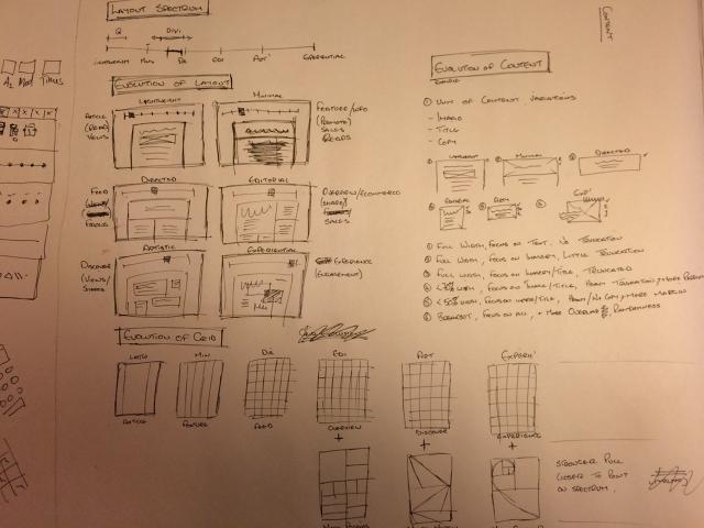
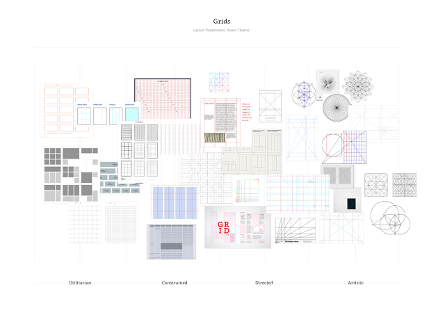
Taylor broke out different spectrums as a way of displaying the results visually, and as as strategy to help the machine determine the best design decisions to make according to user need. One of these spectrums was for the “layout,” to separate the different parts of a site’s design elements—where pictures were placed and so on. On the graph above, the far left is something very utilitarian, for example, while the far right is something very artistic.
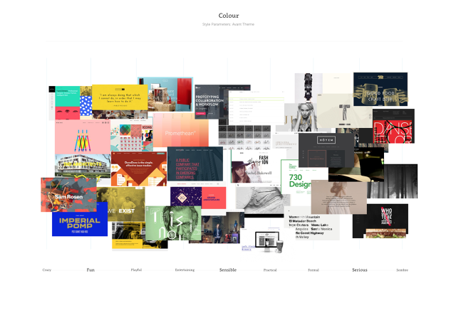
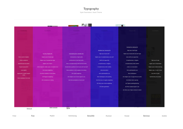
The same type of spectrum was then done for “style,” ranging from “fun” to “sombre” with lots of stops in-between. Once the spectrums were created for layout and style, they were merged which started to highlight relationships between the structure and aesthetics of content driven designs.
“Finding ways to communicate design intentions or directions on a holistic level was where the spectrums were first introduced,” says Taylor. It was a way to classify designs at an elemental level and help communicate changes over a wide scope early in the project.
All of this sets up The Grid to produce millions of different combinations that will continue to evolve. Not only will these basic elements affect the results of a person’s website, but even the content itself—like text of an article—will be examined to alter the outcome.
There’s nothing magical about how the team at The Grid have systematically looked at the fundamentals of design and asked a computer to follow their interpretations. Even if the machine does make its own tweaks or calculations, it all stems from the tedious work of picking apart circles and squares and trying to translate what humans like to look at into code.

It’s easy to imagine how The Grid could allow any designer could create their own set of spectrums like the ones shown here, establishing a new market for dynamic design languages as opposed to the more static, single-serve designs which are currently offered.
Zooming out to look at the big picture—including the early days of Geocities site builders—it’s always seemed like creating a digital space shouldn’t just be easy, but it should be obvious and natural. Yet, most have remained outside the reach of the typical mom and pop. The phrase employees of The Grid like to throw around, trying to explain what they’re doing, is “removing unnecessary barriers of entry.”
“I do truly believe that in a decade’s time, if we realize the potential of assistive AI and automate a lot of the production tasks, the majority of the online community will look back and wonder why we had it so hard, for so long,” reveals Taylor.
The whole platform is a bet that the fundamental potential of the Internet has yet to be fully tapped yet and people do want to carve out their space in the form of a personal website.
As you might imagine, the last two years have taught Taylor a lot about how he thinks about design. He no longer believes design is as subjective as he once did, for one.

A lot of people want to believe that good design is unexplainable magic, but it’s certainly helped along with design principles like the rule of three, Fibonacci’s spiral, the golden ratio, sacred geometry, and others. Whether those crafting designs are intentionally using those principles or it’s just a gut instinct.
Even personal taste is often heavily influenced by external factors like society or a person’s upbringing. Meaning, successful and beautiful designs are probably less random than some assume.
And like the successful comedian who needs a science like understanding of humor to craft a joke, and an intuitive sense of timing to deliver it, The Grid is hoping to thrive in that same space between machine-like logic and human intuition.