How To Design The Perfect Horror Cover
Horror comic book legend Steve Bissette gives his four top tips on designing covers that scare the hell out of you.
I grew up reading comics in the ’80s and ’90s. X-Men, Justice League, and The Tick were my favorites. Every Thursday I couldn’t wait to go to the comic store to peruse the latest issues. But there was one section of the store I’d always try to avoid: the shelf with the horror comics. This was the shelf with covers so terrifying to my young mind that even a glance at them would give me nightmares.
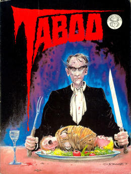
There was once such cover I remember seeing that literally kept me awake all night once. It was the cover to Taboo #1 by Steve Bissette, a legend in the comic book world who rose to prominence for his work with writer Alan Moore on the DC horror series Swamp Thing-–a series for which he won the prestigious Jack Kirby award.

Bissette’s Taboo #1 cover showed a demonic Catholic priest sitting down to dinner to dine on a child. Though it frightened me enough to keep me awake all night, I couldn’t help but stare at it. That’s the great oxymoron of horror: if done successfully it compels and terrifies us at the same time.
“For me, from childhood, I fell in love with horror. And I don’t know why,” says Bissette, “but I did, and it was profound, and it was deep, and it has been very lasting, and I want to have movies, and comics, and literature, and music take me to dark, dangerous emotional spaces that I would never, ever want to go near in my real life.”
“We all go through bad stuff in life, some people more than others. To me, I’ve always used my love of horror as a way of keeping sane, keeping a certain amount of balance. I can also honestly say that I think I’ve handled some crisis situations in my life better than I may have otherwise because of my interest in horror and the vicarious rehearsals that horror provides.”
Horror’s pull was so profound for Bissette, of course, that he made a career out of it. His Taboo series even won a coveted Eisner Award—the comic book world’s equivalent of an Oscar.
Even though I’m much older now, that cover of Taboo #1 still sends a shiver down my spine when I see it. So given that Halloween is right around the corner I thought there couldn’t be a better time to confront my fears and talk to the master to find out how others can go about creating horror covers with just as much chilling effect as his. These are his top tips for budding horror designers and artists:
1. Avoid what’s current
“We go through these cycles where certain images will become codified as, ‘This means horror this particular year’,” says Bissette. And once an image has become codified, its effect–its ability to frighten–wears off.
“I’ve vivid memories of being at a world horror convention. And I was with a group of writer friends, and they were very frustrated with what was happening to their horror novels,” says Bissette. “The publishers at that convention had kiosks out where you could take free reading copies of the upcoming novels that they were putting out in their horror lines. We all had a bag of these, and we spread them out on the floor in the hotel room, and there were three images that were repeated time and time again: demonic child, evil clown, or a skull—and that’s what all the art directors were putting on covers.”
In short, we’re so used to seeing these images that we become desensitized to them. A more recent example of codified horror, says Bissette, is this zombie phase pop culture is in right now. “I love drawing them—zombies are a blast to draw, but it’s like, ‘Oh my God, do we really need seven more variants on The Living Dead out there?’ If you’re going to do that, cut a check to George Romero because we all owe him for that one.”
His point is well taken. Zombies used to terrify me (even well into my late 20s), but now The Walking Dead has made me so desensitized to them the image of a zombie is no more frightening than a Disney villain.
Bottom line, says Bissette: “Don’t do the same thing everybody else is doing.”
2. Dig deep inside yourself
“I am tired of comfortable horror,” says Bissette, noting the demonic child, evil clown, or skull covers that grace many horror novels. He notes that people get into the trap of creating comfortable horror when they try to guess what is horrifying to others instead of themselves.
“If you’re going to do an image that’s supposed to be horrific, make sure it’s something disturbing to you,” says Bissette. “My kids weren’t normal. They grew up in a household where their dad was drawing horror comics, but they loved these two collections of horror stories for kids. I think they were called “Best of Scary Stories” or something like that, and the illustrations were brilliant. They were really disturbing, and that was their favorite book. From a young age on, people that are drawn to this material are drawn generally to the stuff that plucks those nerves, and if it’s not going to pluck your nerve when you’re working at the drawing board or on your Wacom tablet, why is it going to bother anybody else?”
One of Bissette’s most horrifying covers came as the result of sticking to this rule. The character who scarred me so much on the cover of Bissette’s Taboo #1 is a man called Cardinal Sin-–the one sitting at the dining table about to feast on two young children.
“My Cardinal Sin was this demonic priest that started to pop up in my dreams, and I had some really vivid dreams with the character, and I had poured a lot of it into that cover,” says Bissette. “My son Daniel is now an adult, and he’s proud to say that I based the baby that’s on the plate in front of Cardinal Sin on a couple of photos on my son Daniel.”
“If you’re going to do a terrifying image or a scary image, it’s got to be disturbing to you, the artist, or it’s not going to be effective.”
3. Invest it with emotion
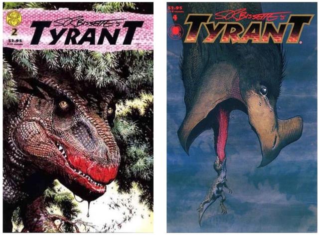
Bissette’s two favorite covers he’s ever done are the covers for Tyrant #2 and #4. The series has a cult following and deviated from typical horror as its monster actually existed. Tyrant was about a tyrannosaurus rex’s fight for survival.
“I associate Tyrant with horror because to most people, dinosaurs are monsters, and I love monsters,” says Bissette. But the reason these two covers are his favorite out of all the horror works he’s done is because they adhere to his third rule: invest your horror art with emotion.

“The Tyrant #2 cover is the one with the mother Tyrannosaurus rex looking right out of that cover picture at you, the reader, the viewer. I was able to catch something in that portrait where I was not anthropomorphizing the animal to my mind, but I was making a direct connection between this fantastic, marvelous creature and the reader.”
Where Tyrant #2 created an emotional connection between monster and reader, the cover of Tyrant #4 was able to instill another, less frequent type of emotion in the horror world: compassion for the monster—a baby T-rex about to be consumed because it’s dangling from a larger dinosaur’s tongue it thinks is food.
“Those are my two favorites because I think I really hit something there, and it doesn’t have anything to do with scary images,” says Bissette. “It has to do with something more primal than that, something deeper than that. Really invest yourself emotionally in that image that you’re doing.”
4. Keep it fun
It’s odd to think that someone who is a legend in the comic book industry would ever willingly leave his craft behind, but that’s exactly what Bissette did as the commercial aspects of being an artist drowned out the creative impetus.
“I really pulled away from the drawing board for years and years because it stopped being fun,” says Bissette, who now teaches classes on comic art history, drawing, and film at the Center for Cartoon Studies in Vermont. “I fell out of love with it, and it’s taken me years to get back in love with it.”
It’s actually his time off from his craft and his move into teaching that’s reignited his love again.
“I’ve had 5 or 6 careers—and for this article we’re talking about my career as a cartoonist, but right now, my career is teaching,” says Bissette. “My bread and butter is teaching, and I’m working with artists. And I try to make the most of the time I have each year with each new class of young creators…They’re really in it for the love, and that’s why I got into comics. I was in it for the love. There are so many other better ways to make a living if you’re in it for the money, believe me. I was in it for the love, and I did pretty well. I had a pretty good run in comics. I raised two kids primarily on what I was earning as a cartoonist, and I also made part of my living as a writer, and I love that, too.”
“My advice is keep it on a level of play because that’s really important to your own stability, and well being, and happiness–getting some pleasure from what you’re doing,” says Bissette. “Make sure it’s still fun for you to do it, and if you love doing horror, it’s fun to do stuff that really gets under your skin.”
“I have very fond memories of some of the images I’ve drawn over the years that really bothered me.”
That’s something only a master of horror could say.
[Images: courtesy of Steve Bissette]
Fast Company , Read Full Story
(58)


