How to Present Complex Data Using Infographics (With 10 Examples)
April 29, 2016
You know you have valuable intel to share with your target audience. However, many of them might end up falling asleep before they get to the essence of your content.
You can prevent this by turning your ideas into more vivid and easy-to-understand visual concepts. Here’s how to revamp your complex data into awesome infographics.
The Challenges of Complex Data
Complex data can easily turn off even the most attentive and educated readers. In order to avoid scaring away your dedicated audience, it is crucial to know about the most critical challenges that complex data poses for your reader:
- Boredom. Reading and pondering over complex data is a tiresome process. If you don’t opt for the most appropriate tone of voice, or if you go too heavy on industry terminology, your readers could easily get bored. Chances are that they will either lose interest in your content, or lose interest in your company altogether, both of which are definitely not what you’d want.
- Confusion. If you don’t succeed in presenting your data clearly, you risk discouraging your readers. As a result, they might feel ignorant or awkward for not comprehending your message, and they might send them looking for the same info elsewhere. Worse still, they might draw the wrong conclusion about what you have to offer — the one thing worse than your clients failing to understand your message.
- Lower recollection rates. The more complex the data you try to convey, the harder it will be to understand. Accordingly, the less successfully it would be retained in your readers’ memory.
- Low social shares. Given that complex data could likely only be interpreted and appreciated by a smaller pool of people, the virility of your content could find serious obstacles.
Why Infographics?
Because they overcome all of the above-mentioned challenges!
According to statistics, infographics are the cure for:
- Attention loss. “With detailed images, you can get the attention of up to 67% of your targeted audiences,” according to HubSpot.
- Inability to process complex data. “The brain processes visual information 60,000 faster than text,” says 3M Corporation on Visual Teaching Alliance.
- Forgetfulness. People remember about 80% of what they see and do, 10% of what they hear and 20% of what they read, reveals Paul Martin Lester in Syntactic Theory of Visual Communication.
- Social sharing stillness: “Visual content is more than 40 times more likely to get shared on social media than other types of content,” according to Buffer.
Are you still hesitating to do a total makeover of your complex-data representations?
Would you feel more inclined to do so if you saw how others have managed to revamp their content without compromising its essence and usefulness?
Great! Let’s go over some awesome infographics that are packed with complex data while still excelling at engaging the reader. They offer valuable insights and keep a fun note to the overall reader’s experience.
Read also: 24 Awesome Infographic Ideas to Inspire Your Next Beautiful Creation
A Look at Some Examples
Industry-specific Terminology
One way to explain complex industry-specific terminology is by borrowing a story that you know your target audience is familiar with and really enjoys.
It could be a movie script, a comic storyline, song lyrics, or an emblematic fairytale or anecdote that your customers often tend to refer to.
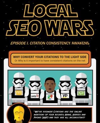
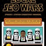
- The Local SEO Wars reveals how a local SEO company educates its audience about complex concepts like local business citations. Given that SEO is a rather technical realm, the infographic has a geeky setting: The Star Wars universe, which is specifically chosen to appeal to a particular audience. In this case, much-adored characters like Yoda, C-3PO and the revolutionary Stormtrooper Finn help explain intricate relationships between concepts and entities:

- Social Is Coming is another online marketing project that relies on a world-renowned TV series, Game of Thrones, to represent a comparison between six social networks. The infographics takes a character from the epic drama and draws a parallel between him/her and a specific social media channel. Thus, otherwise dull and repetitive data is conveyed in an entertaining and easy-to follow way.

Connections Between Concepts and/or People
Interconnectivity between concepts, different entities, and humans is the essence of many studies. Whether they are commissioned by pharmaceutical corporations, governmental social welfare departments, or insurance companies, they all list data that may not be easy to follow.
The way two events are connected is often easier shown than explained, like in the following examples:
- How Music Affects Your Driving is a fascinating piece explaining the impact of music on one’s driving performance. The effects of variables like music volume, speed, and genre of music are illustrated for different driving situations. If this data had been compiled into a whitepaper format, it almost certainly would have turned out quite wearisome, bordering on condescending.

- Who Is Fighting Whom in Syria is another great example of an infographic that traces down the relationships between different people. only this particular design has more of a political focus. With a total of 13 interested parties, it could be hard to see the big picture plain and clear. Not with an infographic, though:

Timeline of Events
Timeline articles tend to remind us of history textbooks that we once opened in college as a prelude to our afternoon nap. It is a challenge to turn such a third-person narration into an entertaining read, especially if you do not support your story with great visual material.
- History of The Businessmen. An evolution process can be illustrated quite ingeniously, if you simply put some creativity into it.

Cause and Effect
Research papers that explain cause-and-effect topics make for intriguing reads. However, there is a thin line between an educational piece and a dry exposé.
How to avoid the latter? Draw wisdom from the next infographic:
- Fume Leads to Death is an impressive, data-packed infographic. And even if it offers some overwhelming info, it does not discourage the reader from investigating the document. It is the ease with which you could skim through the content and skip from one pie chart to another, from the single unifying cause (the habit of smoking), to the multiple effects that result from it, that grabs your attention and inspires you to want to learn more.

Geographical Distribution
Many find geography rather confusing. Comparing countries whose names people know only in theory is unsettling to say the least.
Map visualization could come in handy when trying to present a geographical study. On the other hand, country comparisons in terms of population, economy, religion, internet speed, and even beer consumption are also topics well-covered by this infographic format. Check out the two examples below:
- What Each Country Leads The World In is a pretty straightforward topic. Where’s the complex data here, you’d ask? Well, it is one thing to actually read about the advantage or the “sigil” of each country, but it is an entirely different story to actually visualize where that country is located, what size is it, which are its neighboring countries and how are they different or similar to it.

- Global Carbon Footprint by Nation is a more complicated concept that has been visualized so masterfully, you simply need to scroll to the end, looking either for every country you know, wish to visit, have travelled to, or you simply have read about lately and are curious to compare with your own.

Intangible Concepts
Intangible concepts like emotions, health, fortune, and politics are sometimes hard to explore and speculate about.
In this regard, comparing the value of money or assessing the cost of a feeling like love are contests which infographics excel at.
- The Cost of Love. Can you put a price tag on a feeling? Obviously you can — at least, according to this infographic below:

Examples of Perfection
What is the secret ingredient to perfection? That’s always been a tough question to answer.
Describing perfection can be a challenge: whether we’re talking about creating the perfect story, tweet, password, or how to brew the perfect coffee, it all boils down to how to perfectly structure our tips to keep the attention of our readers as long as possible.
Here’s a “perfect” example for you:
- How to Watch Every Marvel Property in Perfect Order is far from being a flashy and color-rich infographic, but this is exactly what makes it perfect! Following Marvel’s storyline is a feat for even a dedicated geeky fan. Among the countless movies and TV series released for the given Universe, it is impossible to keep track of the intricate chronology of events. This infographic offers a simple take on a spectacularly complex mess of information. It truly helps the reader reach the Aha! Moment.

Have you ever tried to make your own complex data more reader-friendly through infographics? Share your experience in the comments below!
Digital & Social Articles on Business 2 Community
(77)

