Hulu is rolling out a new home screen to Apple TV and Roku users

If you’re like basically everyone else in the country, you’ve probably been spending lots of time binging TV and movies from your couch. And if Hulu is one of the services you’ve been using, it’s about to get a bit of a visual upgrade, if you use Apple TV or Roku, anyway. A redesigned home screen starts rolling out today to tvOS and Roku devices and should hit all users over the next two months. If you’re using another platform, Hulu says that it should hit most living room devices during the summer. And if you’ve used any other video service lately, the changes Hulu are making should have you feel right at home, though the company is putting its own touches on the experience.
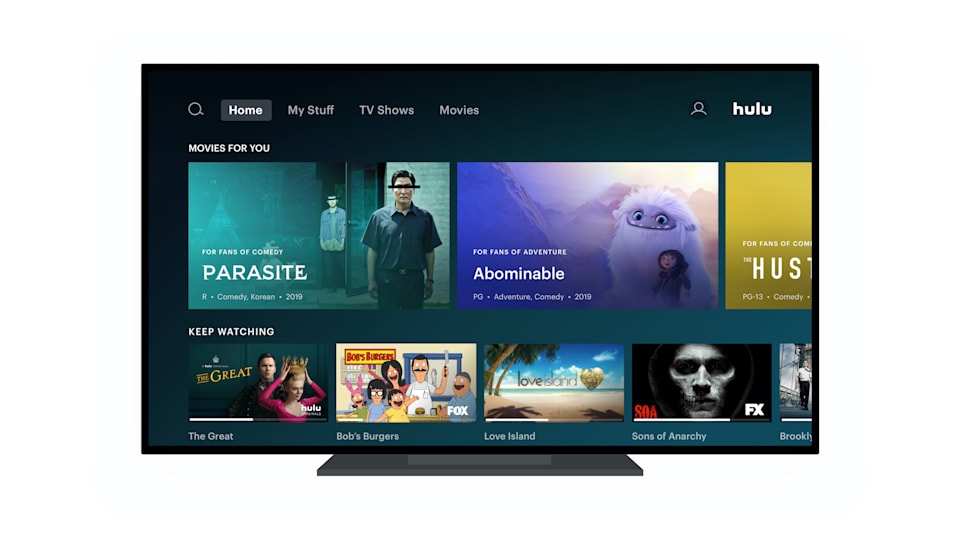
At a high level, Hulu is adopting the horizontally-scrolling trays that all the other major streaming services use. As you scroll up or down, Hulu will present various collections, including expected options like “continue watching” and “unwatched in my stuff.” Those collections will also include a wide variety of recommendations based on your viewing habits.
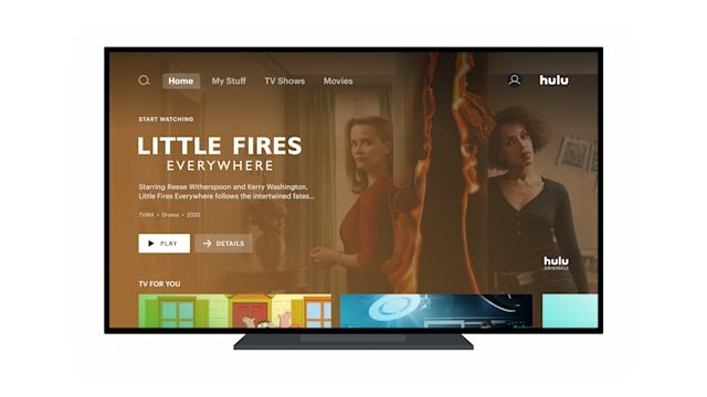
Hulu had these recommendations before; think things like “martial arts movies,” “teen dramas,” “Oscar-winning films” and the like. But the company has a few tricks to make its system stand out a bit from other options. The most obvious to viewers will be that each “tray” can display different-sized tiles. There’s a default smaller size, a bigger one that shows more information about the recommendation, and a full-size banner for additional emphasis.

The different sizes provide a much-needed visual break to keep you from getting some “scroll fatigue.” If you’ve ever endlessly gone down lists in Netflix or Amazon Prime, you’ll know the feeling. I haven’t used the new Hulu interface yet, but I can say from the demo I had that the varied sizes helped from going a bit cross-eyed while browsing.
Hulu isn’t just using different sizes to break up the scrolling — they’ll be used in different contexts depending on what the content benefits from. For example, your “continue watching” tray typically has small tiles so you can see more of the shows you’re already watching. On the other hand, a tray imploring you to check out new drama series could have medium tiles, so the art is bigger and there’s more room for information on why you’re getting that recommendation.
Similarly the large, full-screen tiles are used for something Hulu calls “high confidence” recommendations — which could be something trending in a big way, or something custom based on your watch history. As director of product management Jason Wong said, these recommendations are as likely to be a deep cut show or niche film as something that’s being watched by a lot of viewers.
As for what recommendations show up in Hulu’s trays, the company is naturally utilizing both human editors and algorithmic recommendations. But the company is also doing human-curated but machine-assisted recommendations all in one shot. That means putting a few human recommendations in and then letting the algorithm take over — but the algorithm will customize it based on your personal preferences, as well. The goal is basically to have everyone’s Hulu home page look different, even if you’re getting served the same category of recommendations.
The last change Hulu is making is subtle but smart. The top navigation bar has been significantly simplified, with simple headers for browsing all movies, TV shows or sports (along with tabs for the home page and your collection). Previously, the movies and TV show categories were buried among other collections Hulu showed viewers, so having an easy top-level navigation option to get to those is a smart change.
Besides the new home screen, the company says it’ll also roll out more tweaks to the experience throughout the year, though they didn’t get specific on what we should look for yet. Unfortunately for Hulu users on other platforms, there’s no word just yet as to when the new UI will arrive. But Hulu specifically mentioned aligning its UI with other products like ESPN+ and Disney+, both of which are available alongside Hulu in a bundle. Given that the company is looking to align with those other products, it seems like Hulu will be motivated to get that update out sooner than later.
Update, 12:55PM ET: Hulu let us know that while the new home screen is coming to Roku and Apple TV first, it should hit most other living room devices during the coming summer. We’ve updated that article with those details.
(26)


