Inside the design of the MTA’s super bright, extremely spacious, high-tech new subway trains
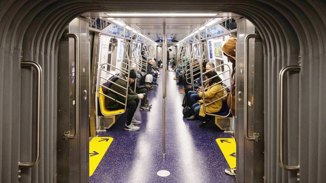
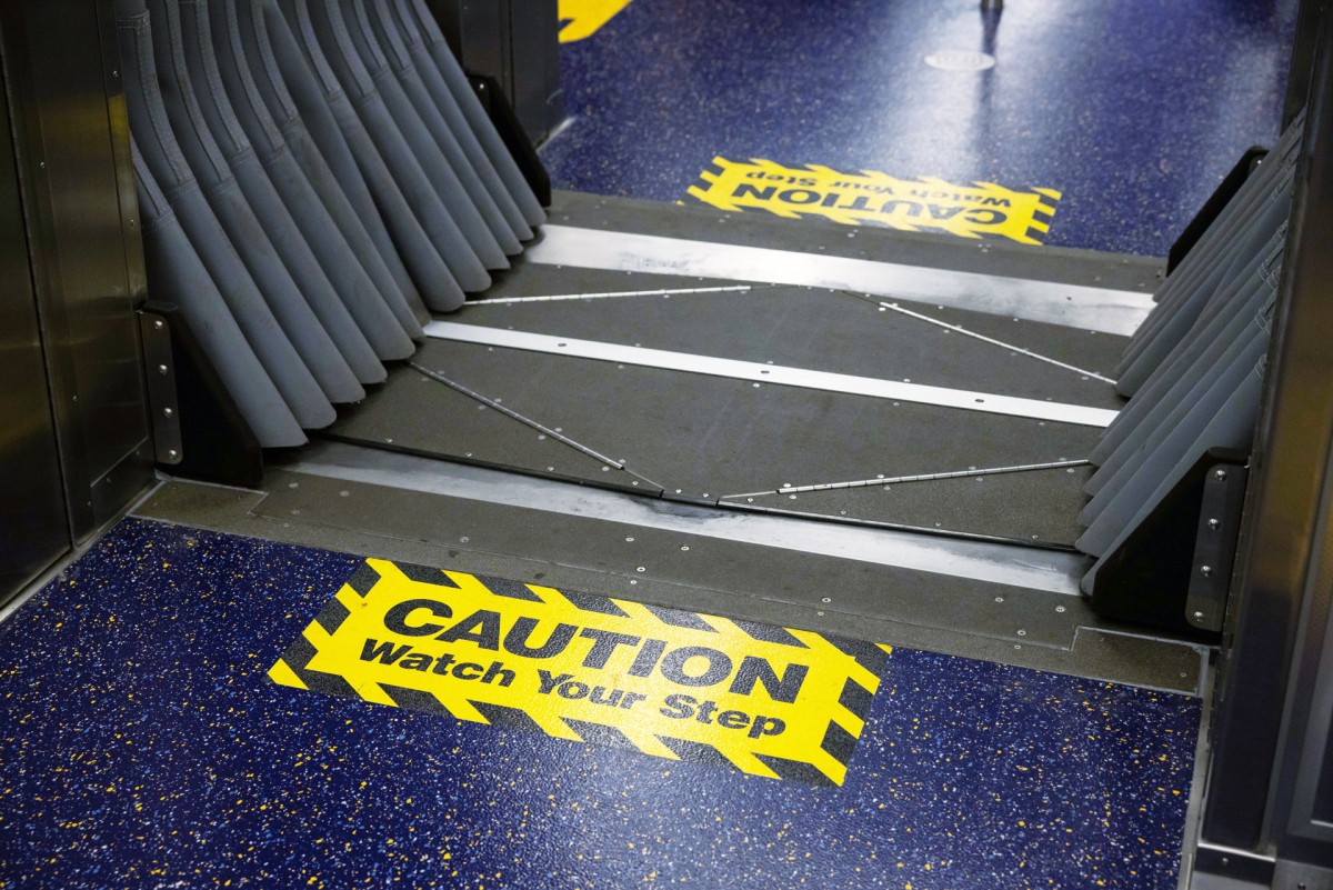
At long last, the MTA’s newest train, the R211T, has entered the subway system. It’s outfitted with wider doors, digital signage, and brighter, more vibrant interiors. And, notably, it has open-gangways, which allow for door-free passage between cars. It’s a feature that’s already been in use for years in Tokyo, Hong Kong, London, and Paris.
The response so far has been mixed. Subway enthusiasts are gleeful that New York City is finally catching up to the rest of the word with a design that helps reduce crowding inside. But some people are nervous that this new fluidity will mean wafting odors, end-to-end echoes of showtime, and encounters that might make them feel uneasy. “Imagine this at 3 a.m., you make eye contact with some dude six cars down, and he starts walking towards you,” read a comment on X.
This weekend, I waited about an hour on the C train platform until I was able to catch one of the new open-gangway trains and see for myself what the new experience is like. As the train pulled up, people waiting on the platform were excited that they happened to catch the new R211T. (Last year, the MTA introduced the R211A, a model that has closed-end cars but the same interiors.) Inside, everyone I talked to was ecstatic. “New York is finally a modern city!” a woman told me. I overheard a man joking with his son that the slightly bouncy gangway section meant that now you don’t have to climb on top of a car to subway surf.
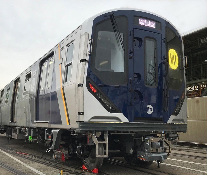
MTA’s new high-tech train
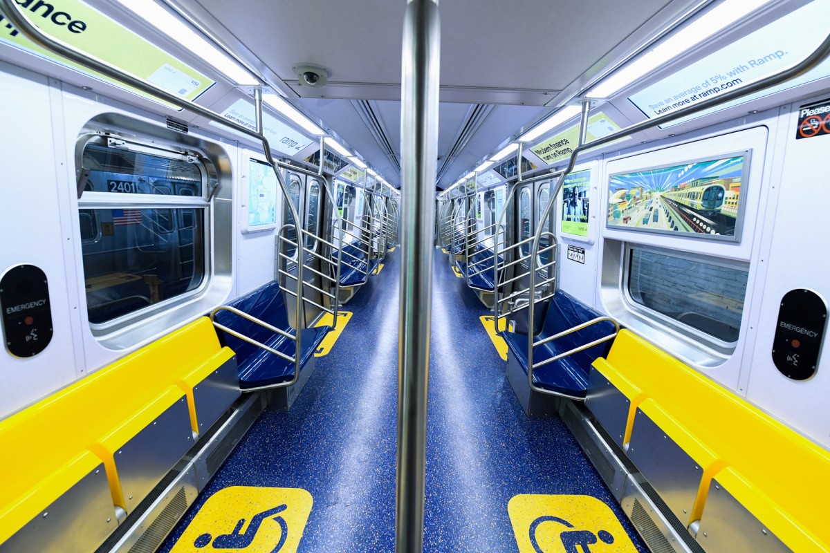
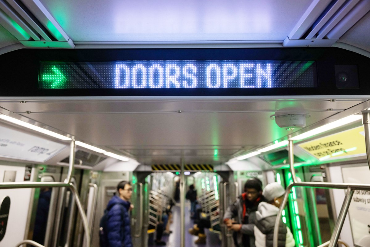
Inside, the R211 looks a lot like the last iteration of the “New Technology Trains”—models that the MTA has introduced since 2000—but more intensified. The lighting is especially bright, from the headlights on the front of the train to the 28 digital screens inside each car and new warning lights that line the door niches. Throughout the train, I felt like I was standing under the glare of a Ring light. I noticed a woman next to me was wearing sunglasses. When certain video ads came on the train and the door-opening lights began to flash, I felt like I was in an arcade.
The dialed-up brightness inside the R211 trains is part of the MTA’s strategy to make riders feel more comfortable. I was curious about this approach given how overwhelming the train felt. (No one likes the big light, after all.) A representative from the agency told me that customers generally say the brighter an environment is, the safer and more comfortable they feel. Because of this, trains, stations, and platforms have all started to become a lot brighter. The MTA is also replacing fluorescent lights with LEDs in older trains as part of this effort to improve customer experience in the system. This decision, and the interpretation of comfort, revealed a fascinating story about how many problems train car interiors are expected to solve.
Antenna Design, the New York City–based studio founded by Sigi Moeslinger and Masamichi Udagawa, is behind the interiors of all of the MTA’s New Technology Trains, the R211 included. When the studio designs public equipment—some of their other work includes the Metrocard machine and the LinkNYC kiosks—it aims for an overall appearance that “withstands the timestamp effect,” Udagawa explains, so that it looks good over a long period of time. To that end, the R211 represents an evolution of previous generations. “The funny thing about designing for public spaces is that it’s always a little bit of a social experiment, and you have to see how it works in its context,” Moeslinger says.
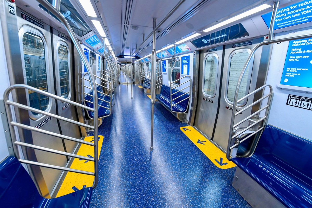
Like the models that came before, the R211 is designed to be safe, functional, and easy to maintain. There are more grab bars on the train, and the benches are darker to mask dirt and stains. Meanwhile, the walls and ceiling are white to help the cars feel more spacious and open. It turns out the same trick that people use to make their studio apartments feel spacious is also effective on a train. (Antenna Design specified white walls on the first train it designed, the R142, but the MTA asked to darken them because they got dirty fast.)
The trains are now illuminated by LEDs, which are more energy efficient and last longer than fluorescent bulbs. This switch also meant that the trains didn’t need light fixtures, which made room for a higher ceiling. Lastly, the lights are now angled outward facing standing passengers instead of directed toward the walls, which makes for more even, bright light throughout the car.
A more accessible subway train
The MTA also wanted to improve accessibility. Bright yellow seats on the end of each bench and yellow floor graphics very obviously indicate seating areas for seniors and people with disabilities. Antenna Design found that the signs and stickers in older trains were too easy to ignore. For example, wheelchair users told the designers that people often didn’t leave the flip-up seats that are meant to give them priority even after they asked. “Hopefully this increases social pressure that if somebody were not to give up their seats, other people will point out, ‘Hey, you have to do this. This is an undisputed wheelchair-parking area,’” Moeslinger says.
Improving accessibility also meant speeding up the flow of passengers as they enter and exit the train. The R211’s doors are eight inches wider than older models (any wider and there wouldn’t be any room for windows because the door mechanism is in the wall). There’s now a few inches between the doorway and end barriers because riders like to stand there and don’t move away when people are boarding. There’s also more signage that tells passengers which doors are going to open in order to give passengers time to prepare a route to the door before getting to the station. Twelve neon-green lights around the door frame illuminate as a train arrives at a station to let passengers know which side of the train will open. When the doors are about to close, they start flashing red.
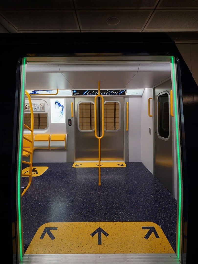
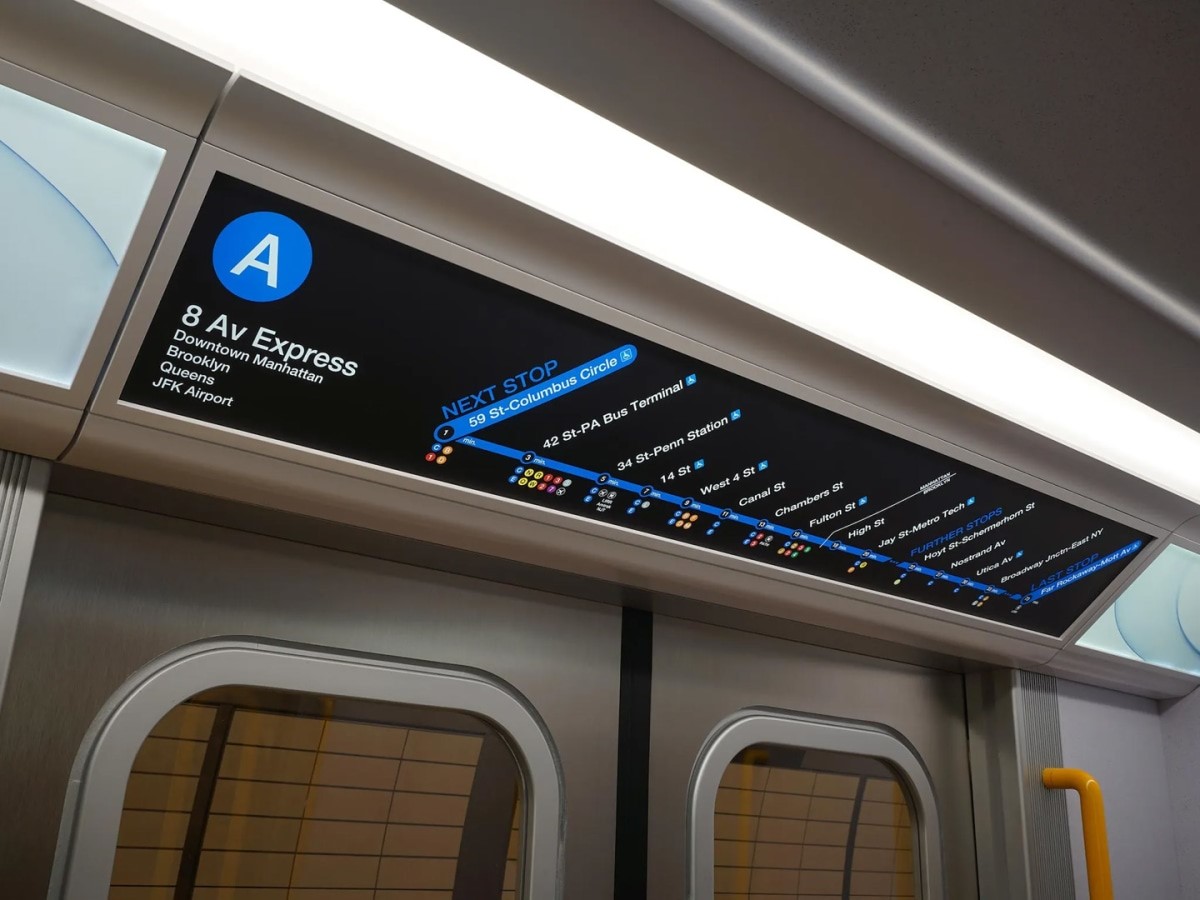
Antenna Design hopes this will be useful on crowded trains. It’s a common feature in Japan and Europe, but the designers made it extra obvious in the R211. “As we know, many people are just glued to their phones,” Udagawa says. “This can catch people’s peripheral vision even if they’re looking at their phone.” Meanwhile, there are new digital strip maps that offer more information than before. Now, they’re located over the door instead of over the window and when a train is at the platform, the screen changes to show a station map of stairs, escalators, elevators, and transfers and tells you where your car is in relation to them. The aim with this is to prevent people from exiting the train and stopping on the platform right in front of the door out of confusion on where to go next, which blocks foot traffic.
Designed for your attention
A theme emerged during my conversation with Antenna Design: Many of the new design elements are needed because people are oblivious on the subway. Either they’re distracted, they aren’t paying attention, or they just don’t care about what’s going on around them. So when something wants your attention, it has to work a lot harder. This is especially true of the advertising, which adds to the cacophony. It’s all on screens in the R211, the latest development in a digitization push that started in 2017. The screens cycle between MTA maps, notices, and PSAs and advertising. Some are static images, some are videos, and some are motion graphics. Outfront, the agency that manages advertising in the subway, told me that motion graphics and video ads are becoming more popular with their clients because riders remember seeing them more than typical print ads. These, too, add to the brightness of the cars.
After riding in the R211, I craved the dim lighting and screen-free experience in those lumbering 1970s and 1980s R68 cars with the orange and yellow seats. The MTA’s lighting guidelines (which are set by the agency) have changed since then. The design specifications for the R68, which is one of the oldest trains currently in service, call for fluorescent lighting that is at a brightness level of at least 377 lumens per square meter (lux) at standing height and 161 lux at floor level. The R211’s specifications call for an average lighting level that is no more than 200 percent and no less than 50 percent of 377 lux at standing height and 215 lux at the floor. The MTA followed lighting guidelines set by the American Public Transportation Association, which says that the minimum brightness for a seated passenger should be at least 215 lux. New trains in other cities have lighting that’s closer to that level.
I rode in Montreal’s new Azur cars for the first time this fall. Like the R211, they are open-gangway, have illuminated signals around the doors, and also tout lighting as one of its innovations. When I first stepped inside, I immediately noticed how much more soothing the lighting was. This is because part of the design strategy behind the Azur was to make Montreal’s trains feel more “agreeable.” Lighting is brighter by the doors to guide riders to the exit and dimmer between them to create “the impression of being in a lounge,” a spokesperson from the city’s transit agency told me. Additionally, the lighting is directed toward the ceiling to make it feel taller. The brightness level? 200 lux at the ceiling and 55 lux at the floor.
Last year, London launched new trains on the city’s Elizabeth line. Lighting, too, was a key part of the interiors, which were designed by Map Project Office. The floors are dark and the brightness gradually increases toward the ceiling. The seats are illuminated at 255 lux. “Conventional train lighting tends to be quite stark and overly lit,” says Scott Barwick, the industrial designer at Map who led the project. “Our approach to lighting was architectural with indirect lighting washing down either side of the carriage and reflecting off the white ceiling.”
The interpretation of comfort on the Elizabeth line and the Azur trains is much more sensory based than psychological like it is with the MTA. The reason for the difference may have to do with issues that are present at a higher degree in New York than in other large cities. For example, an increase in assaults in the system (despite overall crime being down) because of a mental health crisis, open drug use because of a lack of safe injection sites, and people sheltering in the subway because of the housing crisis. These aren’t interior design problems, but design is attempting to solve them.
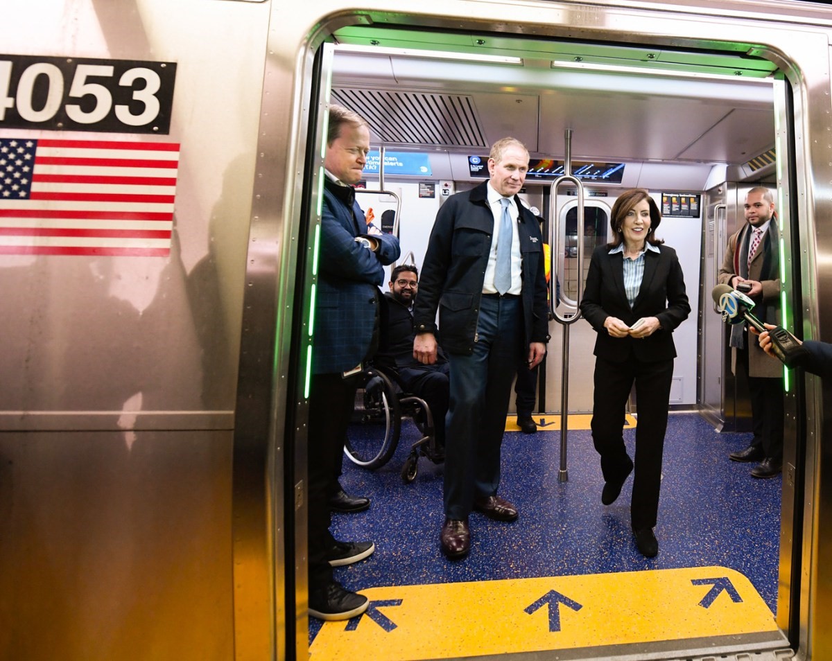
At a press conference celebrating the R211T’s inaugural run on February 1, New York Governor Kathy Hochul made sure to mention that there are more security cameras in the train. And they are designed to be more visible. “People are made aware that they are being watched,” Moeslinger says. “Some people don’t like that, but for the general feeling of safety, it’s a plus that you feel that you’re not alone in this car when somebody misbehaves,” Moeslinger says.
Over the past few years, the MTA has been trying to win customers back after ridership plummeted due to COVID-19. Last year, peak daily ridership reached 4 million people, which is still lower than the pre-pandemic average of 5.5 million people a day. The agency has framed this challenge as one of restoring confidence in the system and has taken a public safety angle to this work. Hochul and New York City Mayor Eric Adams have described this approach as “cops, cameras, and care.”
It’s true that increasing confidence in the system is important. And as Udagawa explains, confidence increases comfort. “The physical safety elements, the maintainability, the passenger information that lets people know what’s going on so they can plan their next move all generate a sense of confidence in the system and that helps people relax and that translates to comfort,” he says.
But building real confidence in the system will take more than shiny new trains. After my ride, I met up with a friend and told her about what I liked on the R211. She’s a graphic designer and I thought she’d appreciate the new wayfinding screens. “That sounds great,” she told me as I showed her a photo of them, “but I just want the trains to run on time.” Knowing that her train would show up and that she wouldn’t have to wait a long time for it was more important than all the bells and whistles. During drinks, I got a text from a friend who stayed on the R211T. He said that the train went out of service. There was a problem with the doors.
(36)


