Inside the design of Zoox, Amazon’s quirky, self-driving car
I’ve seen the future, and it looks a lot like an old, horse-drawn “wagon.”
That’s not my analogy, but the way the eight-person design team behind Zoox so often describes their self-driving car. First founded in 2014 and acquired by Amazon in 2020 for $1.2 billion, Zoox has spent nearly the last decade building an autonomous vehicle from scratch. Their goal is not to sell the car, but to build the rideshare service of tomorrow to challenge Uber and Lyft.
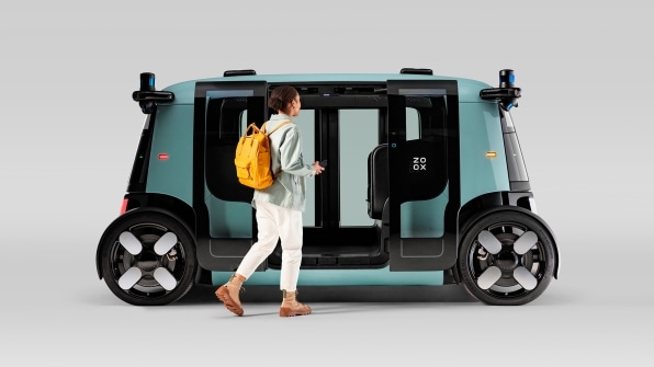
Few manufacturers truly question how cars are designed. Despite the fact that electric cars need no front engines, and true self-driving vehicles won’t require front-facing seats, our autonomous vehicles of today are still modeled after conventional cars. Waymo retrofits Chrysler Pacifica minivans with lasers, computers, and all sorts of screens and sensors for this job, while Tesla has squeezed more discreet self-driving tech into its vehicles using cameras, but keeping the car’s classic silhouette.
Zoox, on the other hand, gave itself no such constraints, which has enabled the company to build a unique vehicle like none on the road–something that resembles human-sized toaster. The Zoox car is smaller than a BMW i3, and completely symmetrical front to back, allowing it to take passengers forward or in reverse without even turning around. (The symmetry also means the vehicle is built from fewer unique parts.) Large automatic doors slide open on each side of the vehicle so it’s as easy to enter as a sun room, while two bench seats face each other inside, like in a wagon. And yet, despite all these unconventional decisions, Zoox believes the entire vehicle will still receive a five-star crash rating before it launches on public roads.
“It’s the benefit of designing from the ground up,” says Chris Stoffel, director of studio engineering and industrial design team lead at Zoox, who walked us through some of the finer points of the design.
A wagon designed like a giant gadget
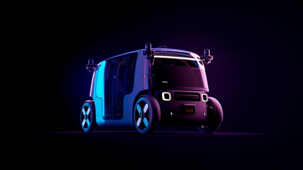
In many ways, Zoox’s form is self-explanatory. It’s a wagon—a room on wheels—and, as such, it’s shaped like that, while the design cleverly channels air through its own wheel wells to stay aerodynamic.
Instead of being inspired by the silhouettes of vehicles, “we’re going for more of a product aesthetic, something well established in consumer electronics,” says Nahuel Battaglia, senior industrial design lead at Zoox. Indeed, despite its soft edges, the entire design reads gadgety, like you could shrink it to the size of your palm and play with it.
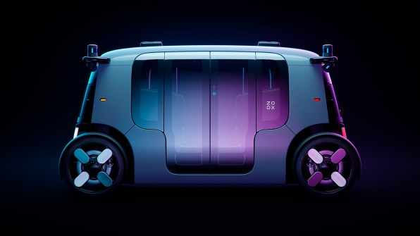
That’s only emphasized by the four sensor pods that stick out from each corner like antennas. The decision might seem lazy—why not integrate the Lidar depth camera and other sensors into the vehicle’s form? But the team frames their approach as a classic instance of form following function. Engineers needed to maximize the view of each sensor, and ensure the vehicle itself wasn’t blocking their view, so they requested a camera in each of the vehicle’s four corners. Each pod has 270-degree vision, which means their field of view overlaps in the sake of safer redundancy.
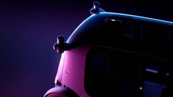
The other benefit of this overt pod design is that these are modular, complete with their own cleaning fluids to keep a clear view. Without being integrated into the body of the car, the pods can easily be pulled out for repair, or upgraded as technology advances. Zoox estimates its vehicle will operate for 400,000 miles, and as such, it has to be serviceable.
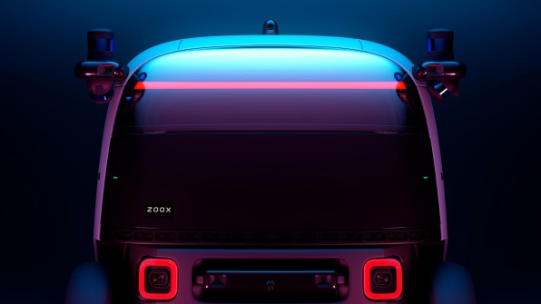
However, what’s less obvious about the exterior design is how it’s been built to communicate with pedestrians. The way we’ve learned to communicate with normal cars just won’t cut it for self-driving, because there’s no driver inside. Zoox’s unique vehicle body grabs someone’s attention, but the car itself is designed to elicit trust and broadcast its safety.
“It’s really about developing a language around self-driving cars,” says Stoffel. “We’re so used to, consciously or not, the way we interact with drivers and other objects, with the hand wave, the nod, the light flash.”
The vehicle features a 32-speaker array, which can actually beam sound to individual people within a 7-degree arc. “It was about smart communication and, in another sense, reducing noise pollution in cities,” says Stoffel. Instead of simply honking for the whole block to hear, the vehicle can chirp at someone who is crossing the street while looking at their phone. The quieter ride benefits everyone—including Zoox passengers who might be trying to sleep.
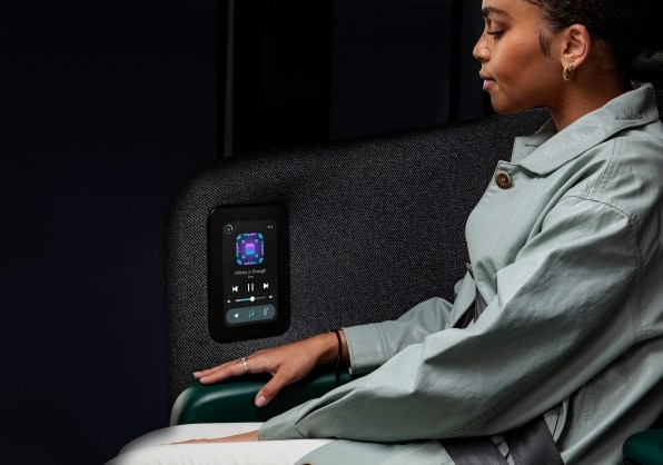
A predictable, but customizable, interior
The experience inside the vehicle is just as intentional. And it really does start with the aforementioned bench seats, which have two pairs of riders facing one another rather than sitting in rows. In theory, the idea makes sense—we’ve seen it used in trains for decades.
“I found that to be a careful balance. In those scenarios where you’re facing someone and they are too close, it’s almost too intimate,” says Stoffel. “[But] the architecture really allows us to shove those seats farther out than people expect. It’s more like sitting in a lounge or at a table than a tight compartment.”
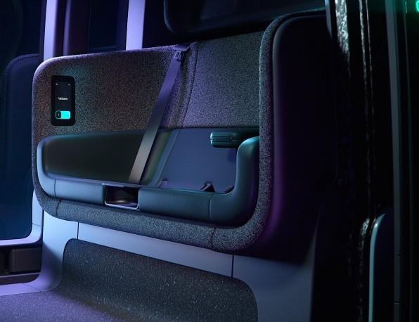
The seats themselves feature integrated screens for each person to choose music and tweak A/C, and they’re covered in a no-waste 3D-knitted textile. But what you won’t see are any seat adjustments or moving parts like articulating cup holders. That’s so Zoox offers a consistent feel every time you hop in.
“The experience is the same at 6 a.m. as 6 p.m.,” says Stoffel. “We always call that return-to state. If you have people coming in and out of the vehicle, it should always be the same.”
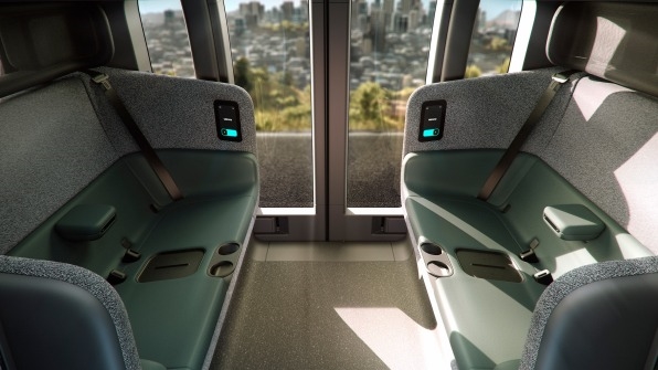
Yet the one catch with a bench design is its potential impact on passenger safety. Static benches usually hug the body less than form fitting chairs. “That means designing what looks like a couch . . . and having five-star safety!” says Stoffel. One breakthrough that made the design possible was a custom, horseshoe-shaped airbag, which deploys in accidents to wrap each bench up like a fragile item in bubble wrap.
Whereas the Zoox team believes they’ve figured out how to make this neutral, return-to state safe, they did work expression and customization into the interior through their spectacular “Celestial Headliner,” a ceiling with 600 individual LEDs that shine like stars in any color.
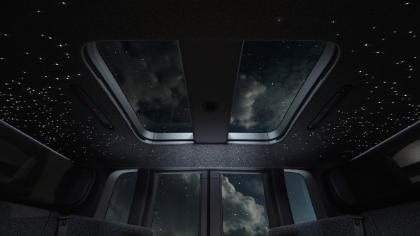
“Turned on at night, they are a really magical experience. We can use them for ambient lighting—they have a calming effect on the rider—and we could potentially use them for subtle notifications, like which doors are opening,” says Battaglia. He also imagines that as friends go out at night, they may book a full Zoox rather than sharing it. In these cases, the LEDs might even enter some controllable party mode for the evening. Anyone willing to spend a bit extra to rent the ride for themselves will be able to customize the vibe of riding in a Zoox.
“In the morning, you might want a serene commute. During the day, running errands is a different mood, and at night you want to go out, and that’s a different mood—this can do all that,” says Stoffel. “This is your ride, that’s the beauty of it. You don’t have to worry about owning the vehicle, but you get to enjoy this badass thing and make it your own . . . we’ve enabled the vehicle to be able to do that in the future as we roll it out.”
(104)


