Inside The Hip Redesign Of Holiday Inn Express
Ideo helps the budget hotel chain rethink everything from beds to mood lighting.
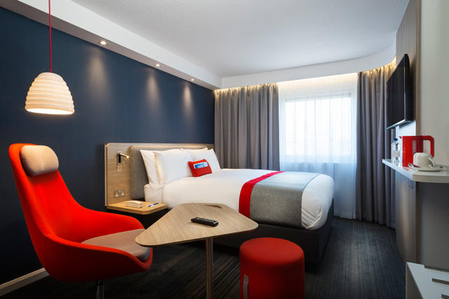
A modern chair. A sleek cafe table for you to set your laptop on instead of a bulky desk. A bed with a plush headboard for you to sit against. Remind you of the new Virgin Hotel? The features are all part of the new Holiday Inn Express “next generation” design for Europe.
Call it convergent thinking in the hotel industry. The redesign, informed by the research of design consultancy Ideo, includes everything from how you check in to the look and feel of the room itself. IHG (Holiday Inn Express’s parent company) has been profiting with its big brand approach to hotels, even as the market for boutique hotels grows. In hiring Ideo, IHG wanted to home in on the desires of today’s “smart traveler”—an all-encompassing term for business and leisure guests. The goal: to create a hip budget hotel that’s more about convenience than creature comforts.
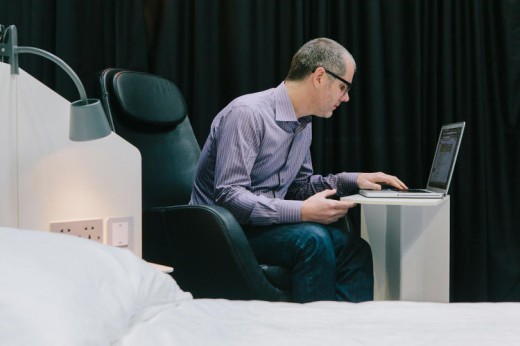
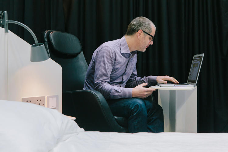
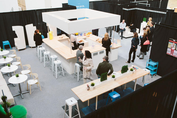
To help visualize the new design, Ideo constructed a mini Holiday Inn Express inside a warehouse. It was fabricated to be what Ideo Brand Experience Portfolio Director Chris Grantham calls a low-resolution prototype—that means rooms were furnished with cheap Ikea furniture, televisions were cardboard constructs, and the checkin desk was foam core. And then Ideo invited all sorts of people—from hotel industry professionals, to families, to business travelers—to try it out.
“Basically, we get them to really experience an environment. We’ll roleplay service interactions, check-in or over the bar. We’ll serve them some fake food. We’ll get them to sit on the bed or the chair and imagine using it,” Grantham explains. “We do have the occasional odd moment where someone might sit on something and it breaks because we didn’t tell them they can’t sit on that particular bit because it’s really fake.”
In a short, busy week of testing, Ideo observed all sorts of pain points in the hotel experience—sometimes leading to adjustments the designers hacked together in real time, sometimes informing unique furniture pieces they’d put into production.

Inside the room itself, Ideo’s designers realized that nobody actually uses a full-sized desk. So they replaced it with a cafe table (one that can actually slide left or right to accommodate your sitting position). They also realized how few people actually unpacked their suitcases, so they constructed an efficient combination bag holder/mirror/ironing board slot to handle all things sartorial. Another important observation: People like working from bed, despite how difficult it can be. So Ideo took a cue from the airline industry, and integrated “wings”—not literal wings, but bedside light/USB/power access like you might see in a business class seat. The designers also added a padded headboard that you can lean against instead of crunching a pillow behind your back.

“At one point we even had some trays in the bed where people could drop a laptop instead of leaving it into the bed,” Grantham says, “but that wasn’t practical in terms of the bed design.”
As cliche as it may sound, simplicity tended to go over better with testers, even when it came at the expense of creature comforts. When Ideo tested what Grantham calls “fancy mood lighting,” the consultancy found customers preferred a clear, functional switch. When designers demoed in-room entertainment from the hotel, they found travelers preferred to just use their Netflix accounts from their own iPad, or the hotel’s smart TV.
“The traveler is the show when they’re traveling. They’re very independently minded,” Grantham says. “Overall, it’s about providing this simple experience that they can connect with now and again.” In other words, he saw Holiday Inn Express’s task as less intervening to provide some unforgettable collection of moments to a traveler than stepping out of the way to accommodate his habits.
For the time being, the redesign will only roll out in Europe, but Ideo London has a U.S. team currently working on what a new Holiday Inn Express might look like in the states.
Grantham wouldn’t tip the firm’s hand on what U.S. rooms would look like just yet, but he teased that Europeans and Americans were different in at least one way: Guests there still crave a person-to-person experience when they arrive at a hotel, so the hotel provides it (though guests can also check in with an app). Americans, on the other hand, are a lot more comfortable with automation. “That guest is more on an extreme,” Grantham says. “‘I just want to be able to press buttons that will fly me through.’”
Holiday Inn Express Europe will roll out its next gen redesign toward the end of the year; the goal is for a quarter of its hotels to be updated within the next three years.
[All Photos (unless otherwise noted): Forpeople]
Fast Company , Read Full Story
(195)

