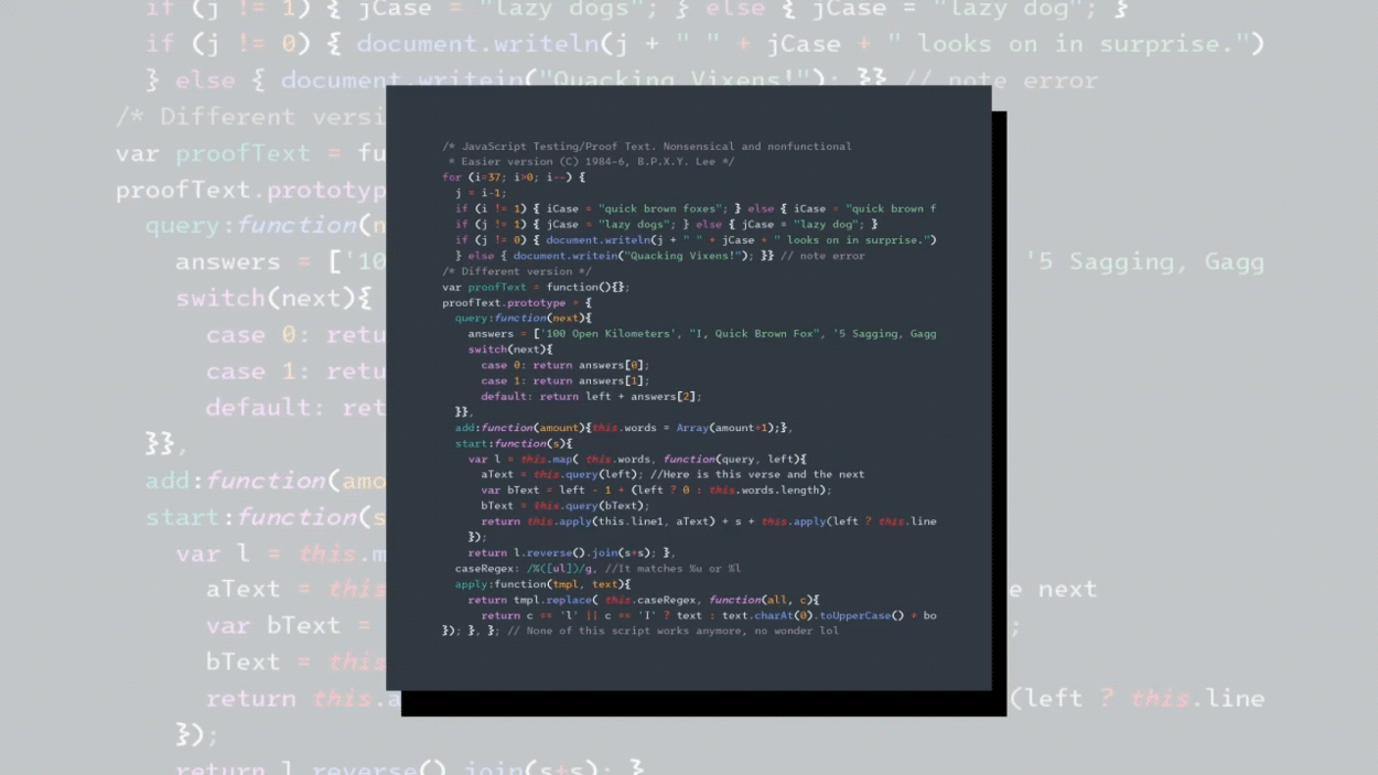
Intel’s new font for low-vision developers is causing design drama for coders
There’s a new font in town—and it’s already causing rifts on Reddit.
The font is called Intel One Mono, and as its name implies, it was designed by tech giant Intel, together with New York-based type design practice Frere-Jones Type and marketing agency VMLY&R. It joins a group of monospaced fonts designed primarily for developers—think JetBrains Mono, Fira Code, and Consolas. By definition, monospaced fonts consist of characters that have the same width and occupy the same horizontal space, making it easy for coders and programmers to tell the difference between long strings of characters. But here’s where Intel One Mono stands out: it was designed with and for low-vision developers. (It’s free to download on GitHub and will soon be available on Google Fonts, too.)
To ensure the font was legible and readable to its target audience, the team ran more than a dozen “live testing sessions” with visually impaired developers who were asked to write code using Intel One Mono. “I and a number of researchers would be sitting where I am right now watching these people program, and as they identified a pain point we’d stop and look at where it was coming from,” says Fred Shallcrass, a type designer at Frere-Jones Type.
Some of the feedback the designers received was particularly surprising. For example, some people were struggling to tell apart a capital “M” from a capital “N,” most likely because both letters have two vertical stems and some diagonals in between, which can be confusing. To make the letters more legible, the designers sloped the vertical stems on the “M” so it looks close to an inverted W. “The point at which the two diagonals meet in the middle gets shifted up to make it clearly a V shape in the middle, and then the two verticals get flared out a little bit to give it slightly more differentiable shape from the capital N,” says Shallcrass.
Similar challenges kept coming back with the “x” and the “y” which people struggled to distinguish, and the “e” and the “c.” In every instance, the designers meticulously tweaked the letters to make them highly distinctive, resulting in a fairly idiosyncratic font where every glyph is as different as possible from the other—all the way down to the curly brackets, which can best be described as extra curly.
This brings us to that Reddit rift. “This font would be great were it not for those curly braces,” one person wrote. “For someone that hates fonts sometimes because of curly brackets not being clear and evident, I’m officially switching to this font set because of the curly brackets,” wrote another.
The developers were equally torn, but the designers stand by them. “Part of our thinking in negotiating those responses is that reinforcing the identity of any shape is not just amplifying what is unique about that letter, but also making it clearly not some other letter, so foreclosing any confusion,” says Tobias Frere-Jones, the founder and lead designer at his eponymous studio. “If there’s a thing the curly braces do, which is that extra back and forth movement, the parentheses don’t do that, the brackets don’t do that, therefore these ought to do a lot of that.”
(26)


