iOS 16 could include improved notifications and new health tracking features
macOS Big Sur review: A mix of new and familiar
Big Sur looks different, but still works just as you’d expect.

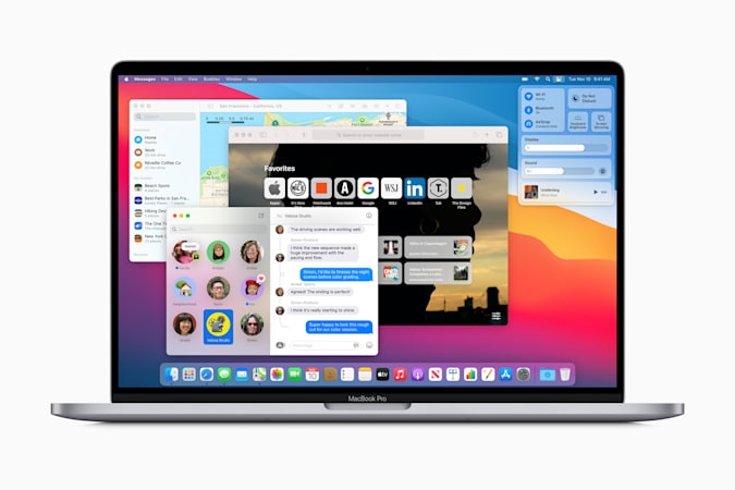
Big Sur is different from Apple’s usual annual macOS upgrades: the company calls it the “biggest design update” since Mac OS X arrived way back in 2001. That’s a little bit of a stretch, as 2014’s macOS Yosemite brought major design influences from iOS to the Mac, but Big Sur’s changes are nonetheless dramatic and significant. It’s not just visual, though; Big Sur also features major updates to key UI elements like notifications and control center as well as changes to core apps like Messages and Safari. Add it all up, and Big Sur feels like one of the more significant macOS updates in years.
I’ve been using Big Sur daily since the public beta was released this summer, and I’ve had the final version for a few weeks. If you’re used to how your Mac works and are concerned that the new software will be too much of a change, fear not. As with most recent macOS releases, Big Sur tweaks some things for the better without fundamentally changing how the system works. While the macOS and iOS get closer than ever in terms of design, Big Sur still feels unmistakably like a Mac — just with a fresh coat of paint.
As usual, upgrading to Big Sur is a pretty simple process — if you’re running macOS Mojave or Catalina, you can install Big Sur through the System Preferences app. If you’re on an older system, you’ll find it in the Mac App Store. After downloading, it took around 45 minutes to install Big Sur. Apple has all the details on how to install and what Mac models are supported here, but basically any Mac released in the last five years will work.
New design

I dug into Apple’s Big Sur redesign extensively earlier this summer, but suffice it to say that there are a number of elements subtle and significant that make the OS feel different than its predecessors. A bright desktop background, translucent menu bar, uniform icons in the Dock, rounded window edges and revamped toolbar buttons all immediately make Big Sur stand out. Apple has also updated the macOS system sounds, so things don’t just look different, they sound different too. But fear not — just about everything is still where you’d expect it to be.
While a bunch of Apple’s default apps, including Messages and Maps, have gotten significant updates, two of the most useful changes aren’t specific to any one app. Instead, they’re core changes to the UI: say hello to the new Control Center and Notification Center. For years, the Mac menu bar has hosted a variety of system controls like battery, bluetooth and WiFi as well as plenty of third-party utilities. That’s still the case, but there’s a way to make the menu bar a lot less cluttered while still having quick access to loads of settings. Like on the iPhone, Control Center offers one-click access to WiFi, Bluetooth, AirDrop, Do Not Disturb and multiple other controls.
For example, I’m at home pretty much constantly now, so I don’t change my WiFi settings… ever. So now I don’t have a persistent WiFi symbol in my menu bar, but it’s quickly available under the Control Center. On the other hand, I like having fast access to light and dark mode, so I pinned display preferences to my menu bar. And, if you’re on a billion Zoom calls every day, you can pin the “do not disturb” toggle.
Apple
The changes to Notification Center are useful, as well, and have improved since my early experiences. The fact that notifications are finally grouped by app is a major improvement, though you can turn this off if for some reason it offends you. I find that being able to clear all notifications from a specific app to be extremely handy, though. When you go into Notification Center, your most recent notifications are grouped at the top, and the rest are hidden and can be expanded. Below those most recent notifications are widgets, which were previously hidden on a separate page.
While I still feel a slight cognitive dissonance having widgets and notifications in the same pane, it’s nice that they’re always one swipe away. More importantly, the new widget design Apple introduced for iOS 14 and Big Sur is a huge improvement over the old style, with multiple sizes and actionable notifications. For example, I just got one for a new podcast episode, and clicking the “expand” arrow pulls up a sheet with more details and a “play” button. Of course, it’s up to third-party developers to implement rich notifications and these new widgets, so my Trello notifications are still pretty useless and static. But lots of Mac developers are already taking advantage, and support should only improve in the coming months.
Safari updates
While Big Sur’s visual refresh is the most obvious change, Apple has made a number of noteworthy functional updates to some core apps, as well. Safari received some of the most significant changesAs usual, Apple says that Safari is faster and more battery-efficient than Firefox and Chrome; all three browsers seem plenty fast to me at this point. I do generally find Safari to be less power-hungry than Chrome, but I also noticed that some tabs forced my 16-inch MacBook Pro into using the dedicated graphics, which murders battery life. I wasn’t able to determine what sites specifically caused the switch. But most frustrating was the fact that after a site pushed my Mac into using dedicated graphics, I had to quit Safari to get it back to running on the integrated chipset — even if I closed all my windows, it wouldn’t revert until I closed the app.
Probably the most noticeable change to Safari is a new start screen, which pulls together your favorite sites, frequently visited pages, Siri suggestions, stories saved in your reading list, tabs open from your iOS devices, and the new Privacy Report (more on that later). It’s a lot of info, but organized in a way that doesn’t feel overwhelming; you can also turn off any of these groups if you don’t want to see them. Plus, you can set a start page background, just like you can on Chrome. This is one of my favorite new Safari features, and it makes the default start page in Chrome feel pretty spartan.
Apple
Apple is also finally using favicon for all tabs — previously, you’d only see these handy little site markers if you had a tab pinned, but now every tab has a favicon. As you add more tabs, eventually the page title disappears but the favicon remains, and your active tab is a little larger with part of the title displayed. Other quality-of-life improvements include tab previews when you hover the mouse over a tab and more widely available browser extensions in the App Store. Safari now supports the WebExtension API, which Apple says will make it easier for developers to port over existing extensions.
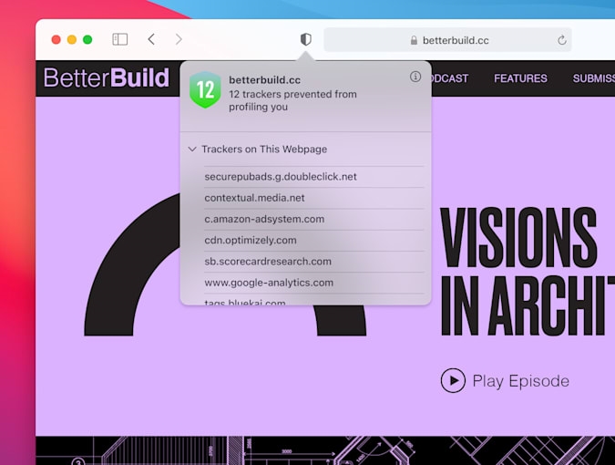
Probably the most noteworthy change is the aforementioned Privacy Report. Safari has had a feature to block website trackers for a few years now, but with Big Sur that information is front and center. Clicking a shield button next to the URL will show you the trackers that Safari identified and blocked on a particular site. From there, clicking a more info button shows you the full Privacy Report, which includes a more detailed look at how various sites follow your behavior around the internet, including on how many total trackers Safari blocked in the last 30 days and a full list of every site that you’ve visited that users trackers.

This just drove home how bad the state of website tracking is, but it’s not particularly actionable. I can’t stop (or don’t want to stop) visiting most of the sites on my list, but I can take comfort in the fact that Safari is actively blocking many of them. One security feature Apple added that is actionable is password monitoring. If you have a password saved for a particular site, Apple can identify if it has been involved in a data breach. Plenty of other password managers can do this as well, but it’s still a useful feature if you’re saving site login information in Safari.
Messages and Maps
If you use both an iPhone and a Mac, Messages is probably one of the most important apps you have on both devices. Fortunately, with Big Sur, the Messages experience is nearly identical across platforms. iOS 14 brought a host of new features like in-line replies, the ability to pin conversations, @ mentions and custom images for group chat, improved search capabilities — and they’re all here in Big Sur. Apple also brought a few features that have been in Messages for iOS for years over to the Mac, including built-in GIF search, Memoji stickers and “message effects” (like sending a message with a cloud of confetti or fireworks). So if one friend sends a message from their phone with the laser effect, you won’t see the boring text description “sent with lasers” on your Mac any more. It’s the little things.
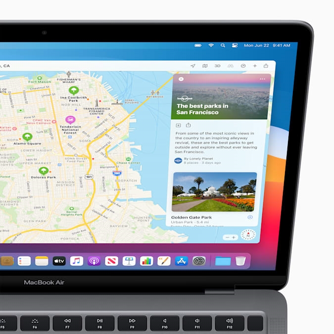
The Maps app has also received some major updates, again bringing it inline with what you’ll find on iOS. Google Maps devotees won’t care about these changes, but Apple Maps on the iPhone is actually very good these days (at least in the US). But, like Messages, Maps on the Mac was missing a lot of features that Apple had added to its iOS app over the years. Now, they’re in perfect symmetry. The biggest benefit is that any “guide” (basically a list of locations you save) you create on your phone will also be available on the Mac, and vice versa. Previously, Maps only let you add places to a single “favorites” list, but having multiple lists is far more natural. That way, you can save spots you want to visit on a vacation (when we’re allowed to travel again, sigh) separately from your favorite local spots, for example.
All those lists are saved in a new sidebar that also includes favorite spots like your home and work addresses as well as recent searches. Clicking the search field at the top of the sidebar also exposes a signature new Maps feature: Guides. These are third-party curated lists of local spots like restaurants to try and best photo-taking spots; you can save ones that you want to come back to. The guides range from trusted sources like Lonely Planet and The Washington Post, to smaller, more specific options like Fotospot and AllTrails. There aren’t a ton of guides yet, but you should be able to find some for most big cities. There’s guides from about 20 publishers, and hopefully it’ll keep growing over time.

Finally, Apple’s “Look Around” features, basically an answer to Google Street View, is on the Mac for the first time. It’s only available in “select cities” right now, but given the pace at which Apple has been improving on Maps lately, this will hopefully show up more broadly soon. As is often the case with Apple Maps, the company lags behind Google in a variety of areas, so Google Maps devotees likely won’t switch. But I prefer using Apple Maps for turn-by-turn navigation these days, so I’ve been using the app more and more — having the same experience available on my Mac is important if Apple is going to convert more users to its platform.
Odds and ends
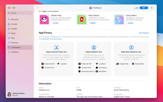
Those are the biggest updates, but Apple made nips and tucks across many other apps. One of the most significant is sadly one that I haven’t gotten to try yet: privacy labels that are being added to every app in the App Store. They’re not live yet, but when they are, you’ll be able to see what tracking data an app can collect, what personal information is linked to a user, and what data is collected but not linked to your identity. Unlike Safari’s Privacy Report, these cards in the App Store are the kind of thing you can check out before installing software so you have a better idea of what a developer might do with your personal information. Given how hard that is to keep track of, this is definitely a smart move. (These cards are coming to iOS soon, as well.)

Other changes include new video- and photo-editing tools in the Photos app, a redesigned “Listen Now” experience in Apple Music, the ability to assign reminders to other family members, improved search in Notes, and a bunch of other relatively minor updates. Most of these are features that Apple added to iOS 14, so it’s not surprising to see them show up on the Mac. I do appreciate the fact that, over the last few years of software updates, Apple has put more of a focus on keeping the feature sets for its core apps in sync across platforms.
Another change you may have noticed on the iPhone that’s now on the Mac is optimized battery charging. Apple says that it learns about how you use your computer and optimizes charging to avoid wear and tear on your battery. In practice this means that the OS holds the battery charge at 80 percent when the computer is plugged in for “extended periods of time” (like overnight). It then makes sure the battery is full at times when you typically unplug. I can’t say if this has made any difference to my battery yet, but I will say that my charging patterns on a Mac are less consistent than with my phone, which hits the charger every night. With my laptop, sometimes I’m plugged in all day and other days I wander around the house with only short charging breaks. But I haven’t run into any problems with my Mac not being fully charged when I need it, so I’m leaving the setting turned on for now.
Wrap-up
As with other recent macOS updates, I have little hesitation recommending you install Big Sur. It may look different, but the core experience of using a Mac hasn’t been blown up, and there are a host of meaningful improvements. People who buy a Mac with the M1 chip might notice more dramatic differences, because apps from the iOS App Store are already being ported to the Mac, but even that doesn’t change the overall experience. In some ways, it feels like the Mac is getting a little boring, for lack of a better word. But that’s just a negative way of saying that macOS is very solid, stable and mature at this point. If you want to see Apple experiment with what the computer of the future might be, that’s where the iPad comes in.
(63)

