IVF treatments are beyond stressful. The Aura app counters with compassion
Conceiving a baby can be remarkably stressful, and during in vitro fertilization—a notoriously grueling process that fails more often than it succeeds—that stress can compound. A commonly cited poll found that 42% of people undergoing IVF treatments report have suicidal thoughts, and multiple formalized studies have discovered that around 10% are considered to be at a clinical risk for suicide.
Aura Fertility wants to see these numbers improve. The U.K.-based, female founded and led startup launches its Aura IVF app today. Currently available to patients of three IVF clinics in the U.K. at launch, the app is anything but another gussied up fertility tracker. Instead, it follows a patient’s mood through the course of IVF treatments while providing information on the process, appointment scheduling, and even allowing the patient to connect face-to-face with a doctor.
Designed by Special Projects—a U.K. firm that’s known for taking a human-first approach—the app is specifically meant to avoid stressing or othering the patient.

“This is normal,” says Clara Gaggero Westaway, cofounder of Special Projects. “One in four women will have problems conceiving. There are a lot of taboos people don’t speak about.”
That philosophy is not mere lip service. Clara, alongside Adrian Westaway, her spouse and cofounder, designed Aura to avoid adding any additional stressors on the user—and without painting an unrealistic or overly optimistic view on success, either.
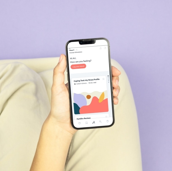
The app greets its user with an emotional check-in. This is the same mood-log questionnaire used across clinical research (you choose a face that most clearly matches your feeling), and it allows an IVF clinic to have a reference point for the emotional state of its patients.
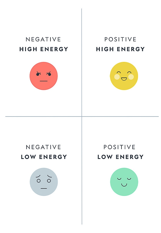
After that, you’re ushered into the content—the bread and butter of Aura’s patient service. Aura provides a database of articles explaining what to expect through the IVF process, but Special Projects had to consider how and when to surface these articles to the user. Should the database be searchable like Google? Or presented as a page of news more like an online magazine?
Through several conversations with IVF recipients, the Westaways of Special Projects found their answer. “It sounds super obvious,” says Adrian, “but folks we talked to said they were never given a timeline of what the [IVF] journey might look like.”
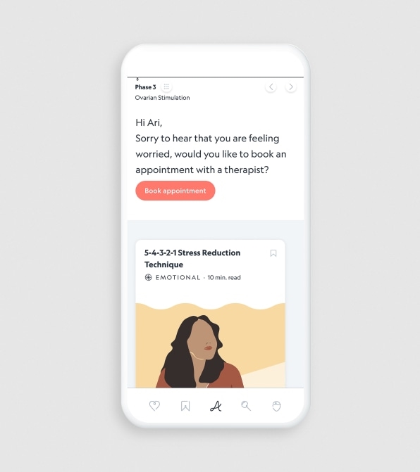
In response, the Aura app provides exactly four articles every day—no more, no less—focused on explaining the IVF process and providing psychological care. The content itself can be customized automatically in response to the patient’s mood log, providing evidence-based care like cognitive therapy to help people cope with stress. While this means that Aura has to write a lot of articles for patients, that figure is somewhat finite, since one round of IVF treatments runs six to eight weeks on average.
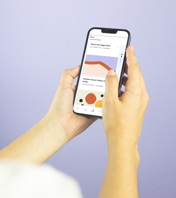
The story feed is a simple vertical timeline, like Twitter, but it is finite. “Often, when we design, [companies] ask, ‘How can we maximize the time people spend in the app?’ or ‘make people come back as much as possible,’” Clara says. “Aura said, ‘We’re open to deliver what the patient needs.’ We had a good discussion of the most we could achieve with the smallest time asked from the users.”
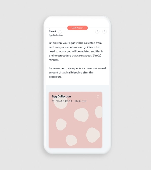
The cards disappear after they’re read (rather than being checked off, like a to-do list, which could feel like a chore, or worse, a race to a finish line that a patient might never reach). And while you can scroll down through those four articles in the app, you can also swipe right to take a peek at the next phase in the IVF process. This preview screen features nothing more than a short summary of what’s next, rather than another pile of articles.
That’s intentional UX, to offer the user some clarity and control without luring them into the sort of binge-consumption that could further feed their anxiety. Meanwhile, a backend dashboard at the IVF clinic allows doctors to set up a treatment schedule in the app and follow the patient’s progress, similar to medical dashboards at hospitals today.
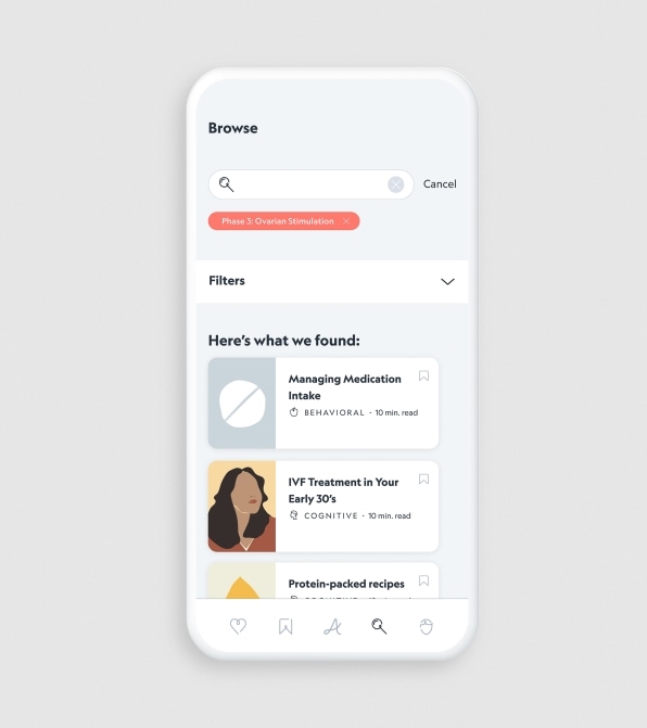
Since the app is available only to the patient, rather than a patient and their partner, Special Projects was keen to figure out how a couple could still read the articles together. They settled on a one-touch share button. When you first set up the app, you can enter your partner’s (or trusted person’s) phone number. From then on, any page you read contains a share button at the bottom, and a single tap will automatically text your chosen partner a copy.
All of these functions are crucial to Aura’s experience, but the visual design was just as thoughtful. Special Projects handled the UI and branding, which was designed with a welcoming, handwritten feel. Even the app’s custom icons look like pen drawings; none of them are quite complete by design so that they appear casual. It’s a manipulative touch, yes! But it’s also done in the service of the user, to create a sense of warmth within the app.
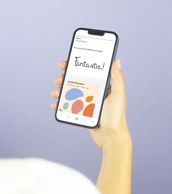
The other notable component of Aura’s graphic design is what’s missing: the heteronormative imagery of couples, cute images of babies, and even scientific imagery of eggs and sperm that dominate the apps and fertility clinics that Special Projects studied during the work.
“They might not do it on purpose, but the imagery is really hard for people trying to conceive,” Clara says.
Aura launches today in the U.K.; U.S. expansion is planned for 2023.
(36)


