Space: the final frontier.
That’s how Spock described it years ago on Star Trek. Here on earth, however, it’s most recently become the field of operations for a new branch of the Armed Forces: the U.S. Space Force (USSF).
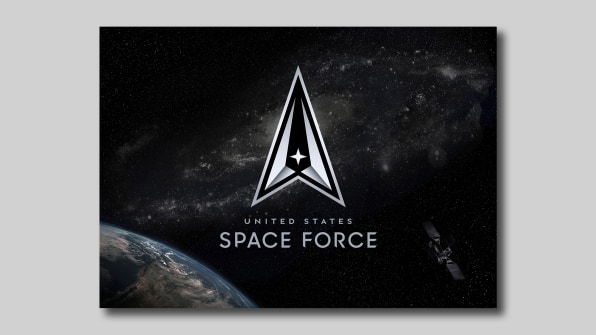
The Space Force revealed its official logo last week (not to be confused with the official seal released in January). Both have been called out for their similarities to the fictitious Starfleet logo, but the Armed Forces insists it in fact “honors…the Air Force’s proud history.”
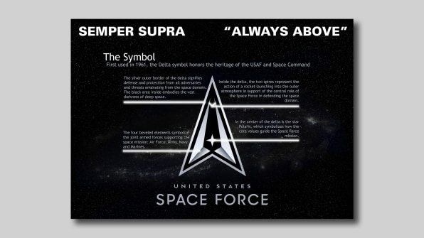
The new logo utilizes a delta symbol as its core icon (the delta was first used in 1961, USSF noted on Twitter). There’s a star in its center, which Space Force says symbolizes the North Star and represents how its core values guide its mission. That lays on a black field, embodying “the vast darkness of deep space.” This is paired with the Space Force’s official motto, “Semper Supra,” or “always above,” which embodies its “role in establishing, maintaining, and preserving U.S. freedom of operations in the space domain.”
But does it have the design chops to live long and prosper? We asked several design and branding experts to weigh in.

A missed opportunity to make its own mark
The delta shape is a design element that has been used by armed forces as early as 1942. Something as momentous, futuristic, and expansive as the formation of a new branch of the military is a ripe opportunity to push the boundaries of branding rather than reemploying expected tropes, similar to how the NASA Worm logo, introduced in the mid-’70s, presented a technical, strong, and unique design vocabulary. Unfortunately, this mark feels like it’s borrowing as much as it can from surrounding marks, so that it can fit in and feel legitimate.
—Lawrence O’Toole, cofounder and head of design at The Working Assembly
A version of the future that’s stuck in the 1960s
It’s generally understood that if a logo needs this much explanation, or defense from the unveiling, the presenter is already on the backfoot. That said, the comparisons to TV’s “Starfleet Command” are natural and legitimate.
When Star Trek first launched, it was designed based on on an idea of tomorrow that existed in the 1960s. We see this everywhere from Disneyland’s Tomorrowland to the Jetsons—The Future was designed from our 1960s eyes. America fell in love. And that might be the problem. We became addicted to that default, that tomorrow was best defined by the jet age—which was well over half a century ago.
We might do ourselves and the mission of the Space Force good by stepping away from 1960s nostalgia. Brilliant ideas and ambition came from that era, but I don’t believe that was the limit of our capacity. As such, perhaps we shouldn’t define our future-faring endeavors by that retro frame either.
The mission of the Navy is clear—so is its logo. The same can be said for the Army and the Marines—we know why they’re here and what they do. Between NASA, JPL, and the Air Force, we don’t look to Space Force with the same understanding of its capacity and purpose, and in the end, the logo doesn’t really clarify things. U.S. Space Force says this iconography has been utilized by space organizations since 1961 . . . five whole years before Star Trek. That might exactly be the problem. I fear we might be in a black hole tractor beam of nostalgia.
—Lawrence Azerrad, founder of LAD Design and designer of Grammy-winning Voyager Golden Record

A Star Trek connection that overpowers the logo itself
Although the new explanation for the Space Force logo’s concept is sound, its connection to the Star Trek logo somewhat overpowers that sentiment. No matter what brand you are creating a visual identity for, you have to be responsible for the brand’s image and how you want it to be perceived. Without that connotation, the design and execution of the logo is clean and on-brand with the logos of the other branches of the U.S. Armed Forces in that its strong diagonal lines and movement shine through. This is a prime example of how the brand identity that has been created doesn’t land as intended with the public and that disconnect is always going to be difficult to overcome.
—Nakita Pope, brand strategist and chief chick of Branding Chicks
A lack of nuance that underscores how unnecessary the branch is
We cannot assess this logo without reflecting on what it represents: a distraction from a grave and tragic moment in the history of our country.
The really remarkable thing about the Trump administration is that it takes the worst parts of America and amplifies them to an extreme level. Instead of focusing on saving American lives and reforming the justice system, Space Force imagines yet another nonexistent enemy as a pathetic attempt to rally an increasingly skeptical public.
If the Trump administration were a cheap reality show, this would be the logo of its fake space army. Its gray gradients and sliced-Futura typography look amateurish and unserious, and its sharp edges convey a cold, villainous, and defensive attitude rather than an authentic mission of safety, respect, and progress—values historically enshrined in American military institutions. The lack of nuance or detail further undermines any message of solidarity or gravitas. It would be threatening if it weren’t so ridiculous and tacky.
—Waqas Jawaid, partner, Isometric Studio
A muddled design that isn’t functional
I’ve always felt a personal affinity for delta’s symbol; I’m immediately reminded of Star Trek when looking at it. But I think the issue with the Space Force logo is less a matter of being derivative in its design than not having a clear vision of who its audience is, what function it serves, and how it can deliver the seriousness of its endeavor. Strong logos are simple, scalable, and memorable.
The goal is to create a mark that not only immediately identifies the company, but can also resonate timelessly. The new U.S. Space Force logo consists of graphical elements that don’t prioritize functionality. The combination of gradients and bevels cuts an otherwise simple geometric shape into segments to imply an artificial layer of gloss. Still, these extra edges only complicate the logo without adding anything meaningful or unique to the brand. It also isn’t made to translate well into a variety of digital platforms that require scalability—which should be a priority for the Space Force or any modern brand.
—Brian Nguyen, design lead at Work & Co.
(48)