Jony Ive’s emblem for King Charles III’s coronation is pure class
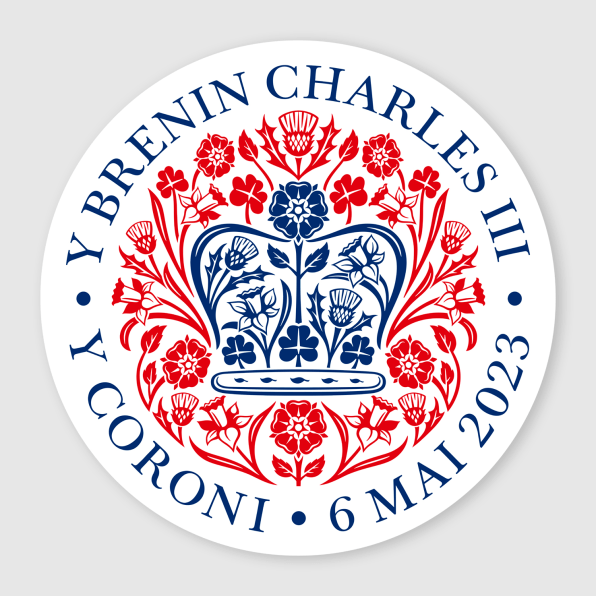
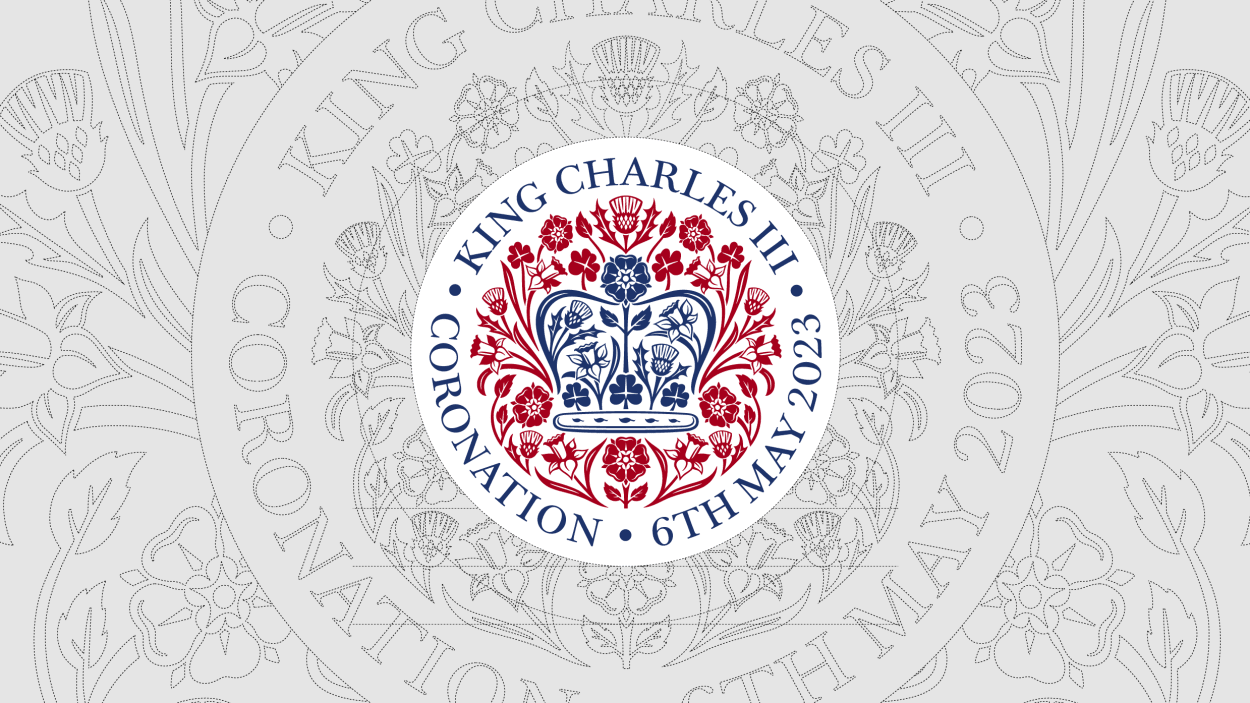
Once again, Sir Jony Ive has wandered into the idyllic fields of the British Isles hand-in-hand with one of his biggest fans, the artist formerly known as Charles Philip Arthur George, Prince of Wales and Earl of Chester, Duke of Cornwall, and Great Steward of Scotland. The (arguable) king of design has designed the coronation emblem for a literal king and her majesty the Queen Consort.

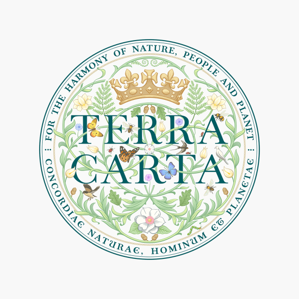
If the coronation emblem seems familiar, it’s because it’s not far from the seal Ive’s design collective, LoveFrom, created in 2021 for Terra Carta. Both feature intricate floral illustrations, tidy serif type, and a crown, of course.

Considering Ive’s Bauhausian heritage, the new coronation emblem could feel like a confirmation of a theme. Much like Terra Carta, it is an aesthetic valorization of the past, and one that runs counter to so much of what Ive pioneered while at Apple. Has Ive developed a taste for the organic and the filigree in his later years? Of course not. Like any other designer, he is serving a client’s needs and speaking the client’s language. Still, it feels like an “aesthetic 180” for a man who gave us the iPhone, a device so elegant and minimalistic that it became, in my colleague’s words, “a visual whisper, drawing you in to listen more closely.”
Back then, Ive told Fast Company: “So many logo marks . . . tend to be very binary, black and white. In a way, I think they speak to being quite exclusive. And I think we wanted to create a far more gentle piece of work. Just immediately when you see it, it feels vital, it feels alive. And you have a sense, I think, of optimism . . . and that it truly grows.”
The coronation emblem is an evolution of that same growth and love for nature. On the Crown’s website, Ive claims that “the design was inspired by King Charles’ love of the planet, nature, and his deep concern for the natural world. [ . . . ] The gentle modesty of these natural forms combine to define an emblem that acknowledges both the joyful and profound importance of this occasion.” The new design abandons the CMYK color of the Terra Carta logo in favor of the red, blue, and white of the Union Jack. The coronation emblem’s flora also has a deeper meaning: It represents the four nations of the United Kingdom—“the rose of England, the thistle of Scotland, the daffodil of Wales, and the shamrock of Northern Ireland.”
Ive’s team packed all of this (presumably nonnegotiable) symbolism into a solid symmetrical structure. The end result, I must admit, is a design that feels both classical and romantic, which one can imagine is exactly what King Charles asked for on his RFP. In Ive’s words, “The emblem speaks to the happy optimism of spring and celebrates the beginning of this new Carolean era for the United Kingdom.” I like to imagine King Charles smiling and politely applauding during the emblem’s presentation meeting, somewhere in one of Buckingham Palace’s thousands of rooms. For Ive, Cupertino must feel like a century in the past now.
(29)


