Kylie Minogue’s album shows that it’s not enough to just have great album art anymore
When Kylie Minogue’s first studio album came out in her native Australia in 1988, it was released as an LP and cassette.
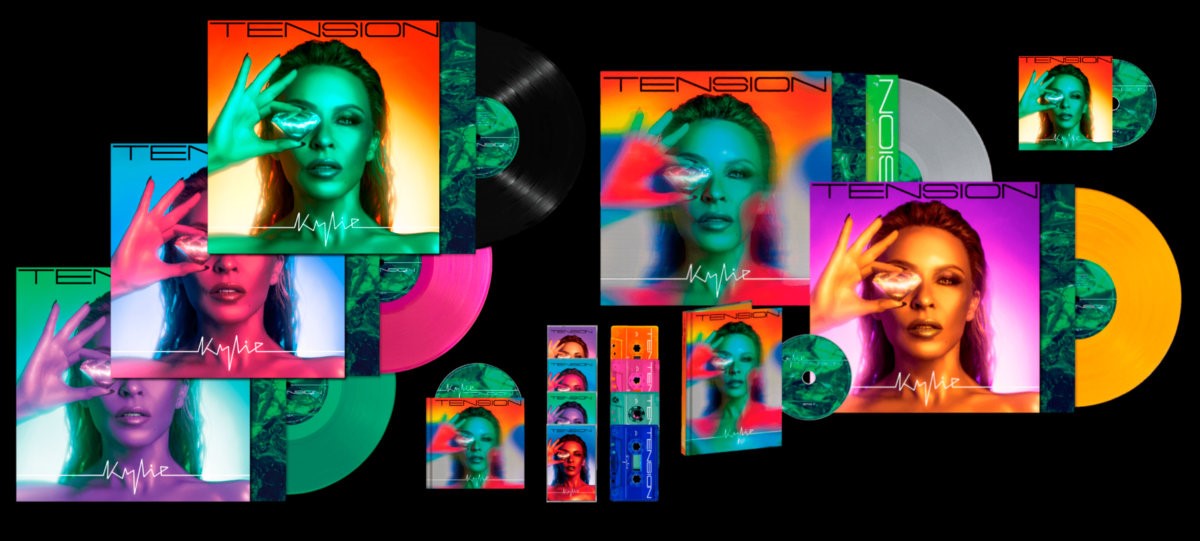
When her 16th album Tension came out last fall, it was available on vinyl, as a CD in standard and deluxe editions, a digital download, a limited-edition cassette in one of four color ways, plus a deluxe double-frosted clear cassette with bonus tracks. The Grammy-nominated lead single “Padam Padam” got its own merch line, complete with long- and short-sleeve tees, a hoodie, tote, necklace, and litho print. There’s candles, an ongoing “More Than Just a Residency” at the Venetian Las Vegas, and an album of extended remixes that was released last month.
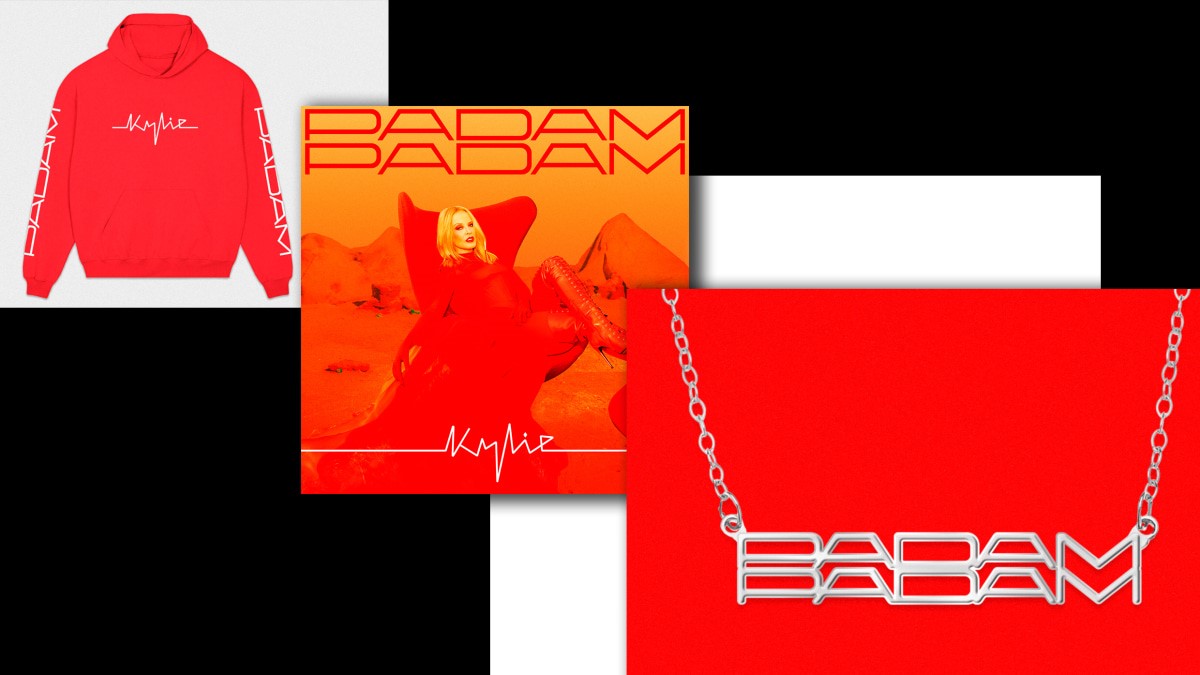
Tension is an album, but it’s also a “place” built by sound and sight, and it says something about the way music is marketed today. As music formats have multiplied, it takes much more than just an album cover to launch a major record and designers now must “world build” to extend a campaign beyond a single image and some music videos.
“The main piece of creative that you remember for those sorts of seminal records, it’s just one square image,” creative director Aries Moross tells Fast Company. “Now our jobs are to create these, like, millions of assets and content.”
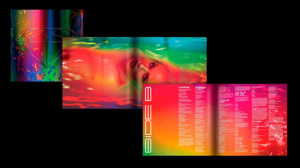
Moross, the founder of Studio Moross, has designed for clients like the MTV European Music Awards and the Spice Girls. Their studio worked with Minogue on the campaign for her 2020 album Disco and was asked to design the follow-up.
“I haven’t done a standalone album cover in a long time,” Moross says. “I’m more thinking about the bigger picture.”
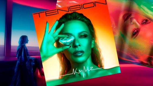
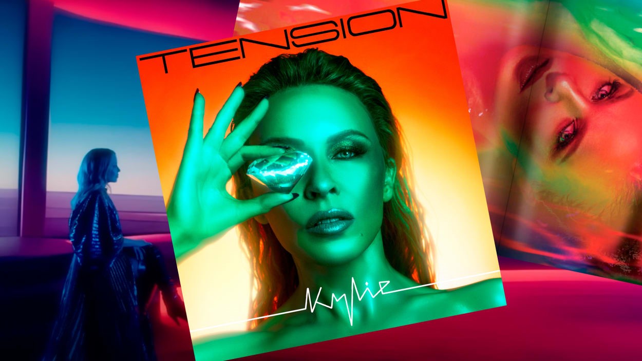
The world of Tension is bright and bold, made of jewel tones, gemstones, and otherworldly landscapes that evoke the desert outside L.A. but also Mars. The orange and green album cover, shot by Haris Nuken, shows Minogue holding a diamond over her eye (filmmaker Sophie Muller describes the image as “seeing life through a distorted element that’s been fused by tension”). The typeface used throughout the campaign is Yapari, a wide, futuristic sans serif from Power Type Foundry.
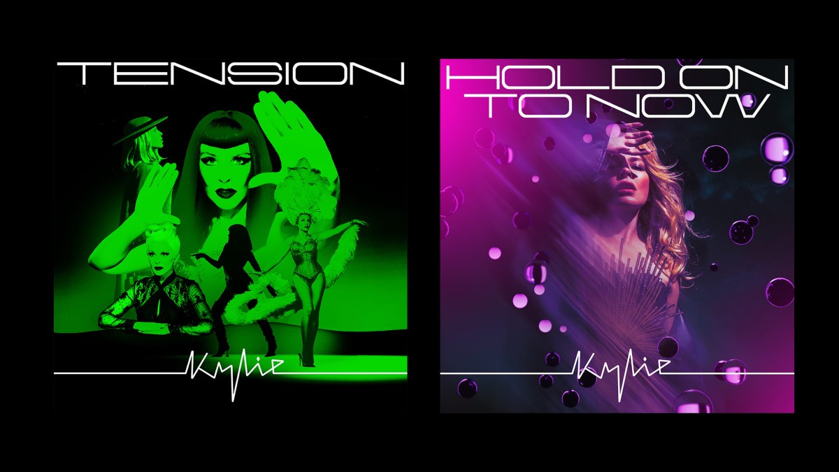
During the design process, some of the songs on the album were assigned a color. Named after the sound of a beating heart, “Padam Padam” is red, and “Tension” is green. “I will be like, ‘Kylie, what color is this song?’” Moross says. “This is something we do a lot in the live world when we design lighting and visuals for songs. We’ll be like this is the blue song, this is an orange song. So we kind of do the same thing but in an art direction world so we can kind of extract that and make sure that thread runs throughout the campaign.”
For designers, determining where to invest their time isn’t always obvious. Listeners might look at a lyric video bigger than they will an image of an album cover on a streaming app, and physical music isn’t even necessarily for listening, it’s for hanging on the wall (about half of vinyl LP buyers in the U.S. don’t even own a record player, a report last year from the music sales data company Luminate found). On a whim, platforms can alter what record labels and artists need from their social media and video assets.
In addition to “official audio” videos on YouTube, Tension has two music videos, five lyrics videos, and six “visualizers,” a format that’s evolved from the days of Windows Media Player to mini music videos in their own right. Though there are no costume changes in the visualizer for Minogue’s song “Things We Do For Love,” it’s just as visually engaging as a big-budget video.
Lyric videos and visualizers expand the way fans can interact with their favorite songs, but there’s a business imperative for these new mediums, too. Video views count towards chart placement, and as music revenue has fallen, musicians have turned to other revenue sources to make up the difference, like merchandise, live performances, and endorsements. That means a cohesive album campaign now has to be designed for more use cases.
Still, for the musicians and visual artists who work with them, there’s a strong desire to serve the music with a cohesive campaign. “Commercial aspects aside, I think artists really desire to create worlds for their fans and for people to be engaged with them and understand the music and the context of the music beyond just the sound of the music, but also through fashion, through politics, through all of these other things,” Moross says. “I think it’s very complex but ultimately I think everyone benefits from good visual campaigns.”
Some fans might even expect them. Nicki Minaj purposefully didn’t release music videos for her new album Pink Friday 2, telling Apple Music she wanted fans to “listen to the music,” and yet the Barbz (Minaj’s devoted fans) built out their own imagined all-pink Gag City with generative AI using the album cover as a starting point. A hit song is proof that what a musician is doing is working, but so is an aesthetic. Beyoncé’s Renaissance is a fashion, the Taylor’s Version project is a friendship bracelet shared with a stadium full of friends.
“I have not been asked to do so much visual stuff ever,” Muller, the filmmaker, says of the industry’s demands. She directed the “Padam Padam” music video, which included dancers in dramatic red outfits and lo-fi images, and the video inspired TikTok videos including one shot at a craft store and another made with Legos. The song became Minogue’s first top ten hit on the Billboard Hot Dance/Electronic Songs Chart and was a staple of critics’ end-of-year lists, but Muller says she’s never quite sure whether or not a video and song will connect that way.
“I can’t tell you why because if I could tell you why it would happen every time,” she says. When it works, though, she says it feels like every visual element lines up. “Ding, ding, ding, ding,” she says. “Like a Vegas machine.”
(25)

