London Tube font redesigned for the internet age
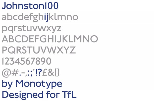
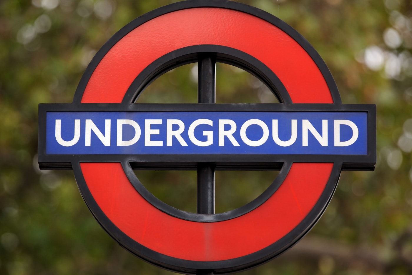
The iconic typeface of the London Underground is getting a revamp. Design firm Monotype has been commissioned to rework the letters, numbers and symbols that people look at every day while they hurriedly board Tube carriages, stand on platforms and look at maps. The “Johnston” typeface was unveiled in 1916 and while it’s undergone some changes since then, Transport for London (TfL) thinks it could use another tweak. The new “Johnston100” serves two purposes; to bring back some of the “soul” of the original typeface, which may have been lost in subsequent redesigns, and to make it more legible for apps and digital signage.

The latter is especially important given how often people now connect with the London Underground on the web and through social media. The first Johnston typeface was, of course, never designed for the internet age — as a result, there were no “@” or “#” symbols. They’ve since been added, but now Transport for London wants a more considered look.
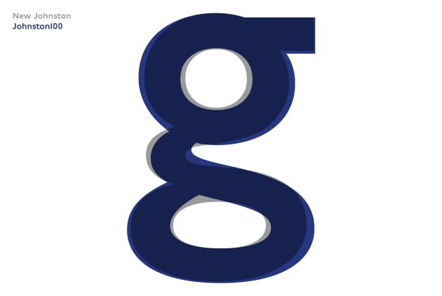
The Johnston100 typeface will come in five different weights, two of which are completely new for the Johnston family: thin and hairline. As their names suggest, these are the narrowest and most skeletal, making them useful for smaller screens and intricate designs. Monotype has also worked to bring back some of the original typeface’s quirks and idiosyncrasies — the lower case “g,” for instance, is no longer round at the bottom, but slightly diagonal so the hole in the middle is shaped like a teardrop. “The latest versions had started to become slightly mechanical, and a little bit uniform,” Nadine Chahine, Monotype Type Director explains.

The redesigned font will be rolled out in July, starting with printed materials such as Tube maps and posters. Over time, it’ll be expanded to train carriages and station signage — including the long-awaited Crossrail Elizabeth Line — as well as the web and other digital platforms.
(122)


