Long lines, stressed poll workers, COVID-19: How Stanford d.school is using design to streamline voting
They started the project by reviewing the elections system through three lenses: a system-level overview of the people and processes involved; what they could strategically achieve in a short timeframe; and what would be most beneficial to the users overall. “We found that poll workers and election administrations are powerful nodes within the election infrastructure and have a lot of responsibility to deliver,” says David Janka, a lecturer and designer at the Stanford d.school on the team.
After interviewing poll workers in Philadelphia, Janka, who has a background in infectious diseases, found that a major pain point was just a general sense of uncertainty around what their polling place would look like and how it would operate during the pandemic. (Especially considering poll workers tend to be older, more vulnerable adults.)
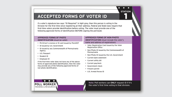
The d.school team looked at the potential for disenfranchisement on-site—where uncertainty could lead a poll worker to turn someone away who’s actually eligible to vote.
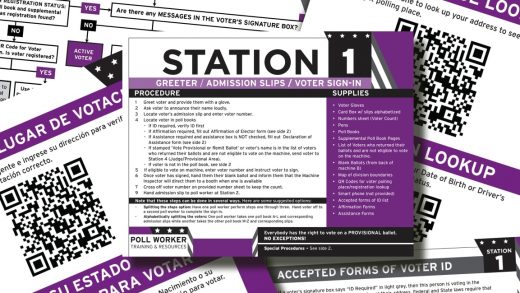
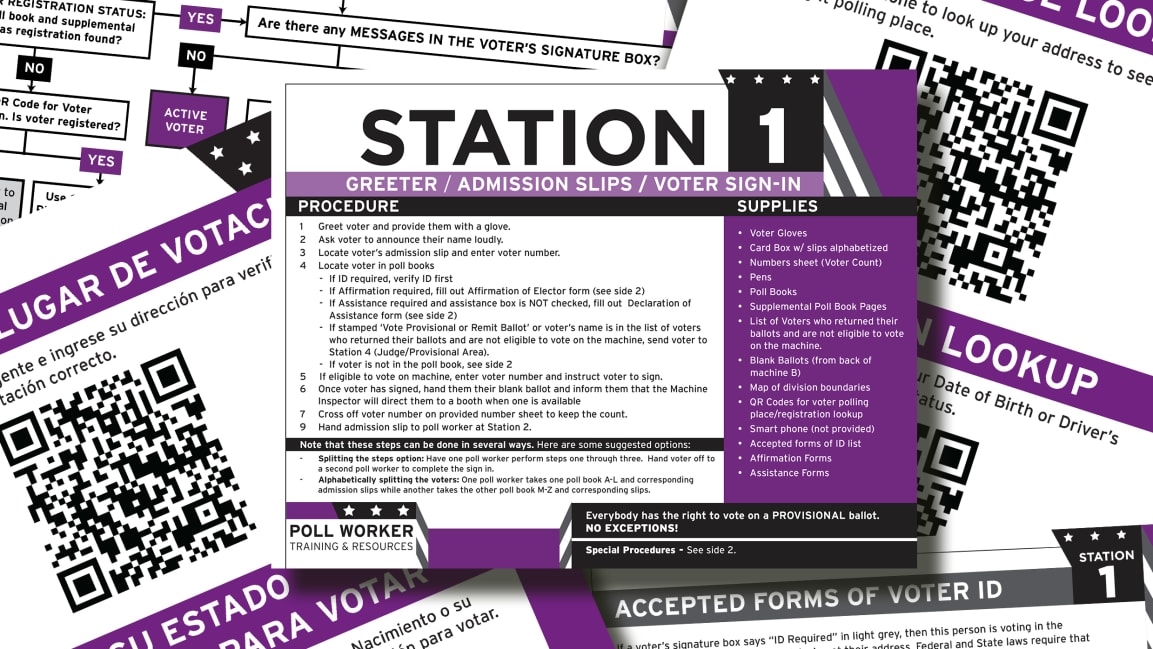
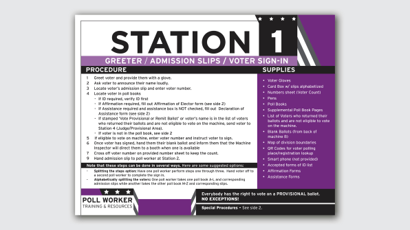
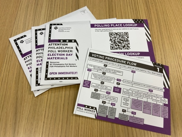
Two local poll workers had already been working on tools to simplify the process. D.school used these as a starting point and collaborated with the Philadelphia nonprofit Committee of Seventy, poll workers, and local designer Jeanne Maier to create a set of new visual tools and resources. The set includes cards that poll workers can use to quickly determine eligibility requirements, like a list of accepted forms of voter ID. There’s also a decision tree card to help poll workers determine a person’s voting status and subsequent steps to process their ballot. This “will mitigate stress and help them feel like they have the resources they need to make decisions,” Janka says.
The team also helped streamline and expand an existing tool: QR code signs that voters can scan while in line to check their voter registration status and make sure they’re at their correct voting station. Together, they gave it a look consistent with the overall suite of resources and made it available in English, Spanish, and Vietnamese.
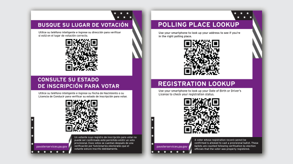
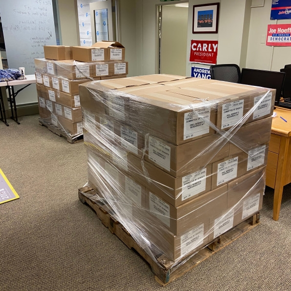
The Committee of 70, which handled distribution, has mailed thousands of these resources to Philadelphia election officials so far, Janka says. Meanwhile, the QR code sign has expanded from one location to about 1,000 voting sites across the city, he says. It’s all part of a larger resource guide that’s available free to download. The d.school’s work in Philadelphia is just one piece of its nationwide project, which also includes signage to help find polling locations, a healthy voting guidebook, and explainer videos in partnership with the Michigan Secretary of State.
Janka plans to interview poll workers who used the tools after the election. In the meantime, he sees it as an example of how design can help relieve strain on an over-burdened system. “In the context of election and democracy, this is a way for designers to serve.”
(25)

