Meet the man behind the moody visual style of “Atlanta”
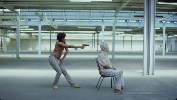
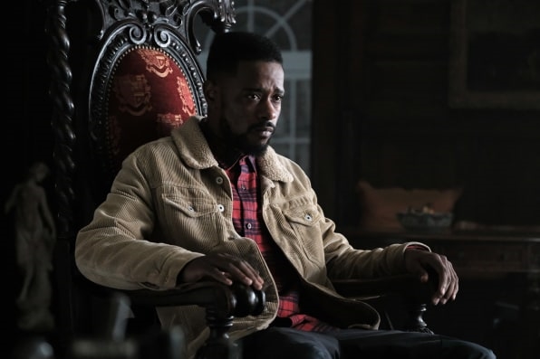
Since FX’s Atlanta premiered, creator/star Donald Glover and series director Hiro Murai have been lauded not only for bringing much-needed diversity to the small screen, but also for broadening the visual parameters of what a TV show is capable of. With episodes like “The Streisand Effect,” which featured a black personification of Justin Bieber, or the curveball horror show of “Teddy Perkins,” in which Glover played a reclusive white man, Atlanta is constantly bending genres and teetering on the edge of surrealism—not unlike Glover and Murai’s bold music video for “This is America,” which went viral.
For all the dynamism between Glover and Murai, there’s a third Musketeer in the mix who’s been instrumental in executing these creative visions: colorist Ricky Gausis.

Born in the U.K., Gausis has established himself as one of the foremost colorists, mainly for music videos including Zayn and Taylor Swift’s “I Don’t Wanna Live Forever,” Sam Smith’s “I’m Not The Only One,” and Lorde’s “Green Light.” He’s responsible for creating or enhancing the mood through color grading.
In 2014, Murai directed the music video for Queen of the Stone Age’s “Smooth Sailing,” and Gausis served as the colorist. The two have worked closely ever since, with Murai bringing him on to Atlanta, “This is America,” and several Nike ad campaigns.
Speaking about Murai, Gausis says, “I love him because he’s very sure about what he wants–he knows the direction he wants at every part of the process. But at the same time, he manages to stand back and let me do my own thing and that gives me a lot of creative freedom. He also has a very similar aesthetic to me. We like images that have a darker, moodier vibe, nothing too candy-coated.”
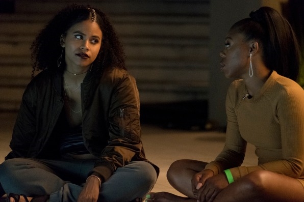
That aesthetic played a key role in season two of Atlanta.

“Everything stemmed out of the conceit of ‘Robbin’ Season,’” Murai says, referring to the subtitle for the second season. “Thematically, it’s sort of darker and a little more anxious and visually moodier too and because Robbin’ Season is technically end of Autumn, the beginning of winter–the city itself looks very different than the first time we shot season one. Season one was in the middle of summer, so it was very lush and green, and Atlanta is covered by trees. Season two, because we’re in the dead of winter, it was a little more barren and a little more subdued. I think that informed a lot of our choices about where we wanted to take it.”
Gausis went from working in the U.K. in an aesthetic that he describes as “softer and more ethereal,” to the Los Angeles, where he says “the market was asking for a richer image.” Season two of Atlanta played well into that and shined a spotlight directly on Gausis’s work.
“There are a lot of times people come up to me in the commercial world as a direct result of Atlanta, saying we want that ‘Atlanta look’ on our commercial,” Gausis says. “I’m scared of becoming that person. I’m doing everything I can to mix it up. I never say that I work for Atlanta. I try not to bring clients’ attention to it. I certainly don’t want to saturate the market with the ‘Atlanta look.’ I want it to be unique to that show.”
The high demand for a specific visual style has forced Gausis to expand his boundaries. Sure, the nature of a project largely dictates how he approaches the visual palette. But in the creative agency space in particular, Gausis says colorists have been granted more creative license over the years. So he has pushed his style to land somewhere in between what he considers the American and European approach. Case in point: “This Is America.”
The song takes a direct, unflinching look at race relations and violence in the United States. As a shirtless Glover (or Childish Gambino, his alter ego in the music world) dances in the foreground, a second narrative unfolds in the background: people run around wielding various crude weapons, a car is engulfed in flames, a masked figure dressed entirely in black gallops by on a white horse. The video ends with Glover running toward the camera from a hoard of cops.
“The content is so intense. I think a lot of people would lean themselves into something very dark and grave, but that would’ve been completely counterproductive,” Gausis says. “The whole video is obviously Donald’s performance, but the message was really behind him. We wanted to have the mood and have atmosphere and have some richness but not go perhaps as dark as we historically have, whereby we’d be losing some of the information in the back.”
“That’s a good example of a video where a colorist can accentuate what’s been shot but also really change the whole video,” Gausis continues. “If you were just a little too heavy handed on that video, the viewers wouldn’t see quite as much as they wanted to in the background. In the wrong hands, that could’ve actually completely changed the tone of the video and impeded the message that it was trying to put out there.”

Now, looking ahead to season three of Atlanta, Gausis and Murai are being careful not to overextend the visual lane they’ve carved out for themselves. “It’s a very nuanced approach to how we can expand the universe but still have it feel like our show,” Murai says. “It goes to pretty much to all the collaborators we have on the show. On the visual side, Christian Sprenger, the D.P., and Ricky, the colorist—these guys have been on the shows since season one, so they’re a constant on the visual palette. So when the script tells us to reach into a different genre or play with a different palette, we’re still working with the same people who know the identity of the show.”
Restraint and letting the script dictate the tone will continue to be the guiding forces. “Hopefully we never find out what too far is,” Gausis says. “We’re pushing it, hopefully, within the bounds of good taste. If you push it too far, you’re actually missing the point of the scene.”
(22)


