Meet the man who brought Swiss Modernism to corporate America
Meet the man who brought Swiss Modernism to corporate America
Fred Troller came up alongside Paul Rand and Massimo Vignelli. So why haven’t you ever heard of him?
Fred Troller and his family liked to entertain. On any given holiday, it was routine to see such friends as Paul Rand, Rudolph de Harak, Massimo Vignelli, and Keith Godard—a veritable who’s who of midcentury design maestros—moseying about their home in the suburbs of New York City.
Troller came up in a formative moment for graphic design, and he was considered by his peers as a preeminent designer of the midcentury era. Yet Troller’s work—unlike his friends’—has largely been lost to time. And that’s exactly what his daughter, Meret Troller Piderman, is trying to rectify in a new book from Unit Editions, Fred Troller Design.
“Everybody knows all of these guys who were his friends,” she says. “I’m hoping that he will finally get recognized—that people will see who he was.”
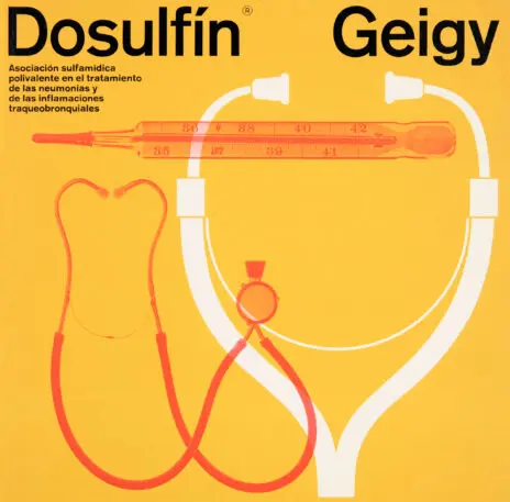
Troller came to New York from Switzerland in the early 1960s, a time when visual culture was primed to explode with the electric design bloom of psychedelia. But Troller brought something wholly different with him: Swiss Modernism. Troller was a critical force in importing Swiss Modernism to the States, but what makes his output particularly unique is how he expounded upon the traditional Swiss style with his blend of playful geometry, bold color, and visual wit.
“Swiss Modernism and the Swiss grid can feel kind of rigid,” Troller Piderman says. “And he was able to adhere to that, but also bring in his creative artistic touch and his sense of humor and turn it into something that’s not just clear, concise, and easy to communicate with—but something that’s actually beautiful.”

Around 1960, the Geigy Chemical Corporation hired Troller as head of the art department, and in a span of around six years he would lead the charge in forging the influential “Geigy style”—the aesthetic Steven Heller and Greg D’Onofrio aptly describe in their book, The Moderns, as “a general design spirit represented by white space, grids, geometric principles, stylized and abstract graphics, Akzidenz-Grotesk (and occasionally Univers and Helvetica), visual metaphors, experimental photography, new printing techniques, and vivid saturated contrasts.”
A pharma company might seem like an odd breeding ground for graphic design innovation. But as Geigy’s ads, packaging, posters, and ephemera hit the market, they made a profound impact by virtue of looking like nothing else. It’s a testament to Troller and co. that in 2024, “Geigy” is synonymous not with a chemical company, but rather a graphic style.

Though perhaps “style” is the wrong word. “I show Troller’s work for Geigy to student groups at least once a week, to let them begin thinking of design as more than a style, but as a way of making and thinking,” says Alexander Tochilovsky, director of the Herb Lubalin Study Center of Design and Typography at The Cooper Union. “This period of work reveals an ideology underpinning the visual choices. To me, it also points to a moment when design comes into what we see it as today—a transition away from visual styling to design thinking.”
Geigy may be Troller’s legacy, but it’s ultimately only half the story. After leaving the company, Troller launched an eponymous firm and worked with major corporate clients, such as IBM and, notably, book publishers, turning out an array of jackets that stand the test of time decades on. From books on philosophy (Plato’s The Republic and Other Works) to academic tomes and sci-fi (Paul Anderson’s Brain Wave), Troller had a knack for distilling hundreds of often-heady pages down to brilliant and singular graphic images—not unlike Geigy at large.
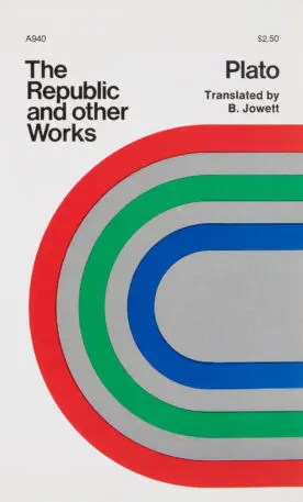
So why is he lost to so many design history books?
Troller Piderman believes that it was perhaps because he’d bought a converted carriage house for his family in the suburbs of Port Chester, New York, which became the home of Troller Associates. While it was large and undoubtedly great for entertaining those industry greats on Thanksgiving and New Year’s, it was also a veritable world away from the Manhattan design scene. She adds that Troller was a bit of an introvert who wasn’t a fan of self-promotion. (Something that, it should be noted, many of his contemporaries excelled at.) Troller eventually closed up shop at Troller Associates and shifted his focus to education, becoming chair of graphic design at Alfred University. He died in 2002.
After years of pondering the idea of a book, Troller Piderman reached out to design historian Steven Heller, who had written her father’s obituary for the New York Times. Heller connected her with Adrian Shaughnessy of Unit Editions, which is currently crowdfunding the book. Designed by Dani Piderman—who studied under Troller, and is married to Meret Troller Piderman, making the endeavor a true family affair—the book features 60 pages of Geigy work across 256 pages, more than 50 pages of book covers, as well as essays by Steven Heller and Mark Owens.

Asked what the book means to her, Troller Piderman is blunt.
“Everything,” she says. “I want to give him the recognition he deserves, and I hope that wherever he is, he sees that because he was so disciplined and always worked so hard—and I wonder if he realized how successful he was.”
(23)


