Microsoft’s design rules push Windows ‘beyond mere rectangles’
Microsoft’s Fall Creators Update for Windows 10 might have an ironically uncreative name, but the upgrade itself is flush with artistic potential and useful features. It will give users a timeline to manage complex work sessions, APIs that tie all of Microsoft’s services together and, notably, a new design paradigm intended to radically overhaul the flat-rectangle user interface it’s known for. Microsoft’s Fluent Design System focuses on five tenets to help developers build more creative and engaging user interfaces: depth, material, light, scale and motion.
These philosophies are intended to draw a line between Microsoft’s stiff, old design and a new future of interactive user experiences. “It’s time to move beyond mere rectangles confined to a plane,” Microsoft’s Joe Belfiore declared as he introduced the design language at Build. “It’s not just about visuals, it’s about interactive models and spaces and how all this comes together.” Let’s take a quick look at each element and how it might change how Windows apps are designed.
Light
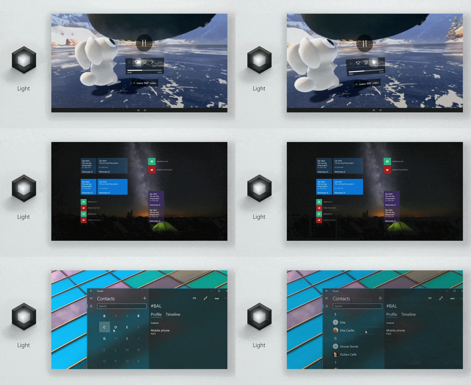
Ask any filmmaker worth his salt, and he’ll tell you all about how important lighting is in a scene. With design, it’s no different: How bright or dark an interface is can change how the user perceives it. Belfiore says it creates atmosphere, lending an app design a sense of place. That’s true enough, but when it comes to designing an interactive menu or app interface, it’s also an important tool for drawing a user’s attention. An illuminated button can teach customers how to use an app, or highlight a program feature they might otherwise pass over.
Depth
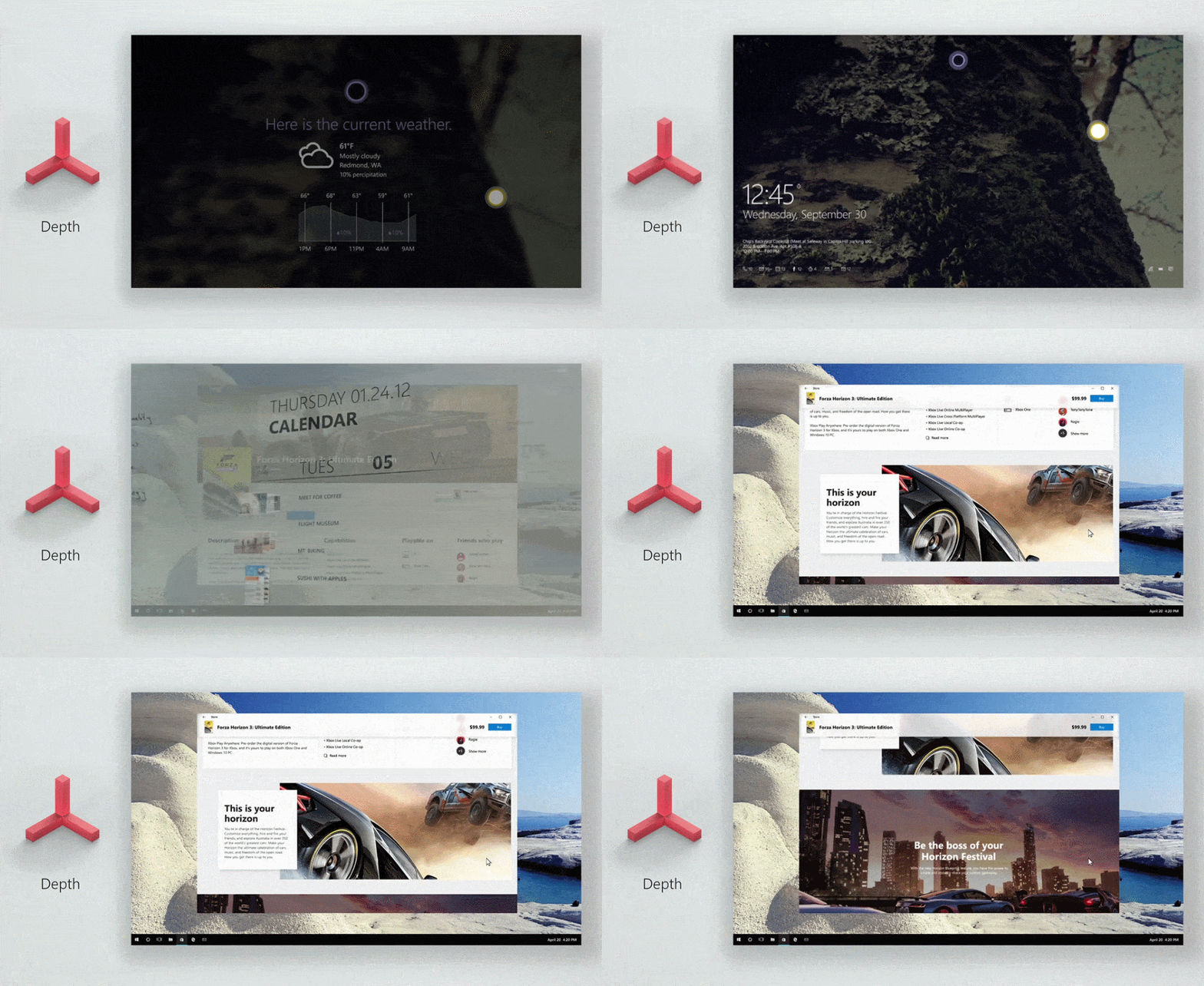
Between the classic era of gray, dull menus and the short-lived, flat “Metro” design language, Windows has almost exclusively relied on boring, square frames to present users with information and tools. With Fluent Design, Microsoft is challenging developers to kill that paradigm by breaking information and objects free of a traditional 2D frame.
Rather than presenting a flat, traditional calendar, for instance, Microsoft’s Build presentation imagined an “at-a-glance” agenda zooming in and telescoping important events toward the user — creating an illusion of depth by layering and sizing more important appointments to appear larger. The hope is that by using depth to lend interfaces the illusion of a physical environment, Windows apps will be able to keep their users engaged for longer.
Motion
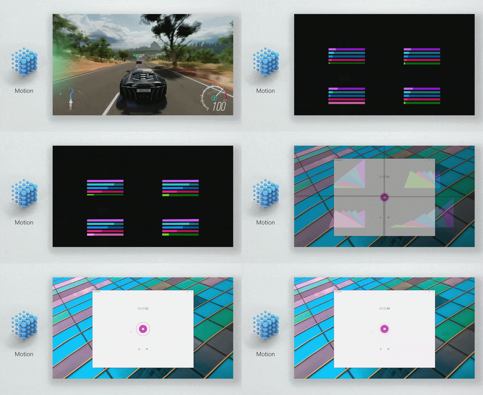
A well-animated interface is an engaging one, and the “motion” edict is all about keeping a user’s attention by giving her something active to look at and interact with. Belfiore likens the use of motion in Fluent Design to a director using movement to lead the viewer to the story they want to tell. “Motion design has a special power to bring all of our experiences to life,” he says, “and lead people from one task to another with a cinematic ease.”
Microsoft illustrates this with the Xbox One’s live pop-in menu, music visualization in a media player and with a motion graphic transitioning a simple graph to a more dynamic, brightly colored array of representational shapes — all examples that quickly draw the attention of the user to the task at hand, be it controlling music, managing game settings or simply keeping the viewer engaged with a dataset.
Material
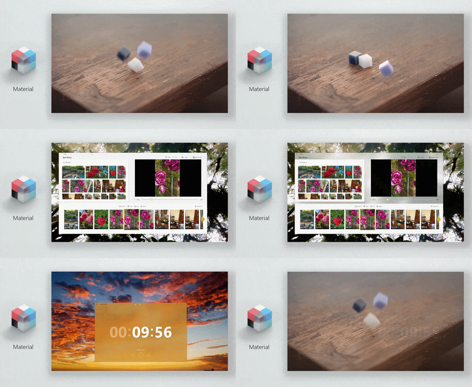
Like most of Fluent Design’s core concepts, “material” almost seems like a dig at the visual style of Windows’ past. The functional squares of the traditional Microsoft interface may be, well, functional, but it lacks a connection to the physical world. Belfiore suggests that the key to making users love Windows’ app design is to emulate the “sensory and invigorating” feel of the materials that make up the real world.
“We want to bring more of that character to our designs in the right way, with a physical quality,” he says. “Inviting people to touch and interact.” This statement could easily be dismissed as an effort to give apps more interesting textures — but with Windows 10, the idea of making a PC interface inviting to touch holds some merit. We may think of PCs as simple, traditional keyboard-and-mouse interfaces, but the Fall Creator Update leans hard on better voice control, better touch interaction and natural-feeling stylus input. Building an interface that invites that kind of interaction makes a lot of sense.
Scale
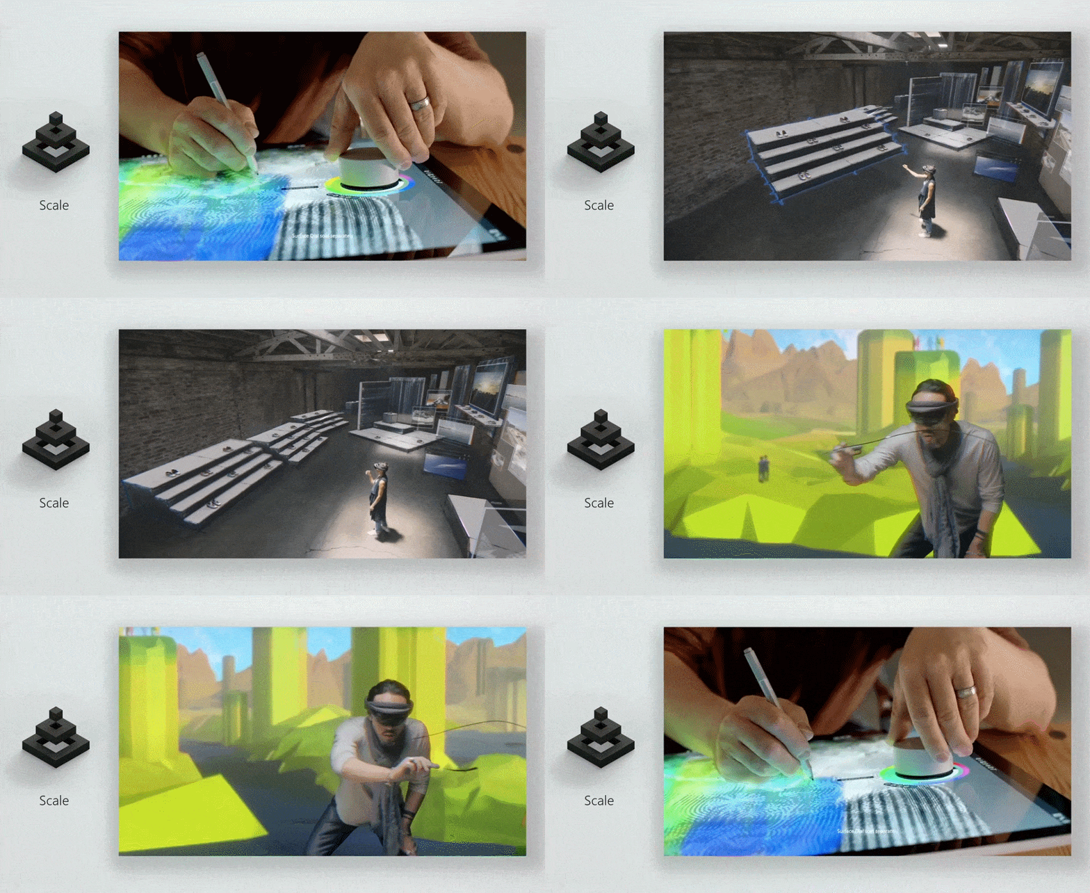
Most of Microsoft’s new design language seems primed to improve the traditional computing environment — objects under glass controlled with peripherals and accessories. “Scale” is a bit different. Here, Microsoft is looking toward its own future. Specifically, the scale of digital objects used in 3D interfaces and virtual/augmented reality.
The relative “size” of digital assets happens to be something VR developers have been working on for a few years now — an object that might be properly scaled when viewed through a computer monitor might seem incredibly large or surprisingly small when viewed through an AR or VR headset. Getting the size of virtual objects right is paramount to building a good first-person interface. By challenging developers to think about the scale of their interface in terms of a 3D environment, Microsoft is asking them to imagine how their product might look through the company’s Hololens headgear.
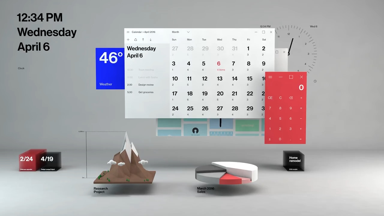
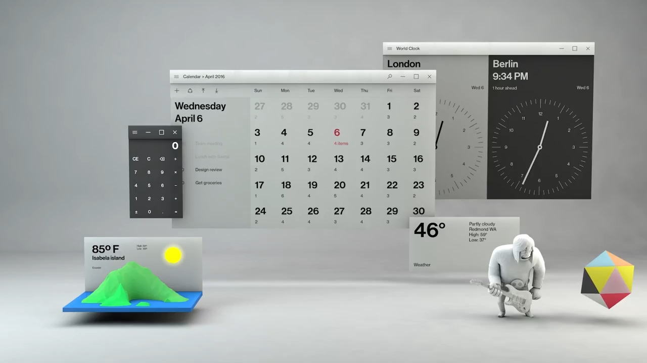
In theory, all five of these core design tenets have the potential to help Windows developers create more-robust and interactive user experiences — but what would a Fluent Design inspired Windows actually look like? Microsoft didn’t reveal much during the Build Keynote, but at the end of the style’s teaser video, a few brief examples flashed by the screen, including mock-ups for a Fluent Design calendar and a possible new Windows desktop.
These images are almost surely just concept art at this point, but they certainly embody the tenets of Fluent Design. This new desktop, for instance, oozes depth — with light and shadow work clearly defining where each window is within a physical space. Each object in the scene has a distinct feel, a nod to the material element that makes it feel more tangible than a standard square window. The light, depth and material elements also highlight the idea of scale between the objects, making it easy to imagine these same interface windows being projected on a wall in an augmented-reality environment.
It’s too early to say for sure how Fluent Design will work out, but Microsoft is clearly thinking about its user interface in a completely new way. It’s weird and a little bizarre — but the idea that the next version of Windows could look completely different is absolutely exciting.
Click here to catch up on the latest news from Microsoft Build 2017.
(52)


