Muji’s brand-new pop-up is half store, half design gallery
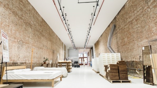
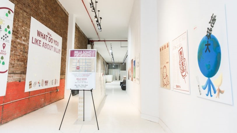
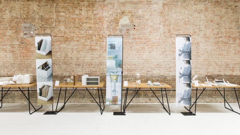
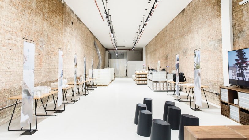
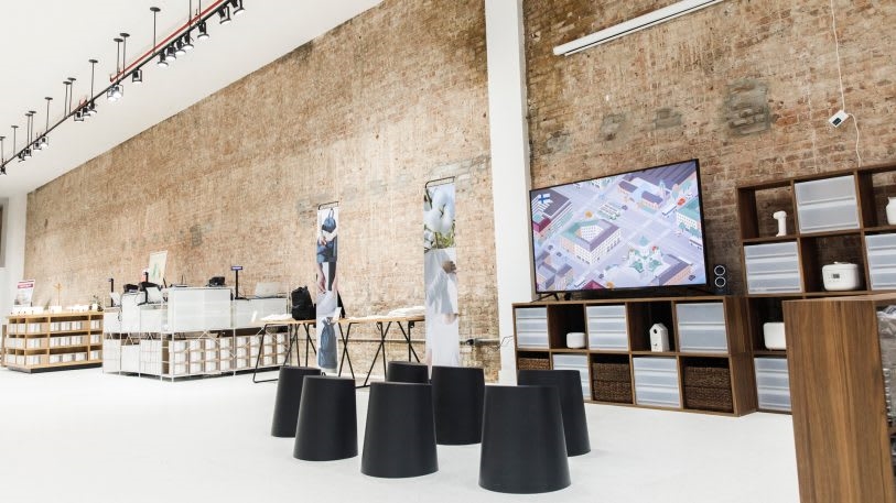
Muji already has 19 stores in the United States. But today, it’s opening a new kind of location in the city: a pop-up in Soho that will last for just six months.
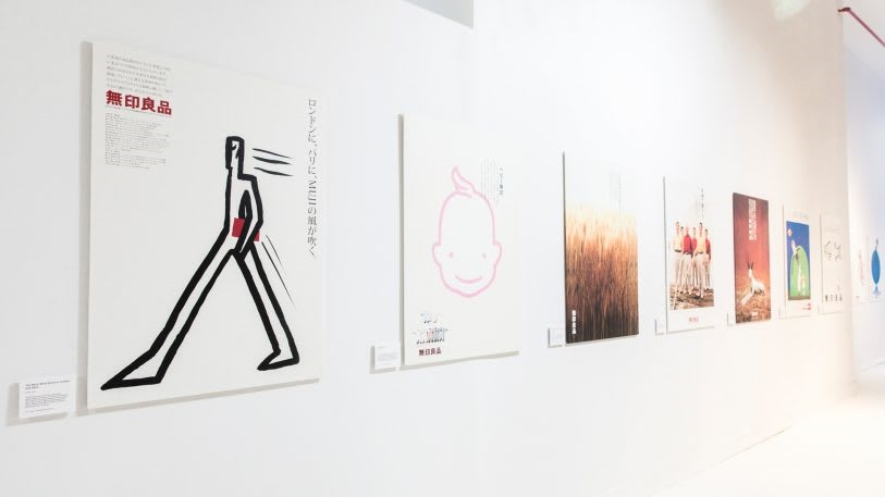
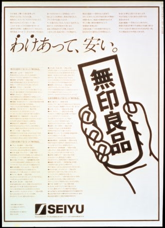
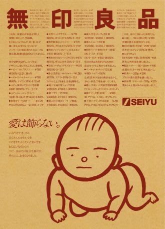
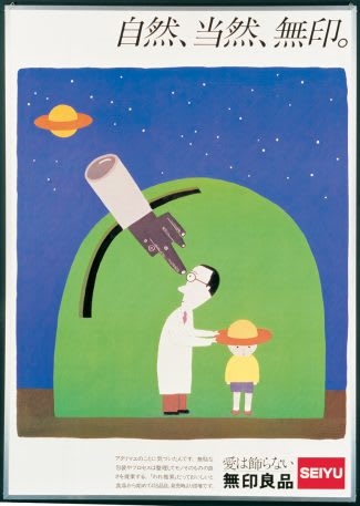
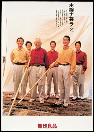
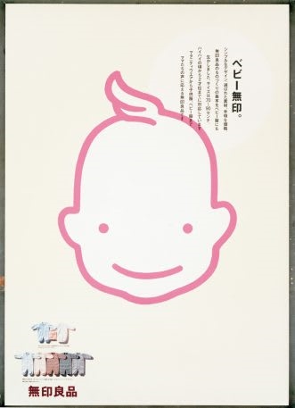
While some housewares will be available for sale, the space isn’t exactly a store; it’s meant to be a celebration of Muji’s history as a design house. The main focus is an exhibit of posters by the late artist Ikko Tanaka, who was famous for blending traditional Japanese art with principles of modern design and created advertising for Muji over two decades of working for the brand.
[Photo: courtesy Muji]
When Muji was founded in 1980, Tanaka came on to develop the brand’s identity and served as the company’s art director until 2001. He passed away the following year. His approach to design helped shape Muji into a global juggernaut and is still visible in the way Muji makes products and retail experiences today—an understated but instantly recognizable design style that the pop-up celebrates and reinforces. As Co.Design reported in 2016, it was Tanaka who designed the brand’s logo and who had the idea to use unbleached, recycled paper to package Muji products in the 1980s.
Tanaka was born in Nara, Japan, in 1930 and, at 33, he founded his own company, the Tanaka Design Studio, where he created art for some of Japan’s largest companies, including Mazda, Issey Miyake, and Hanae Mori. He was an incredibly prolific designer, producing decades of work characterized by minimalism and simplicity, relying on clean geometrical forms. But he artfully blended Japanese art forms into these images, including calligraphy, traditional motifs of mountains, and representations of geishas’ faces.
[Image: Ikko Tanaka/Muji/licensed by DNPartcom]
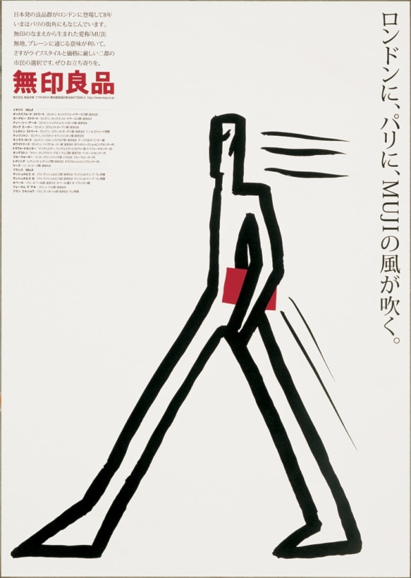
A poster that Tanaka created in 2000 for the opening of Muji’s 20th anniversary encapsulates his style. The poster is titled “The Muji Wind Blows in London and Paris” and features a representation of a man drawn with a few angular brush strokes, who appears to be in motion with wind behind his back. He carries a book that is the same red as Muji’s logo. In Japanese script, the poster reflects on Muji’s history.
At a time when advertising is designed to be attention-grabbing, Tanaka’s posters display a remarkable simplicity and restraint. And for Muji, a company that was using recycled packaging and minimal branding decades before the rest of the world, the pop-up is a chance to celebrate his vision.

Fast Company , Read Full Story
(22)

