NASA atmospheric visualizations are pretty terrifying these days
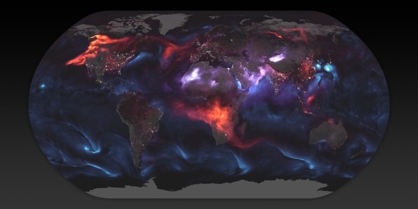
NASA’s Earth Observatory has released a striking map of Earth’s atmosphere that shows the aerosols suspended in the atmosphere on a single day in August. It’s terrifying to see–NASA’s new color palette makes our planet look like a night atlas of Mordor, especially when you compare it to the previous maps’ Pale Blue Dot-inspired hues.
Each color–orange, purple, and blue–represents one type of aerosol. Aerosol are solid particles suspended in the atmosphere, which can have a terrible impact on Earth’s climate. These floating particles help trap the sun’s radiation inside our atmosphere, building up the greenhouse effect that is increasing temperatures globally. According to the 2013 Intergovernmental Panel on Climate Change, global temperatures rose an average of 1.53 degrees Fahrenheit (0.85 degrees Celsius) from 1880 to 2012.

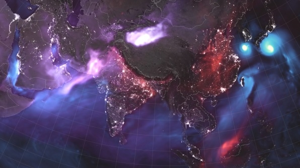
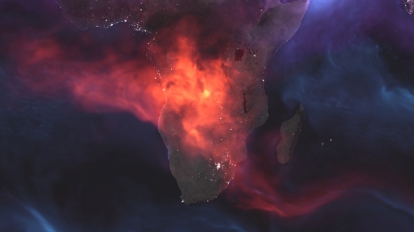
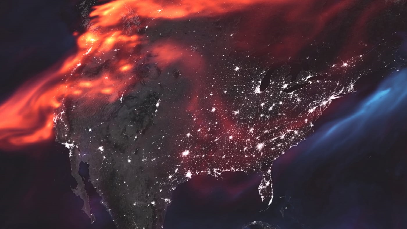
The aerosol represented by orange is black carbon–smoke produced by fires all over the world. You can see clearly see the big forest fires in North America’s west coast and Africa. The latter are seasonal fires provoked to create and maintain farming areas. Other producers of black carbon smoke include power plants burning coal, the steel industry, and land and air transportation.

The purple color represents dust, which is the result of powerful winds blowing sand particles from deserts around the globe, especially in North Africa, the Arabian Peninsula, and central Asia. Lastly, blue represents salt, which gets suspended in the air by ocean storms.
NASA made the visualization using data from different satellites and instruments on August 23, 2018. That included the Visible Infrared Imaging Radiometer Suite, a device dedicated to measuring the properties of clouds and aerosols; ocean color; sea and land surface temperature; ice motion and temperature; fires; and Earth’s albedo (the amount of sunlight reflected by our planet) onboard the weather satellite Suomi NPP. It also used data from the Moderate Resolution Imaging Spectroradiometer, a sensor that photographs Earth’s surface using 36 different bands in the electromagnetic spectrum, on the Aqua and Terra Earth observation satellites. These instruments can observe and measure color and temperature the land and sea, as well as burning fires.

The information recorded by these satellites is then combined in one computer model–which is called the GEOS FP, a complex weather analysis and prediction software developed at NASA Goddard Space Flight Center. The GEOS FP model combines the map with other elements like temperature, moisture, and winds collected by sensors on the ground all over the world. Using mathematical equations, it creates the final map you can see here.
The objective of these maps, which NASA updates on a regular basis, is to have a clear picture of how aerosols, both natural and man-produced, affect Earth’s climate over time. Having so much data over long periods of time will help us better predict the health of our planet. And hopefully, give us the information we need to steer our species’ future away from climate-driven catastrophe.
(32)


