Netflix Launches Video Previews: How The Company Landed On Its Biggest Redesign Ever
Several years ago, when Netflix was playing around with a redesign of its platform, Chris Jaffe, VP of user interface innovation, went to Barnes & Noble and bought every entertainment magazine on the rack. He took them all home and spread them out on his living room floor. Then he asked himself this question: How does Hollywood merchandise its shows?
“And what you saw when you stood back and looked was that it was all about strong imagery with a small amount of contextual text,” Jaffe tells me during a recent interview, standing in a conference room at Netflix’s Los Gatos headquarters. “It was, ‘Here’s The Walking Dead‘ and there was a big, strong image of that. Or, ‘Here’s Mad Men,’ and a big image.”

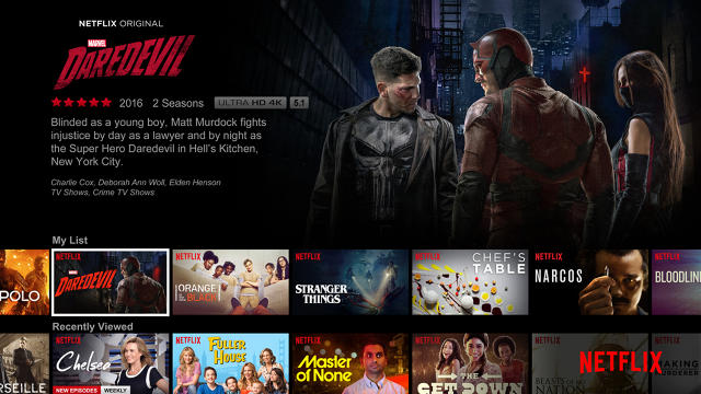
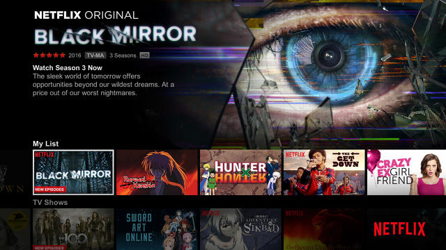
This revelation led Netflix—following the kind of exhaustive testing and research the company is famous for—to ditch its earlier UI design, which highlighted optionality, and put an emphasis on imagery instead. By now, most subscribers are familiar with the look, which debuted in 2013: A series of lush, rotating images dominates the screen, accompanied by a simple synopsis.
Netflix found that the new design did a better job of connecting viewers to its approximately 7,000 movies and TV shows, but, Jaffe says, “We always thought it could be better… and the better way is video.”
This hunch, confirmed by further rounds of tests and data gathering, has led to an even bigger UI upgrade, which is being rolled out to the company’s 86 million global subscribers starting today, as announced in a company blog post. Now, as you scroll through the rows of offerings, preview videos for each title will begin automatically playing whenever you linger on an image for more than a second or two. It’s a drastic change for a site that, when it debuted its internet TV service in 2009, looked like “an efficient vending machine,” Jaffe jokes.
And it brings the Netflix experience far closer to old-fashioned channel surfing and further away from the act of staring at a computer screen and clicking static icons (which is, incidentally, what browsing Amazon still feels like). Ironic throwback, perhaps, but nonetheless exactly what Netflix was going for. Says Stephen Garcia, director of product innovation at Netflix: “Television has decades’ worth of expectation that when you turn it on, the video and audio play. So it’s actually quite strange to have a silent experience.”
The move may cause some blowback in the same way that the autoplay feature on Facebook has drawn grumbling from people who don’t like videos instantaneously playing as they scroll. But Netflix remains steadfast in its belief that TV—as opposed to a social media site or blog—is meant to come to life when you turn it on. So for now at least, it isn’t offering a disable option. That will likely change, however, on the laptop and mobile UIs, which are still in the process of being tested and built.
“You’re used to turning on TV and things being loud and happening,” Jaffe says. “It’s a different thing on your laptop and mobile. We’re evaluating those (experiences) right now, we’re going through the design exercises on mobile. We’ll probably have different considerations.”
Another important detail: The experience won’t be available to all Netflix users at once. At launch, the Sony PlayStation, Xbox One and S, and Roku platforms will have the upgrade. Following in the next few months will be the Xbox 360, then smart TVs and other set-top boxes such as the Fire TV and Android TV. Other devices—including the Apple TV and Wii—will be upgraded as soon as possible, though Netflix is not sharing specific timelines. (The 2013 UI design has never been implemented on Apple TVs because Apple insists that its app developers all adhere to a grid design, as explained here.)

The intuitive rationale behind the upgrade was that video is a far more compelling format when advertising, well, video, not to mention a feature that users have come to expect from their online experiences. (Netflix customers have been demanding the kinds of trailers that iTunes, Hulu, and HBO Go provide.) But more importantly, Netflix found that when users interact with videos rather than still images, it cuts down on browsing time.
“What this video does is make it so that people actually have to browse less before they find something that they feel confident in watching,” Garcia says. “When I say ‘confident,’ I mean that you pick something and you watch a little bit or you watch a lot. So did you finish Beasts of No Nation or did you watch a little bit and say, ‘This isn’t for me, I’m out’? And when you pick something and don’t finish it, that’s a failure on our part. So what we really wanted to do was make sure we were helping you find something great.”
Less browsing doesn’t completely answer the biggest existential problem that Netflix users grouse about—how to see all of the choices at once without scrolling your life away—but it does chip away at the challenge of discovery something that fits your taste. And a customer who spends less time searching and more time watching “something great” is a happy customer, which helps Netflix achieve its ultimate goal: retaining and growing subscribers. Netflix, after all, does not run ads with its content, which means that its health is entirely dependent on subscriber growth. And as Garcia notes, “It’s very easy to cancel your service. We want you to feel that your subscription is valuable and worth the money.”

This philosophy is the motive behind all of the company’s innovations and distinguishing perks, from its algorithms that recommend content based on users’ viewing habits to its slew of original shows like House of Cards and Stranger Things to its frequent service upgrades and offerings. Just last week Netflix announced—in a major turnaround—that subscribers will now be able to download content for later viewing, when they won’t have an internet connection—an option that both Amazon and iTunes allow.
These improvements come as Netflix faces an onslaught of competition from the likes of Amazon, Hulu, and newer streaming platforms like DirecTV Now. With more and more cord-cutters weighing the benefits between services, Netflix is strategizing how to stay out ahead. Amazon in particular is a growing threat. Although Netflix content chief Ted Sarandos recently snubbed Amazon’s original content efforts, the online shopping behemoth, which has about 60 million subscribers, is catching up to Netflix’s global reach, and has pledged to increase its content budget from the $3 billion-plus it spent in 2016. Netflix, meanwhile, will plow $6 billion into content in 2017, with over 1,000 hours of original programming in the works.
So why has it taken so long for Netflix to get around to video? In short, because it required a ton of work. Jaffe says that when the company began “poking” at video a few years ago, its technology wasn’t advanced enough. “For a long time, the internet technology wasn’t there for us to deliver this really, really quickly,” he says. “We had prototypes of this stuff, we knew that this was always the experience we all wanted. But we needed to make the investments [and optimize] things like adaptive streaming and our Open Connect global infrastructure for delivering content.”
In other words, Netflix needed the horsepower to set up thousands of videos to play at a moment’s notice. “That video needs to start very, very quickly or you’re not in the game,” Jaffe says.
Netflix also needed to prove its hypothesis: that video is more effective than images when it comes to engaging users. And to do that, the company ran hundreds of tests. To help me understand this process during my visit to HQ, I’m brought into a room where I’m seated in front of a screen and hooked up with sensors that measure my palm sweat and heart rate. A small camera on the screen tracks my eye movement, and another one reads my facial expressions to gauge my emotional responses. I’m then shown three preview videos. (The subjects in the actual tests, I’m told, were shown many more.) At the end of the trailers, I’m asked questions such as, “After seeing this video, how interested are you in watching X?” and “Can you remember the names of the trailers that you just watched?”
The tests helped Netflix understand which types of videos work best in a streaming environment, where you’re able to watch content immediately. These previews serve a wholly different purpose than official trailers for movies or TV series available sometime in the future. Netflix made them internally and designed them to accurately convey the gist of a product that you can watch right now.
“[Traditional] trailers can sometimes build anticipation for something without telling you much of a story,” Garcia says. “They’re teasers. Cloverfield did that really well. Blair Witch did that really well. So the purposes can be different.”
Netflix’s previews are efficient, running between 30 seconds and a few minutes. Garcia says he initially thought they would have to be longer, but research showed that “people take 90 seconds in order to make a decision about what to watch. So we try to help them find something to watch in less than 90 seconds to make sure they can enjoy their experience.”

With the exception of Netflix original movies and shows, most of the previews lack dialogue, and instead feature a music soundtrack. But Netflix says that will change as the company continues to discover what kind of audio format works best for each title. Netflix is very much maintaining a work-in-progress attitude throughout the rollout. The company wouldn’t confirm what sorts of features could start showing up down the line, but it’s conceivable that videos personalized to highlight users’ individual tastes might one day appear.
As for when to expect the new UI on mobile devices, Garcia says, “We want to create something that members love. So if we test something and members love it, we will roll it out. Just like we’ve done with this.”
Testing aside, Garcia admits that the biggest affirmation of the new UI came from his own experience. “I used it [at home] for the entire duration of the test and I missed it when it was gone. It feels fresh, it feels new. It feels like something that should have always been there.”
The evolution of Netflix: As of today, static screens like this one, from 2010, are a thing of the past.

What Netflix browsing looked like in 2011…

…and in 2013.

Fast Company , Read Full Story
(45)


