New iPad and iPad Pro review: Just where is Apple’s tablet going?
When Apple announced the first iPad Pro back in 2015, it redefined what its tablet could do. The Pro was a much larger, much more powerful iPad that worked with the then-new Pencil stylus and the first keyboard case the company had ever made. In other words, it was an iPad you’d never confuse with the standard version of the tablet, which at the time was the iPad Air 2.
Over the seven years since, a major theme of the iPad’s evolution has been bringing many of the iPad Pro’s features to lower-priced models. Even the baseline $329 iPad and the iPad Mini have picked up some of them, and the iPad Air has evolved into an iPad Almost Pro.
Mostly, this Pro-ification of the entire line has gone well. As Apple has improved its less expensive models, it’s made intelligent decisions about which features to add and which ones it could leave out to hit a price point.
However, with the new 10th generation iPad, the company has hit a few snags. This model, which starts at $449 with 64 GB of storage, is certainly a meaty upgrade from the $329 9th generation version, which remains on the market and is still a lot of tablet for the money. Feature-wise, it’s also close enough to the $599 iPad Air that it feels like an iPad Almost Air at a substantially lower price.
[Photo: Harry McCracken]
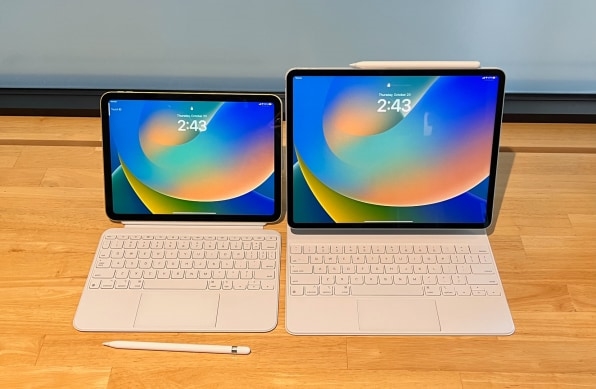
But as Apple worked to incorporate Pro-like features into a $449 device, it’s fractured the iPad lineup in a few puzzling ways. The 10th gen iPad sticks with the first gen Pencil stylus—but requires an adapter to charge it. It works only with a new keyboard case that’s not compatible with any other iPad. And it introduces a new feature—a landscape-oriented front-facing camera, for better video calls when it’s in a keyboard case—that iPad Pro owners have coveted for years.
That last piece of news would be fine if it weren’t for the fact that Apple is also introducing new 12.9-inch and 11-inch iPad Pros that don’t have landscape cameras. They offer only the slightest of updates, with faster processors and a clever improvement to Pencil functionality, and almost nothing else. After spending several days with a 10th generation iPad and 12.9-inch iPad Pro provided by Apple, I’m still wondering where the iPad Pro is going as other iPads incorporate many of its features. (The new models will be available this Wednesday.)
Almost, but not quite, an Air
The good news is that the 10th generation iPad is a nifty tablet in most respects. By ditching the home button and moving the Touch ID sensor to the edge, Apple expanded the screen from the 9th generation model’s 10.2 inches to 10.9 inches—the same as the iPad Air, and enough additional real estate to make for a more enjoyable experience. The tablet doesn’t have the Air’s laminated, wide-color display with anti-reflective coating; I noticed the difference when I did a careful comparison, but it’s a fair tradeoff for a model that costs $150 less.
The new iPad is powered by an A14 chip—the same one in the 2020’s iPhone 12 and that year’s version of the iPad Air. Here again, the current iPad Air, with its M1 processor, is substantially better equipped. But the A14 is plenty zippy enough for the tasks most people perform on an iPad, from cruising the web to game playing to casual photo and video editing.
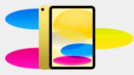
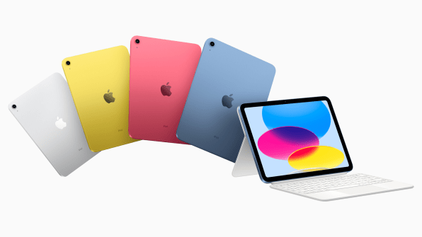
One place where the new iPad handily beats the Air: Along with classic silver, it’s available in vivid new yellow, pink, and blue versions. That’s the most fun color lineup any iPad has ever had. (The yellow review unit I’ve been using makes my daily-driver silver iPad Pro look positively drab.)
[Photo: Apple]
Then there’s the area where this iPad trumps every other iPad ever made: Apple has moved the front-facing camera from the shorter edge to the wider one. Now it sits in the middle if you’re using the tablet in landscape mode, such as when it’s in a keyboard case. And that means that it’s finally possible to make video calls and not look oddly off-center.
Here I am as seen in Zoom on the 10th gen iPad (left) and my own iPad Pro (right):

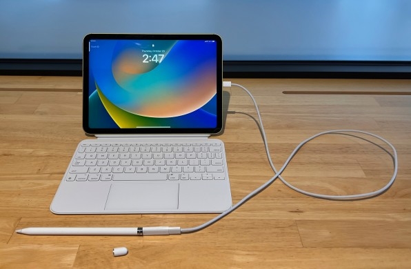
The new iPad also switches out Apple’s Lightning connector for USB-C, as already seen on the Air and Pro models. But those iPads support the second generation Pencil and its ingenious ability to charge by clinging magnetically to the edge of the tablet. The new iPad sticks with the first generation Pencil, which charges via a Lightning connector hidden under a cap. So, Apple is introducing a $9 USB-C to Apple Pencil Adapter, which will also be included with first generation Pencils from now on. To charge, you plug one end of the adapter into the Pencil, and the other into a USB-C cable. Then you plug the USB-C cable into the iPad (or another power source).
Aside from the conceptual clunkiness of having to use an adapter to get two products you just bought working, there’s a basic usability flaw: If the Pencil runs out of juice when you’re out and about and you didn’t tote the adapter and cable, there’s no way to recharge it until you get home.
[Photo: Harry McCracken]
Might you be willing to put up with this complication if you already own a first gen Pencil and can repurpose it with the new iPad? Sure. But for new Pencil buyers, there’s no upside to the way this iPad is trapped halfway between the Lightning and USB-C technologies.
New tablet, new keyboard case
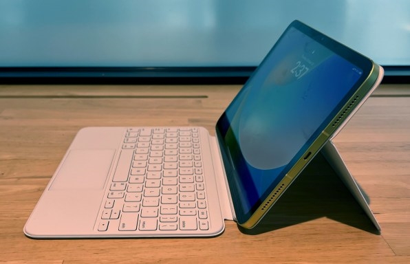
With the Pencil, Apple ran into trouble because it kludged together a way for an old accessory to work with a new, not-entirely-compatible iPad. When it came to keyboard cases, it took the opposite approach. The new iPad’s dimensions are slightly different than those of the iPad Air and 11-inch iPad Pro, and Apple has moved the Smart Connector from its backside to its edge. Enter Apple’s new Magic Keyboard Folio, a keyboard case designed specifically for this tablet.
Instead of offering the earlier Magic Keyboard‘s innovative cantilevered hinge, the Folio is similar in design to third-party cases such as Logitech’s Combo Touch. It stands up via an adjustable kickstand—fine for use on a desk, a little wobbly on a lap, and likely a tight fit on an airplane tray—and has a keyboard you can detach or flip around to the back when you’re not using the iPad in laptop mode. The keyboard offers the same excellent feel as the existing Magic Keyboard and adds a new row of function keys for tasks such as adjusting volume and summoning Siri—a feature many current Magic Keyboard owners will eye with jealousy. (Calm down, everybody: The Folio’s keys aren’t backlit, a significant minus.)
Though the $249 Folio seems to exist at least partially to give 10th generation iPad users a keyboard case that costs less than the $299 Magic Keyboard, it’s still a pricey accessory for a $449 tablet. And nobody will get to choose between all of the company’s keyboard cases: The Folio only works with the new iPad, and the Magic Keyboard and cheaper, trackpad-less Smart Keyboard Folio only work with the iPad Pro and iPad Air.
[Photo: Harry McCracken]
That adds an element of fragmentation to a buying decision that’s already complicated by Apple standards, given that there are now three iPads whose screens are nearly the same size. How to distinguish between them? Well, except for its inability to natively charge a Pencil, the 10th gen iPad has all the elements of a well-priced crowd-pleaser. The 11-inch iPad Pro has much to recommend it to advanced users, including the fastest processor, the best rear camera system, and storage options of up to 2 TB. And then there’s the iPad Air–a good tablet on its own merits, but one that feels stuck in the middle. Let’s see if the current Air, which debuted in March, ever gets a successor.
Slightly more Pro
Unlike the 10th gen iPad, the new iPad Pros are about as minor as upgrades get. They pack Apple’s M2 chip—the same one in this year’s MacBook Air—for up to 15 percent better performance and up to 35 percent faster graphics than last year’s iPad Pros, the company says. There are also a few other technical updates, such as support for the latest version of Wi-Fi and the ability to capture video in Apple’s ultra-high-quality ProRes format.
These iPad Pros also give the second generation Pencil a new feature called Hover. It lets apps detect that you’re holding the Pencil with the point just above the screen and respond with new functionality. Apple’s Notes app, for example, previews the color and point style of the writing instrument you’re using, and an upcoming version of the Procreate painting app will let you adjust a brush’s size by pinching the screen. If other developers embrace the capability in clever ways, it could be pretty cool.
However, hovering isn’t so cool that many people will be tempted to upgrade to the new iPad Pro just to get it. And even as Apple has given its highest-end tablet a vast amount of raw computing power, it hasn’t done much to redefine what makes an iPad a Pro. Like the 2021 12.9-inch Pro, the new 12.9-inch model has a screen lit by 10,000 mini-LEDs, for the best possible color fidelity and blackest blacks. But the technology still hasn’t come to the 11-inch iPad Pro. And rumors of wireless charging didn’t turn into reality this year.
Most confounding, the new Pros don’t get the 10th generation iPad’s landscape-oriented front-facing camera. (In my review of last year’s iPad Pro, I said that was my most-desired missing feature.) How could Apple make the switch on a cheap new iPad and leave the Pro untouched? The explanation might boil down to the company having decided not to perform the remodeling necessary to move the camera in what was otherwise a modest update. However, it’s still a letdown—and an argument for waiting to see what a 2023 iPad Pro might bring.
More than any one new hardware feature, what could make the iPad Pro feel like an even more professional tool is more sophisticated software. Here Apple is foundering, as if it’s given the Pro more computational muscle than it knows what to do with.
With iPadOS 16, which is available starting today, the company placed a big bet on Stage Manager, a new interface that lets you multitask between floating, overlapping windows on an iPad for the first time. But even though Apple ended up delaying iPadOS 16, it’s still shipping it with a version of Stage Manager that’s baffling and buggy, to the amazement of iPad aficionados on Twitter. It’s tough to understand why the feature positions and sizes windows the way it does, and when you move them around, it can feel like they’re fighting back against your attempts to precisely place them.
The one scenario where I’ve found Stage Manager useful enough to bother with is on an external monitor, where you’ve got enough space to make wrangling several apps on one screen pay off. But after including external monitor support in iPadOS 16 betas, Apple decided to postpone it until an update later this year.
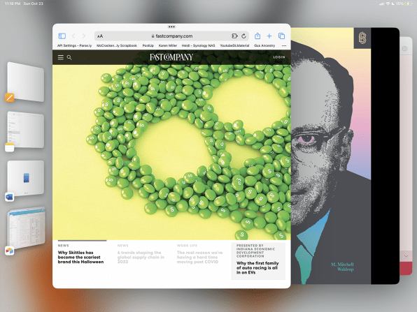
Stage Manager is so resource intensive that it isn’t available on the 10th generation iPad—no great loss. On iPads that support the feature, it’s turned off by default, with the older, more predictable Split View two-app interface remaining the iPad multitasking experience out of the box. That, at least, was a good call on Apple’s part.
The fact that Apple is winding up 2022 with the iPad line feeling a tad muddled and (on the high end) directionless is disappointing. But it’s not cause for panic. After letting a product category get confusing, the company has a decent record of cleaning it up. Consider its current MacBook Air and MacBook Pro portfolio. More so than in years, it’s not at all difficult to figure out which model is likely best for you, and none of the differences between them feel out of kilter with the big picture.
Here’s hoping that by the end of 2023, we can say the same for the iPad.
(49)

