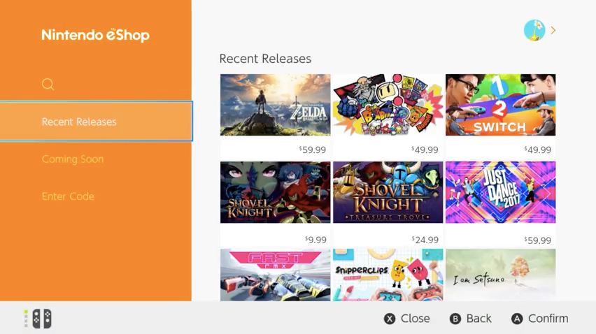
The launch of Nintendo’s very hyped (and very strange) Switch is only a couple of days away. And we’re only just now getting our first look at its digital storefront the Switch eShop. If you’ve touched an electronic device at all in the last few years, the interface should seem pretty familiar. It’s clean and simple, with sidebar shortcuts for search, new and upcoming releases and a place to enter download codes. On the right games are listed as a grid of cards with cover art and prices. It’s not all that different from any other app store really, and looks quite a bit like the Google Play store. And you’ll find most of the features you’d expect from a modern console — like a wishlist and the ability to download games in sleep mode — baked in.
The eShop has it’s own permanent button on the console’s dashboard, but you can also find it in the news feed. When you first turn on the Switch it presents you with updates and information from Nintendo, including announcements for new releases or promotional sales. And with a quick tap you can go from reading about the latest indie smash to buying it and downloading it.
If you already have a Nintendo Network ID you can link it to your Switch and any funds sitting in your wallet left over from 3DS or Wii U purchases will be added to your account. Sadly, you will have to fire up a computer to do that, there’s no way to merge your various Nintendo IDs from the Switch itself.
Right now the eShop is a little barebones, for example filtering options are limited to price and genre. And it’s worrying late for Nintendo to be showing off its primary interface buying games online. As our review says, there’s a lot of potential here, but we’ve still got a lot of unanswered questions about the Switch.
(56)

